By Yuko Aoki
For Master of Architecture at Southern Illinois University Carbondale, students are required to take two elective courses within the core curriculum. We have several choices for electives. The one I am taking is Plant, Soil, and Agricultural System 480- 851 Outdoor Design. This class is an online course and you will have readings as lectures. One of the assignments for this class was to write a seven page research paper. Students can choose their own topics and get approval from the professor of the course. My topic was “Human Stress and Landscape”. I found interesting facts when I was researching for it.
There is a study by Kaufman, and Lohr (2008), which states that people tend to ease their stress just by seeing a picture of green mountains and trees. They said a green canopy makes people calmer, which meant for a less stressful mood. They used other colors like yellow, red, light green, dark green, and orange. The measurement of the research was to observe skin conductance response when viewing trees with different canopy colors. The most effective colors for the stress reduction were in the following order: green, dark green, red, light green, orange, and yellow.
The results could be used as a guide for choosing the color in a room and planning in your yard. When I will design a landscape, I will think about this result and design a mixture of deciduous and coniferous trees because deciduous trees will give a sense of life all through the seasons and coniferous trees will keep remaining green or dark green all year long.
Image: http://www.avisionofbritain.org/Favourite%20trees.html
Citation: Kaufman, A.J. and Lohr, V.I. 2008. DOES IT MATTER WHAT COLOR TREE YOU PLANT? . Acta Hort. (ISHS) 790:179-184
http://www.actahort.org.proxy.lib.siu.edu/books/790/790_25.htm
Tuesday, November 30, 2010
Mike O’Callaghan – Pat Tillman Memorial Bridge
By Micah Jacobson
You have probably seen or heard about the new bridge that has been constructed as a bypass to the Hoover dam. When I saw this bridge I was very impressed by its structure, construction and magnitude. The bridge is made up of over 1,000 ft twin concrete arches. They are concrete piers that connects the arch to the concrete piers cap that holds up the steel box girders.
The arches are 14’ x 20’ and spaced 45’ on center. They are connected by concrete panels containing steel struts for bracing. The longest span of the bridge (the span under the arch) is 1,060 ft. The total length is 1,900 ft. This is the longest concrete arch in the western hemisphere and the first concrete-steel arch composite bridge in the US.
The bridge uses 10 ksi of concrete. Typical structural concrete used for pre-stressed highway bridge is around 7 ksi of concrete. The concrete is high strength, but not as high strength as can be made. There is methods today that a produce concrete that exceeds 21 ksi. Half of a decade ago high strength concrete was considered to be 5 ksi. The problem when you use high strength or ultra-high strength concrete is that there is an increase in fragility. Concrete itself is fragile, unlike steel that can yield, warp and bend before failure. Concrete has a low strain tolerance before it fails. There is no yield plateau or strain hardening like you see in steel. As the strength of the concrete increases, the stress strain relationship increases (young’s modules). This is important for structures when it comes to seismic events. When an earthquake happens there is a lot of contorting by the structure. This causes a lot of strain on the structural elements. The area under the stress strain curves its material and of toughness. This is a measure of the energy the material can absorb before failing. High strength concrete starts diminishing under the curve as the strength increases and the stress strain relationship becomes steeper. As you gain strength, you lose toughness or the ability to absorb energy into the structure (such as shaking).
This bridge is certainly a marvel and fascinating piece of engineering to study, as is the design and consideration behind it.
Pictures from: http://faculty.wiu.edu/JR-Olsen/wiu/
Media:scape
By Jessica Grafton
New from Steelcase is Media:scape, an innovative new collaboration station. This product line offers multiple meeting environment options, in which all of those present can participate by sharing their media electronically. These hubs, if you’ll call them, have taken today’s technology and inter-weaved it with the functions of inner-office conferencing in a way that is modern and efficient for its users.
According to Steelcase, this is how it works:
“media:scape was designed for a “walk-up and connect” experience. Open. Connect. Share.
Open the media well and remove a Puck™
Connect the Puck to your laptop
Share what’s on your laptop by pressing the Puck™
Your team members can do the same. Sharing made simple, quick and seamless … to increase productivity and innovation.”
This product definitely encourages and incorporates group interaction, changing the face of what the normal meeting looks like. It also is a great tool for video and global conferencing as well, making sharing convenient and easy.
All information and photos from www.steelcase.com
Monday, November 29, 2010
Sketching 101
By Russ Baker
As children, a lot of us began experimenting with pens, pencils, or crayons to sketch, draw, or color our ideas onto paper. Professionally, sketching may seem in some instances to be a lost art, especially since computer technology is exponentially improving. On the contrary, in the field of architecture, even with advanced rendering programs, sketching remains a very important ability. The ability to sketch, or draw quickly is extremely beneficial and generally expected by architectural clients. It is by no means uncommon to be required to draw a representational idea quickly in front of a client. Translating one's thoughts onto paper can sometimes prove to be a challenging task, so if you are an architecture student, I recommend practicing sketching as often as possible. Ideas don't always present themselves during your spare time, so often I find myself sketching on napkins at restaurants, post-its in bed, and anything thing else that is readily available. It is a good idea to carry a small notepad and pen or pencil with you at all times. After I finish a sketch, I have a tendency to go back and add detail in my free time just for fun and for practice, as you can see in the first four sketches (each was completed in under an hour).
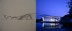
It is always interesting to see initial sketches of ideas or concepts translate into the finished, built product. An excellent example of this is the Hydra Pier designed by Hani Rashid & Lise Anne Couture, built in 2002 in Haarlemmermeer, Netherlands [Two images courtesy of the book Sketch∙Plan∙Build: World Class Architects Show How It's Done, by Alejandro Bahamon].
If you are just beginning to experiment with sketching, here are some tips and rules that I learned years ago in a freehand drawing class:
1. It's almost as important to know when to stop as it is to know how to start.
2. Good beginnings, good ends
3. Never stop short of a guide line.
4. Keep elbows on the table.
5. 50% light, 50% dark
6. Cut the paper out of sketchbook.
7. Leave something to the imagination.
8. Get the proportions correct.
9. Remember the basics.
10. Get up and move around; look at others work.
11. Keep the radio on.
12. Attract the eye to the middle of the page.
13. Keep pencils sharp.
14. Draw the horizon first.
15. Find your vanishing points.
16. Make sure your lines don't go off the edge of the paper.
17. Look at what you're drawing.
18. Know what you're drawing before you put anything down; don't go over anything twice.
19. Good line work - no hen or chicken scratching
20. Don't let anything get in your working arms way.
21. Have fun!!!
Bald Knob Cross
By Ben Temperley
This past June I had a chance to visit Bald Knob Cross for the first time at a Calvary Campus Church Chi Alpha event. The cross is located on a hill in the Shawnee National Forest west of Alto Pass, IL. The idea for the cross came in 1937 when Wayman Presley was chatting with Reverend W.H. Lirely. The two talked about the need for a place for people of different denominations to worship. This led to the first Easter Sunrise service in 1937 on Bald Knob. An enthusiastic crowd of 250 attended. In the following years attendance grew to thousands .
The Cross was completed in 1963. It contained 900 heavy gauge steel panels with a white porcelain veneer that was illuminated from within by 40,000 watts of lighting. The Cross could be seen for 7,500 square miles. The structure is 111 feet tall. The base of the Cross is made of Illinois marble. The Cross can withstand winds of up to 150 miles per hour. The inside is hollow. Visitors were originally able to take stairs to the top. This has been discontinued since 1982.
When I visited the Cross, the porcelain veneer had been removed as part of a restoration process. The website, baldknobcross.com, has a nice rendering of the finished restoration which is projected for fall 2010. Even without the exterior veneer, the Cross is worth the trip to see. If you like seeing the structure behind a form, this would be particularly interesting to you. You can see the steel angles, beams, columns and cross bracing. You can also see the stairs that the public used to take to the top. The view from Bald Knob is spectacular! You can see miles of beautiful Southern Illinois forest. Bald Knob is a neat place to watch the sunset. As the day turned to night, the lights of the Cross were turned on making for a picturesque scene.
To learn more, there is a visitor’s center on the site. There is also a pavilion that makes a good place for a picnic or church gathering. Hopefully soon the Cross will be restored. Not many places are blessed to have a cross over 100 feet tall!
Saturday, November 27, 2010
Spatial Perception
By Rhonda C Daugherty
How one interprets space is a phenomenological experience that goes beyond the limitations of psychological confinement. Smell and taste are consequentially linked to a sense of place by understanding how the brain works and remembers past. To smell and to taste are past, spatial perceptions linking to present; rather visuals, touch, and sounds are descriptive characteristics that exist in the present. Spatial explorations while utilizing one’s senses are indeed manipulated by human behavior which is controlled by social, physiological and his or her physical inadequacy.
Site, location, and intent are the primary concern when designing a project that examines phenomenological perception. Everything plays a key role; for example, in “Invisible Architecture”, the author discusses phenomenological in terms of a physical association to space while; in “Spaces Speak, Are You Listening?” the author challenges the thought of physical association and states that space is subjective. In conclusion, how one perceives something and what it perceived would be impossible without the five senses.
Motorcycles Represent The Major Type of Transportation in Taiwan
By Kang-Hsin Fan
Taiwan’s population was estimated at 23 million in 2010. With its high population density and many factories, some areas in Taiwan, especially the capital city of Taipei, suffer from heavy pollution. Motor scooters are a very common means of transportation in Taiwan and contribute to urban air pollution. According to official public transportation report, there are approximately 13 million motor scooters and 5 million cars in 2010. With the data of transportation, the biggest problem in Taiwan is the omni-presence of scooters. Without the pedestrianization policy by the government, motorcyclists always park haphazardly at the side of the street or in front of shops as close to their destination as they can. The problem is that pedestrians and motorcyclists are in conflict for the use of public spaces. From the view of retailers, shoppers are not able to visit their shops with these hazardous scooters in front of there doors. This behavior clutters up the public spaces, and the development of urban design.
Moreover, some restaurants hope to create an outdoor atmosphere like the cafes of European countries to attract customers, so that they can admire the outside sunshine and the street views. With these businesses reasons, these restaurants extend their service range by arranging furniture on the pedestrian street to shape the outside atmosphere. In Taiwan, the arcade in a building is a public space for pedestrians to walk freely. As a result, who will benefit from the environmental improvement; the pedestrians, retailers, visitors, shoppers, or investors? From the view of urban design, how can they improve the growth of using motor scooters as primary transportation in Taiwan? Can public spaces improvement revive the city center? Hall (2000), states that environmental improvement is considered to be a catalyst, as the essential drivers in the city’s center try and form again.
Reference: http://www.gio.gov.tw/
USGBC GreenBuild Conference and Expo
By Tara Loughman
The U.S. Green Build Council held their annual GreenBuild Conference this past weekend in Chicago, IL. Along with other members in SIUC’s student chapter, I made the trip up North to attend the conference. As a student member, I was able to attend the conference at no charge if I participated as a volunteer. This was a great opportunity for me and many other students. This was a great way for us to attend, but also a great way to learn and network with so many others in attendance.
The Conference was held at the McCormick Center, downtown Chicago, IL. The venue was filled with architects, designers, carpenters, merchants and many well-known key speakers. As a volunteer, I was to work in the exhibit areas and help other GreenBuild attendee’s to recycle their trash while helping them to understand why it’s so important and to show them that they can help make a difference in our world by recycling.
As the conference went on I was able to go walk the exhibit areas and talk to many knowledgeable manufacturers and designers. This was probably my favorite part of the conference because of the conversations made. When going into a booth, you are given an opportunity to talk to the manufacturers regarding their products on display and also to talk to the other attendee’s at the booths as well. Another thing that was great was to talk to the other students to see what they were studying, where they were going to school, and what they were doing in their studio classes.
Over the past few days, I have really seen another vast progression in green design. It’s everywhere! A lot of the things shown and expressed at the conference were really good features that could be used and considered in the design our future projects. I am really interested to see some of the products and ideas created and utilized. Specifically, I would like to see the effects they might have on the environment and to distinguish if some of these designers are really designing for the fact of sustainability or if they are just joining the “green design” bandwagon. Guess we’ll have to wait and see.
Wednesday, November 24, 2010
Diwali: The Festival of Lights
By Bhakti Shah
Diwali, the biggest Indian festival, was celebrated the past week. It’s popularly is known as the ‘festival of lights’ and marks the victory of good over evil. It also marks the beginning of the Indian new year. Diwali is typically celebrated for 5 days and each of these 5 days has it’s own significance.
This festival is of paramount importance and is in a country of over a billion people. Across the country, the people celebrate the important festival with great enthusiasm. Schools, colleges and businesses have official holidays for several days, similar to the Christmas holidays in the west.
The nature of this festival is very social. People celebrate this festival by performing various traditional activities with their relatives and friends. They worship the Gods, visit friends and families, and make a variety of sweets. They light oil lamps made of clay inside the house and in their courtyards. People decorate their houses with colorful lights and lanterns of different shapes. The use of firecrackers is so popular during this festival that the night sky glows with fireworks for 5 consecutive days. There is hardly a moment when you cannot hear a firecrackers noise or cannot see the fireworks lights in the night sky during Diwali.
The enormity of this festival is such that no one can escape it’s aura if they are anywhere in the country during this time of the year. I guess, it would not be an exaggeration to say that no other occasion on this planet is more social and colorful than the Festival of Diwali!
Reference Images: http://www.google.com/images?um=1&hl=en&biw=1280&bih=685&tbs=isch:1&aq=f&aqi=g10&oq=&gs_rfai=&q=DIPAWALI
Monday, November 22, 2010
Modern Architecture Building: Swiss Re Building
By Scott Fisher
Lord Foster and his partner Ken Shuttlework, along with Arup engineers, designed The Swiss Re Building; Skanska later built it. Swiss Re Building or as most know it as the Gherkin. The Gherkin is marked as the most recognizable modern architecture landmark in the city of London. The Gherkin was completed on December 2003 and opened up for business on April 28, 2004. The building is the sixth largest building in London which contains 40 floors totally over 180 meters, 516,100 SF, and is located on 30 St. Mary Axe Street in downtown London where the Baltic Exchange use to be. The construction of the Gherkin helped represent an up-coming boom in high-rise construction in London. In designing the Gherkin, they incorporated energy saving methods, which allowed them to use about half the power that a comparable tower might have used. The main method they came up with was to make gaps on each floor which created six shafts that function as a ventilation system. These shafts form a double-glazing effect - air is pushed together between two layers of glazing and then insulates the office areas inside. The main occupant of the Gherkin was Swiss Re-Global Reinsurance Company. The Swiss Re commissioned the building as the head office of the UK operation. Featured on the 40th floor of the Gherkin, is a bar for employees and guests that have a 360° view over London. The two floors that the bar contains is made up of a restaurant and multiple private dining rooms for special occasions. It has been known for one to be able to see the building 20 miles away, which is where the M11 Motorway is.
Image: Modern Architecture written by Anthony Hassell, David Boyle, & Jeremy Harwood
Chautauqua Auditorium
By Cray Shallenbarger
The following is a summary of a paper I wrote for an architectural history class. It is a good example of a culturally rich piece of architecture that has been preserved over a surprising period of time.
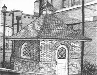
In the small town of Shelbyville, Illinois, examples of unique or even “good” architecture are slim. If one is so lucky to stumble across a unique structure in the said area he should definitely inquire about it. In this obscure Central Illinois town I did just that. The Chautauqua building is located in the center of the town’s park, Forest Park. It’s not an excessively large building by any means. It is merely one hundred and fifty feet in diameter. From the outside the building looks seemingly unimportant. It is a round building with several doors and windows tracing its circumference. When viewing it from the outside it is apparent to one that the purpose of this building is to house entertainment. The building was the center of the Chautauqua festival that consisted of music and prominent speakers of the time.
Throughout time the building has seen good times and bad times. In the early nineteen seventies, the building was in ill repair. There was talk of tearing it down and building a new, more up to date building. This struggle went on for several years. In nineteen seventy seven the building teetered on being destroyed and being remodeled. It was then that a large snowfall caused the roof and part of the wall to collapse. This forced the people of the community to make a decision. Thankfully they made the decision to repair the building and restore it. Since that time, there have been few problems with the building. One electrical fire threatened the then one hundred and one year old structure but the flame was extinguished by the local fire department.
Aside from being a culturally rich building, the Chautauqua auditorium is an excellent piece of architecture. The auditorium was constructed for entertainment purposes. The designer of the building, H. B. Trout, utilized a recent invention to achieve what was required for the building to be functional. The building was to be one hundred and fifty in diameter. Also, they wanted to use little or no middle roof supports. This may have been possible to achieve with the use of arches but the builders of this building went another route. In 1902, just a few years before the auditorium was constructed, a man by the name of Morrison H. Vail of Chicago had designed a ceiling construction method that would do just that. In review of Vail’s patent information, one can see that this invention was well deserving of use. In the specifications for his patent (1902), Vail described his invention and its purpose. It was developed to provide a cheap, safe and durable solution to special obstructions caused by columns normally needed to support a ceiling. He stated that his invention would withstand any strain of wind and snow.
This new method was actually a pretty good one. The patent explained how the load of the ceiling was dealt without using columns for support. It uses tension to keep the roof from collapsing. The roof is not flat. In fact, it raises several feet from the outside edge to the center. On the inside it is obvious that tension is in use. The trusses are fastened down to vertical posts which go all the way into the ground. These are anchored in concrete and have a wrought-iron core. These two are attached by metal straps. The straps’ shape allows for secure vertical down-pull on the truss ends without cutting into the wall plates. The cast iron foot plate is shaped as to bind the members of the trusses and keep it from spreading apart under the strains. The cast iron pin plates are formed as to bind the ends of the struts, being held up in place by the bolts. The position of the ears spreads the outer pair of the tie rods giving added lateral stiffness to the trusses. The wrought iron strap is formed as to bind the pin, the strut, and the truss rafter in their proper position and assist the rafter with the strains on the pin. The straps bind the struts to the truss rafter in their proper positions. The steel tie rods are held immovably in place on the pins and by the pin plates, ears, and nuts on the ends of the said pins.
Two long, steel tie plates are employed at ninety degrees to one another. They are exactly the same width as the rafters. They extend the full length of the core all the way to the opposite truss. These are bound to the rafters by the wrought iron straps which are tightened by bolts. The plates are also lag screwed to the truss-rafter to prevent twisting of the structure. The center, circular core is built up of several layers of planks. Each layer is composed of planks lying parallel to and abutting each other. The several layers are positioned so that the individual planks of one layer will cross the underlying later at an angle. The core pieces are shaped to fit the head plates. Each is drilled as to accept to receive the nuts on the ends of the rods by which the head plates are clamped onto the ends of the rafters. All of the planks are arranged so that when finished, they form a solid body of circular outline. The thickness of this affords a bearing that makes the apex of the roof nearly solid. “Each truss-rafter is built up of several thicknesses of planks, which break joints and are securely bound together by lag-screws, spikes, and bolts.” The center tie plates are two circular steel plates drilled around the circumference. These holes allow a place for the tie rods to connect in the center of the structure. Shims are placed between the two plates to allow space for the tie rods. These plates are bolted together to stop any shifting. The plates hang several feet below the top of the structure. It is crucial that these maintain the same location in relationship to one another. To achieve this, there are steel rods run from the top portion of the roof to the bottom plates which are well above the ground. This center construction is necessary to make the entire truss-work rigid. It eliminates any twisting from uneven loads on the roof. All of the steel rods are adjustable by turnbuckles placed on them. This allows for future adjustments needed because of settling or repair needs.
As one can see the roof of this structure was constructed in one of the most advanced ways possible for that time period. Shelbyville, Illinois does not have much architecture. This building is a symbol of the town and thankfully a great piece of architecture. Not many in the town understand what a great structure it really is. Before coming to school and studying architecture I never really looked twice at it either. It just goes to show that good, sustainable architecture is everywhere. One just has to be willing to look at it with an open and critical eye.
Sunday, November 21, 2010
Code Solutions
By Vince Burdi
As defined in the Illinois Practice Act of 1989, "The practice of architecture is declared to affect the public health, safety and welfare and to be subject to regulation and control in the public interest." With this in mind I would like to discuss the importance of building code and its place in the architectural environment.
At first glance, code review may seem like an overwhelming and tedious task, which it can be at times. As you get involved with a project, codes can become more demanding and even require you to redesign certain portions of your design. This often leads to frustrating visits to clients, departments of zoning, a boss, etc. Codes are not here to make your life hard, but if this happens during a project, take a second and step back. As an architect it is important to remember the final product of your building. Codes can help you see the light in this respect. Codes should not be forced into the design of a building, but instead encourage us to think of ways to incorporate systems, technology, and other tools which we study in our education.
Codes have a reputation for dictating how architects, engineers, contractors, anyone in the respected building profession builds and occupies space. However, codes can and should act as guides helping us understand the spaces we our designing for. Building codes have been tested and used in previous buildings before us. The variations in codes exist because architecture is an evolving trade. There is not always one solution fits all. Which is an interesting fact of the code review, which it is interpretive. What may apply in one situation may not apply to another. There is always some new form of building technology that will challenge or compliment our designs. For this reason we can only guarantee that code changes are to satisfy the health, safety, and welfare of the public. Remember, this is why architecture is regarded as a profession. We need to take responsibility for the people that will ultimately occupy our space. Building codes help architects find solutions, not prevent them.
A Walk through Bellefontaine Cemetery
By Shane Healey
Bellefontaine Cemetery, located in St. Louis, Missouri, is a 314 acre cemetery that is open to the public. Located here are the memorials of many notable individuals including: Adolphus Busch, William Clark, James McDonnell, John O’Fallon, and the Wainwright Tomb. In addition to these individuals, The Bellefontaine Cemetery is home to the Hotchkiss Chapel. Also among the sit,e there is a wide variety of plants and animals including: 4, 181 plants and 4, 173 trees making up 155 species of plants, the State Champion American Elm, and dozens of species of animals.
This cemetery, home to 87, 000 individuals, was opened in 1849 by William McPerson, a former mayor of St Louis. Once inside the cemetery, the only mausoleum without a family name above it is the Whitewright Tomb. In addition, above the Busch Tomb, the phrase, “Veni, vidi, vici” – or I came, I saw, I conquered, is engraved. In addition to the gorgeous views within the cemetery walls, the Hotchkiss Chapel was newly renovated, costing over a million dollars to add electricity, an interior columbarium, and making it ADA accessible.
In the grad studio this semester, we are designing a chapel, columbarium, and crematorium for the Bellefontaine Cemetery. With this project I have learned many thing about myself and my designs: to take in consideration every single culture when designing a building of this magnitude, the importance of concept research, and areas that seem like the worst, can actually be the best with only a few modifications.
Sources: http://www.bellefontainecemetery.org/history/narrative/
Working in the Industry
By Dustin Stoll
Since the summer of 2003, I have spent my free time working at Graber Post Buildings in Southern Indiana. My uncle Glen Graber owns Graber Post and built the business from the ground up. He started out in 1973, constructing post frame buildings with his crew of three local Amish men. As the business began to grow, Glen saw the opportunity to expand his business into the wholesale and retail markets by purchasing truckloads of building materials to save on costs. In 1987 he purchased a roll-former in order to produce his own metal roofing and siding panels. After 37 years in the business, Graber Post is one of the leaders in the industry, and selling building materials across the entire continental United States, Canada, and Mexico.
When I began working at Graber Post, my jobs were mostly stationed in the manufacturing departments. I have helped roll thousands of miles of metal panels, bent countless pieces of trim, and helped assemble several wood trusses. Working in the building industry spurred my interest in architecture, and thus resulted in my enrollment in architecture school.
Since 2008 I have worked in the drafting department at Graber Post, where I use Revit Architecture to produce construction documents for some of the many buildings we build each year. It is a satisfying feeling to draw buildings that are actually being built, and it has helped me hone many of the skills needed for school.
Images provided by: www.graberpost.com
Tuesday, November 16, 2010
Spring Furniture Studio
By Ben Temperley
This week I am writing about my experience in Professor Wessel's Furniture Studio class. This is an elective that I found to be well worth the time. I took the class for graduate credit while enrolled as a Master's of Architecture student. Most students take the class for undergraduate credit. It is offered in the spring.
During the first four weeks of class we were asked to build a version of Gerrit Rietveld's "Berlin Chair". Rietveld designed the chair for an exhibition in Berlin in 1923. I would classify the chair design as De Stijl. De Stijl is Dutch for "The Style". It was a movement founded in the Netherlands and lasted from 1917 to 1931. De Stijl was characterized by simple rectangular forms and primary colors along with black and white. Piet Mondrian is a well known De Stijl painter. Our chair designs were to resemble the "Berlin Chair", but we could change the materiality, color, finish, decoration, jointure, and other qualities that we thought appropriate.
My version was made of 3/4" birch plywood. Birch plywood has a smooth finish, tight grain, and cuts cleanly. I could have used oak plywood, but oak is not as smooth and tends to chip when cut. I chose to give my chair a Japanese feel because I like the elegance of Japanese design. I wanted the chair to reflect my personality. I really like art and music, so I stenciled Kanji on the chair that translates as "artist" and "musician". Important to me is my faith in Jesus Christ. I represented this by inlaying three strips of wood that I stained deep red. The stripes are red for the blood Jesus shed. There are three to represent the Trinity. They also represent the stripes on Jesus' back from the scourging He received before being crucified. The Scriptures say "By His stripes we are healed." (Isaiah 53:5) I finished the chair with a clear coat of lacquer.
For the second project we were given the option to design whatever type of furniture we wanted. Students chose coffee tables, end tables, book shelves, etc. I chose to design a music workstation desk. This was my choice because my wife plays piano, and we wanted a place to set up recording equipment. The desk is about 6 feet long to hold an 88-key piano keyboard on one level. There is a second level above the keyboard to hold speakers and a computer monitor. There is ample storage space for various recording equipment. I chose a black and silver color scheme to match the music equipment we have like amps and a pedal board. I used the CNC machine in the blue barracks to cut out the design. That made my life much easier. For the jointure I chose metal dowels and cams.
The chair currently rests in my living room. It matches the color of the room quite well. The desk has been put to good use in my music room. My wife uses it about everyday. I really enjoyed the class, even though it required a lot of work. I am happy to be able to use the projects that I made. Finally, a piece of advice - if you choose paint as a finish, use spray paint if you do not want brush strokes on you project.
Monday, November 15, 2010
House: What it Means to People in Today’s World
By Bhakti Shah
In ancient times, basic needs of man were food, shelter and clothing. Over the period of time, man has developed due to globalization, industrialization and competition in various fields and his basic needs now have taken a larger scope. A house is one of such needs that have changed drastically.
A house has an emotional touch and it replicates the personality of the person living in it. It has an interior as per the requirements of the person living in it. Growing interest in the field of residential architecture and interior design has given a boost to housing design. People are now aware of the trends in house designing. From small cities to metropolitan areas, trend in decorating and designing the house of any scale is taking competitive form. Houses of different forms, materials and interior spaces are being preferred by the people. House is now not only a need but also a status of symbol in society. Creativity is now challenged because people are ready to spend large sums of money on their house. Interior Design and Landscape Design are the two additional fields on which people focus while designing a house. Old houses, bungalows and small apartments are also given ambitious makeovers.
The development in these creative fields is worth appreciation. It challenges the creativity, technology, knowledge and development in today’s globalized world.
Now a days, the awareness and implementation of sustainability concept is increasing. Individual houses are not behind in this race. I came to know about the world’s greenest and costliest house which was recently built in India. “Antilla” – It’s a house in the form of a 27 storied building with exceptionally high ceilings. With ideal ceiling height, it could have been a 60 storied structure. It occupies 35,000 sq.ft. of area with 500+ feet height. It is a private residence of an Indian billionaire industrialist and it is located in Mumbai, India where real estate costs as much as $1800/square foot. Mumbai is amongst the densest cities in the world, with almost 30,000 people per square kilometer. There has been some debate in India about spending a billion dollars to make an Individual home. It’s covered in foliage, with living walls enclosing all four sides, hanging gardens and green rooftop. The walls of plants will increase green space and combat urban heat island effect. But look behind the green façade, and as far as we can tell, there’s nothing else sustainable about the materials or construction. According to writer Sarah Rich, “Sustainability is most commonly defined as the ability to meet the needs of the present without compromising the ability of future generations to meet their own needs. Sustainability is about humanity as much as it is about greenery. Living walls are lovely, but they’re not a free ticket to environmental integrity. “
Ref : http://www.inhabitat.com/2007/10/25/sites-residence-antilia-green-tower-in-mumbai/
Rendering a Section View in Revit
By Dustin Stoll
If you have ever attempted to render a section in Revit, you will notice that there is no render option when you are in a section view. This option is not available, because section views in Revit are intended for drafting purposes only. Rendering is only available in 3d views, so in order to render a section we must figure out how to cut a section within a 3d view.
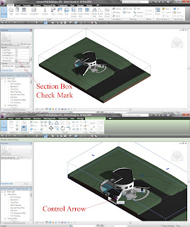
First, create a new 3d view for your project. Next, go to the view properties and click the “Section Box” check box. This will create a box around your entire project that you can manipulate to cut sections within the new 3d view that you created. Click the Section Box that you just created, to bring up directional arrows that you can move. This will give you the ability to cut through your building.
After you have created your desired section, simply follow standard Revit rendering procedures to render the view.
How to Plot in the SOA Computer Lab
By Scott Fisher
Step 1: Preferably bring all files to SOA Computer Lab in Quigley Hall, room 108, in pdf format.
Step 2: Open your file in the computer lab.
Step 3: Go to file print.
Step 4: Depending on what you are printing will result in what plotter to send it to. If you are printing b/w on 11 x 17 or smaller, print on CWPSArchitecturePublicQuene. If not, skip to step 6.
Step 5: Go to properties, Paper/Quality, Advanced, and then choose your paper size then click print.
Step 6: Type your dawgtag number in the dialog box that pops up and name your plot that you are sending.
Step 7: Go to the computer by the window and type your dawgtag number in, then swipe your ID.
Step 8: Click on the plot that you just named and click print.
Step 9: If you are printing color on 11 x 17 or smaller then print on \\soasr02\5500dn-1. If not, skip to step 11.
Step 10: Go to properties, Printing Shortcuts, and then choose your paper size then click print. (If you are plotting on glossy or 11x17 then notify the staff on duty so they can load proper paper).
Step 11: If you are printing b/w on premium trans-bond paper that is larger than 11 X 17, print on \\soasrv02\HP430-1. If not, skip to step 13 (this will print out on 36” roll only).
Step 12: Go to properties, paper size, and then choose your paper size and click print.
Step 13: If you are printing color that is larger than 11 X 17, then select a plotter from the chart below (this will print out on 36” roll only).
Step 14: Go to Properties (look at chart below to decide what settings to change).
Step 15: Go to Paper/Quality and select Advanced, select paper source: roll (see above chart), print quality: Best, Rotate: according to above chart.
Step 16: Click “Ok” three times to plot.
Step 17: Notify staff on duty that a plot was sent.
Step 18: Wait for your plot to print out and then give your ID to the staff for your payment of your plot.
Notes:
-If a file is bigger than 30 MB, give the file to the staff on duty to be plotted on HP Designjet 4520ps PS3-1 on soasr02.
-If you want to plot larger than 11 x 17 on glossy paper, then give your file to the staff on duty to be plotted on HP Designjet 4520ps PS3-1 on soasr02.
-Files can be plotted in other formats, but PDF format will send faster, therefore it will plot much faster.
Image: http://demo.livecart.com/id/HP-DESIGNJET-1055CM-PLUS.6167
Friday, November 12, 2010
Halloween Project – Freshman
By Yuko Aoki
When you decide to study architecture at Southern Illinois University for a Bachelor’s Degree, you might get a seasonal project. Over the recent couple of years, students have had to be creative for Halloween. The pumpkins on the steps, at the south entrance of Quigley Hall, were carved by freshman students in architecture and were exhibited for a few days. They were asked to make architectural Jack O Lanterns!!
Some of them are landmark buildings and some of them are famous architects’ faces. The trend of this year seems to be carving silhouettes of landmark buildings like the Statue of Liberty, the Eiffel Tower, and the skyscrapers of New York City. Proportions of buildings are critical to show what the buildings are. Each pumpkin has a candle in it, but were not lit when I took these pictures. I am wondering how they will light up in the night.
I did not do this project when I was in my freshman year, but I would like to make one for Halloween next year. It is nice to have a fun, quick, and easy projects between actual studio projects. They also can be very unique.
Thursday, November 11, 2010
A Sense of Place
By Tara D. Loughman
Designing a space, whether for interior or exterior use, the space can hold a variety of implications, and for various purposes. In outdoor spaces, design can be defined as a process of specific planning for various and distinctive features that are used to create a valuable strategy for landscapes and urban design. In architecture, designing can be defined in a very similar way except we possess additional focus towards the actual structure and space within the envelope we are creating. In addition, architects use the exterior more for structural form and aesthetic appeal.
Place can be defined as a particular portion of space, whether of definite or indefinite extent (dictionary.com). A place is also somewhere where you as the viewer should feel comfortable and at ease. Places are everywhere; you’re home, the office, the mall, etc. Some people have a certain place where they go to meditate or to read quietly. Wherever the place is for you, it usually is designed for a particular purpose and or function.
A sense of place, to me, is specific to one’s own viewpoint. The site must take in account of the relationship between its region and whereabouts. In outdoor spaces, a sense of place should be formed according to its atmosphere. Along with that, a distinct relationship should be made to the sites architecture, history, culture, and anything else noted that would offer a distinct persona.
As designers we create key moods. This can be intentionally or not, but these moods give the viewer a sense of feeling and reaction toward the atmosphere we are shaping. The feeling you can receive from a sense of place provides the impression of connectivity and meaning. The disposition for the place can be very different, ranging from humorous and cheerful to a distinct sadness. Whatever the emotion expresses, it should engage in a positive outlook for the design and the site.
Overall, creating a sense of place can make for an amazing interest towards a site. Know matter how one person perceives the space is for individual debate. As long as the outdoor space can capture one’s imagination on any positive level, a sense of place has been created.
Sources:
Dictionary. (10/13/10) Citation. http://dictionary.reference.com/browse/place
Wednesday, November 10, 2010
A Post-Disaster Temporary Shelter
By Shane Healey
In FEMA’s molasses-like actions in providing 650,000 families displaced by Hurricane Katrina in August of 2005, our government’s actions could have been viewed by as neglectful, and globally, as a slow response. In addition, FEMA’s attempt to supply the 650,000 displaced households with temporary housing was short of satisfactory. With the occurrence and magnitude of natural disasters increasing, whether it is a hurricane, tornado, or earthquake, there is a large number of people that are forced into homelessness. These people are in need of temporary shelters, which can be located in southern, hurricane-prone, areas. Incorporating Locke, Dewey, and Hillier’s philosophies, my design process is composed of researching past experiences, investigation of those experiences, and researching previous solutions to those experiences. Using this process, I want to design cost effective temporary shelters that can be modified to fit the needs of the customer, as well as to fit most environmental conditions and terrain. To do this, the shelter will have adjustable legs that can be formed to fit a change in site elevation changes. To give the displaced families a place they can call “home”, various materiality aspects of the interior and exterior would be interchangeable. As for the main structure, whether it is located in a tropical wet climate or a dry climate, it would remain constant. No matter the location, with the addition of various cosmetic structures, the shelter would be able to fit in any environmental situation, as well as become a passive structure. To help supply the shelter’s energy, the option for roof mounted solar panels and solar gaining fabric material will be utilized. These shelters will be made from local recyclable materials; therefore, responding to the shelter’s cost effectiveness. In addition, these shelters will supply the inhabitants the capabilities to upgrade and expand, for future use. To make these shelters cost effective, they will be easily transported, arrive as a kit-of-parts that is collapsible and easily erected. After Katrina, FEMA created trailer parks that did many things: packed trailers in like sardines, create unsafe standards, and made people embarrassed to live in such areas. Therefore, in addition to creating a temporary shelter, the need for a pre-designed post-disaster shelter park is in need. This park will give the inhabitants all the amenities, security, and accessibility needed for temporary living, as well as making the displaced families feel welcome to come to the parks. With the occurrence of natural disasters increasing, so is the need to find a nationwide solution that would employ combining: fast construction, cost effective, and green aspects. In addition, utilizing interchangeable items to the displaced families some control; therefore, this research had lead to natural disaster prefabricated housing.
Tuesday, November 9, 2010
Urban Fabric
By Vince Burdi
Design Problem: Urban landscapes are wasteful in nature. The architectural community is promoting a design that that ultimately responds to conserving and supplementing energy to and from the grid. Urbanites are surrounded by weak infrastructure which ultimately leads to unhealthy living conditions. Our attention is deserved to recreate or repurpose the city fabric at a human scale to initiate a social environment where people can begin to interact and potentially thrive. People are not interacting anymore on their everyday routines. It is a cultural phenomenon that is spreading like wildfire. People are too involved with their own personal computers that they forget their surroundings. Scared of contracting diseases, people keep to themselves isolated; creating more waste and show less concern towards issues that concern us all.
Design Proposal: Irony of the situation is that Digital Media has kept individuals from interacting, but can digital facades spark human activity. Can architecture redefine social and cultural interaction between urbanites in the close proximity of the building facade and pedestrian traffic?
This is my thesis topic for the M. Arch program. Please feel free to respond with any questions or comments below.
Monday, November 8, 2010
Architectural Travels with SIU
By Russ Baker
Being predominantly visual learners, students in the SIU architecture program have traveled the world in the years past to experience first-hand many architectural wonders and phenomena. During my undergraduate studies, I have been fortunate enough to participate in many of these trips, including a month long tour of Italy and Greece with Professor Jon Davey.
Among some of the cities we visited were Athens, Bologna, Capri, Corfu, Delos, Delphi, Florence, Glyfada, Mykonos, Napoli, Ostia, Pompeii, Ravenna, Rome, Santorini, Sienna, Sounio, Tivoli, and Venice. We were able to visit the Parthenon, Pantheon, the Colosseum, the Vatican, the Osios Loukas Monastery, Mt. Vesuvius, and I literally could go on and on. We were always on the go, and the trip was well worth the time and money.
Also accompanied by professor Davey, I ventured to Egypt to see the great pyramids, among many other things, and take a three day cruise of the Nile. We visited Aswan, Cairo, Kom-Ombo, and Luxor, with a relaxing 1 day layover in Chicago, another in New York City, and a short stop in London. Aside from the pyramids in Egypt, we visited the Aswan Dam, the Unfinished Obelisk, the Egyptian Museum, the Tomb of the Unknown Soldiers, the Temple of Luxor, many ancient ruins, several small villages, and a quick climb up sandy hill at the beginning of the Sahara Desert (as seen in the photo).
With Professor Yeshayahu and his wife, Professor Vera, I traveled to Los Angeles, CA for a week trip during spring break. In L.A. we stayed in a hotel on Venice Beach and toured several museums and architecturally distinct homes, as well as the Disney Concert Hall and an architecture graduate school to see many interesting and inspiring projects.
I also went to Montreal, Canada for a week in 2009 with Professor Craig Anz as a precedent study in an Urban Design course. Here, we studied the layout of the city, visited several museums, including the Museum of Contemporary Arts, and a film festival.
Other places I have traveled to with the SIU School of Architecture include Falling Water and Kentucky Knob in Pennsylvania, several cities in Illinois, and many others. If you like to travel and see new places and structures and happen to want to be an architect, this program might be perfect for you. In addition to these trips, architecture students often take trips of their own to visit and analyze sites for their projects. It is very refreshing and educational to get out of the classroom and travel to foreign places to see so many interesting, historic, and inspirational works of art and architecture.