Friday, December 18, 2015

ADSD Abstract for RA Position for Review by Peers


By: Ken Howder

This proposal intends to advance experimentally based research for daylighting, thermal control, and window/facade efficiency through the use of an algorithm driven and self-enclosed shading device that can act on a scale from replacing existing windows to full façade possibilities.  By combining daylighting, shading, ventilating, and trombe techniques into a single systematic window unit, this study may potentially add to the ever-growing need for more efficient building envelopes.  The proposed device is constructed of double-sided louvers fitted with a reflective material on one side and a heat absorbent material on the other.  In this manner, the 360 degree rotatable louvers are intended to reflect solar radiation away from the building in warmer weather and absorb heat for entry into the building in colder weather.  The louvers will be situated between two glass skins fitted with dampers to allow trapped heat to vent to the exterior or interior of the building depending on the current needs of the occupants.  The device will be connected to an Arduino that allows for a custom algorithm to control the hardware in response to sun angles, sensor-measured temperatures, and user-defined preferences of visual comfort. Interfacing the hardware with computer-driven controls may potentially increase a building’s efficiency without the need for direct occupant interaction accustomed to the use of traditional window shading.
These potentialities will be studied and recorded by energy software such as IES-VE to determine the effectivity of this device within a simulated environment.  However, a physical prototype is also being produced to test its application in an experimental field setting.  The results of the IES-VE simulation are expected to give the study a better understanding of the effective application for the prototype’s use in building applications.   Using both simulation and physical prototyping should allow the research to produce deductive facts of the outcome as well as efficiency potential to compare with actual field values.

The objective for this device is to be a self-enclosed unit that can vary in size and shape to replace inefficient windows, specifically on south facing walls.  However, if the study proves effective, the applications for this type of construction may be able to expand to its use over full facades and new construction.  It is the intent of this research study to examine the potential contained by combining newer technologies such as algorithm and sensor controlled devices with that of traditional architectural techniques for controlling solar radiation within buildings. 
Relationship between a person and a space


By: Josh West

Understanding the relationship between a person and the dwelling of a space can be very critical when designing and creating a building. Seeing the space as a form, and making a boundary to contribute to change people’s behavior and social patterns are some critical things when you are creating a dwelling in these spaces. Not only do you have to take into consideration all of the architectural aspects but also of the everyday working person. Everyday people encounter new spaces within their work life and these spaces give the building an entire form of placelessness. When people enter a space, especially during the normal workday, it is important for the “being” of that space to be able to change the behavior of any person. It is crucial that any designer take control of how the building looks and how people will react whenever they enter the space. Defining a buildings own placelessness can help achieve the dwelling of a workspace and “the state of crisis urban planning has come to.”(Gottman)  
            Soltani stated within his article, “When “being” happens through the sense of belonging to a place, and the building also is meant by the human presence, it becomes possible to strengthen the sense of individual identity.” Relating this to Heidegger’s essay, an empty space is an empty space and the boundaries of that space are weak but when people are brought into a space, the boundaries become strong, full of energy and create a sense of being. “A boundary is not that at which something stops, but the boundary is that from which something begins its presencing.” (Heidegger) Spaces that create a sense of being, not only give the attention to more people, but it also connects them with the architectonics itself. Stated in Schultz’s suggestions, “architecture associated with dwelling, so goes into the being placed. Dwelling a meaningful link between humans and assumed environment.” The connection between people and the environment also creates the sense of belonging to the space.
                        Another way to understand the relationship between building and the environment is a sense of cultivating the site. By this, the architect is building the site by understatement of the context and climate around the area. This can also play a huge role when trying to fit a “being” within the space. “The site may be layered to create its own characteristics apart from the rest and giving it a good expression to everyone.” Along with the site, comes the most important tool, light. Heidegger, within his essay, explains that natural light has a much greater significance on either an art piece or in my case, the every workday person.
When understanding the relationship of creating a “being” in the space, it can be very crucial of how the construction of a building relates to the design of the site, but “despite the importance of topography and light, the primary principle of architectural autonomy resides in the tectonic rather than the site.” (Heidegger) Tectonics then take control of creating a better space and make the construction of the building answer certain needs for the space. By just using the design of the building alone can conquer the task of changing the behavior of a person when they enter the space. When a person can walk into a space and their body can immediately adapt to the new environment, allowing their behavior to change, bringing the building closer to the person. But along with the tectonics of the building, it is important for the building to be functionally adequate to adapt their every workday needs. 

Thursday, December 17, 2015

Spring thesis proposition


By: Jeremy Clow

Rural communities housing universities are facing new age problems, integrating a metropolitan lifestyle. Where vehicular traffic is limited and public transportation is prevalent. Walking, biking, and riding the metro are second nature for the majority population attending a university. When this demographic begins to further their education in a small community their basic principles of daily life are flipped upside down. Why must a small town rely on an automobile? The distancing of dominant hot spots requires not only the use of gas for transportation but space for parking accessibility. What if transportation to and from the city were directly tied to the economic factors within?
            Facing the approach, when arriving in a smaller community the visitors come from all angles. Transportation via air, train, highway, and interstate all come together in one major hub, a melting pot of national and international cultures. Upon arriving accessibility to specific destinations and locales is most important. When flying into an airport if there wasn’t an exit terminal what would one do?
This process of integrating within the community is closely related to a puzzle. The corner is a key location connecting the visitors with their next destination, a transportation hub. The edge piece is the path from arrival to the next key point being a career, a university, or a place to stay the night is the edge piece. The inside pieces make up the environment along this path, the first impression and the lasting substance to any photo.
The big picture starts with the anchor points, a university, major institution, or career. The transportation from a defined radius to this locale is the second most important factor. Who is the target audience to bring in and where are they from? How do they arrive? Bring all major forms of transportation through a major hub, connecting airports, trains, busses, and automobile traffic. This structure and its surroundings are the key element, the first impression of what’s left to be seen. A path of easy travel and least resistance connects the hub with the anchor. Along the path an abundance of attractive economic facilities can be accessed with ease. These points create a sense of belonging and social setting similar to that originally found at home.
Many potential outcomes for this problem can come from a few tactical placements. A well designed transportation hub placed strategically located to the anchor point or points. Spaces designed in congruence along the way from hub to anchor(s), leaving small gaps allowing for local new age growth to happen simultaneously. All of this leads to a fully functional and productive rural community with metropolitan features from the implementation of well-designed structures with specific functions. 

Updated Thesis Abstract


By: Hunter Wilson

            I am Hunter Wilson, a student currently studying in the Southern Illinois University Masters of Architecture program.  I began my education at Vincennes University located in my hometown of Vincennes, Indiana.  After receiving an Associate’s Degree in Architectural studies, I transferred to SIU where I earned a Bachelor’s Degree and still study today.
            The city of Carbondale has many positives.  It is the home to a large university that contains around 15,000 students.  It is at the center of the second largest metropolitan region in Illinois.  Carbondale also has an active community that has garnered many city awards.
            The university seems to be the central focus of Carbondale.  The university houses many students that are involved in the arts, whether academically or recreationally.  These students have the tools and spaces with which to drive their creativity on SIU’s campus.  However, there are few places in Carbondale for students to gather and exchange creativity.  Carbondale could greatly benefit from a creative arts district.
            This creative arts district will be in close proximity to the campus.  This makes it easier for students to attend the district.  The district will also house students.  These students will also have the chance to work within the district, possibly in exchange for living expenses. 
            A strong relationship with SIU will be key to the success of the creative arts district.  SIU has incentive to promote this type of project.  Students see local, off campus recreation as a large factor when determining where to attend school.  If Carbondale is equipped with a creative arts district that caters largely to students, then prospective student may be more inclined to attend SIU.
            Students will not only inhabit this district, but Carbondale’s local artists will as well.  Carbondale contains a strong local art community that also needs a gathering space.  This district will be able to cater to these local artists by providing gallery space and shops.  Students of the arts have much to learn from local artists, so this will be able to act as a learning/teaching space as well.  Local artists and students may have largely different views and lifestyles, so the merging of these two extremes is a key factor in determining the success of the district.
            Within this creative arts district will be a recording studio.  A main focus of this proposal will be the design development of the recording studio.  Subjects such as sound reverberation, studio equipment, and other acoustical properties will be explored and integrated.


Wednesday, December 16, 2015

Open Air Museum Project: Transcension of a Hunt


By: Hannah Rawashdeh

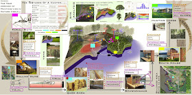
   The true essence of the hunt lies in nature itself. That is the message that is conveyed to any visitor of my museum after researching and knowing the five stages of a hunter.

   The  journey of experience starts with depicting what anyone would expect of a hunting space and simulate those known emotions of adventure, excitement and the rush of adrenaline. The visitor starts exploring and discovering the kekuli huts zone in the dense tree area, then is guided to the next hunting space which is the rolling huts , where he will experience the form and development of hunting spaces through time. After leaving the cantilevered structures the visitor is tricked into entering a cave-like entrance of the third hunting space, which is Qasr Amra, the feeling of excitement and exploration here is still strong. At this phase the visitor is presented with a new additional concept of how hunting is, where he will realize that this hunting space didn’t just accommodate a hunter’s equipment but also held a luxurious addition to a hunting trip; the baths. The bath's walls of Qasr Amra are covered with fresco pictures of activities like hunting, then the pictures shift to those of lovers and gardens and nature, sending a subliminal message to the visitor that there is more to the sport of hunting than they know. The visitors are then led with this new thought down a narrow path surrounded by water almost like the Moses bridge where they become completely isolated from their surrounding nature after getting a glimpse of their next hunting space destination just as they get out of Qasr Amra (the schwimmhaus). While walking in this narrow path the visitor can only hear the calming sound of the water and then he will be guided into the schwimmhaus boat from the back. Once inside the visitor will immediately be driven towards the incoming light from the wide-glass facade of the boat. Suddenly exposed to his natural surroundings while floating to the next hunting space, The Boats House, and docking there, the visitor will have by then a new perception and appreciation for nature. Upon leaving the Boats house with its contrasting materials of copper and wood the visitor’s sense of touch is what interacts, moving across the rustic green colored copper then ascending a hard path defined with natural materials that goes along with the topography of the site the visitor finally arrives at the last stop which is the hunting lodge. There, walking into the lodge, the visitor is greeted with a pleasant surprise in the dining area, a wide glass view of a small wildlife reserve where one could take pictures and interact with wildlife and nature. Feeling whole, peaceful and close to nature, which is exactly how the hunter feels at the fifth stage…and in the end the visitor will have if not an understanding, develop a subconscious awareness of how hunting intertwines with nature and peace within the being.


CAN TECHNOLOGY ALONE ADDRESS ENVIRONMENTAL ISSUES ?


BY: FAEZEH ENSAFI

Population growth and per capita consumption are recognized as correlating factors in environmental problems, hence need to be addressed while looking for a solution. Population growth is at the rate of 1.3 percent per year and projected population in 2050 is 9 billion. Following this increase, there’s a growth in demand for production. Therefore, per capita consumption is increasing drastically at a higher rate than population growth. Technology today plays an important part of humans’ impact on the environment. With the aim of increasing efficiency in energy or material, technology has enabled humans to extract a greater output with the same amount of input (resource depletion by humans) in order to make specific things. However, such technological improvements cannot solely address the decrease in demand and per capita consumption. Therefore, for following reasons I believe technology cannot sufficiently solve the joint impact of population and per capita consumption and agree with Kates that there should be a change in our values to reduce consumption, reuse materials and find happiness in ways other than consuming. Technology can only partly address population problem. According to Kates with the rise of information technology and science the rate of population growth have decreased over time –specifically after late 1980s when the peak annual growth took place –yet, population growth along with its impacts still exists. Technology has been able to provide human with efficiency which is not sufficiently helpful to address the problem because of the following reasons: Firstly, environmental resources are limited and technology cannot expand resources. Secondly, technological efficiencies cannot address growth in per capita consumption due to population growth. For instance motor vehicle consumption is reduced to half but the number of the vehicles have doubled. Thirdly, efficiency eventually reduces cost therefore increases demand and per capita consumption (Jevon’s effect). Considering the tremendous growing per capita consumption due to population growth, the global environment cannot support a future consumer generation of 8-9 billion populations. Technologies such as recycling have been widely deployed to solve the issue. However, recycling technologies still include energy usage (energy used for transporting the recycles) and contribute to the issue in some ways. Given the rate population consumption growth and therefore consumption, there’s a limit to how much recycling can address resource depletion by the consumer society. According to Durning reducing consumption might be the our only option to address our issue. Nonetheless, I would argue that reducing consumption in a consumer society is explicitly difficult to apply due to the behavioral normativity of consumption. Consequently, three stages of reducing consumption, reusing and recycling goods can jointly address per capita consumption. We live in a society run by capitalism where the word “person” is synonymous with “consumer”. In 1953, the chairman of President Eisenhower’s Council of Economic Advisers canonized the new economic gospel: The economy’s “ultimate purposed” he proclaimed, was “to produce more consumer goods” (Durning, 30). Technology not only cannot decrease consumerism and per capita consumption but it’s in fact an important element of the capitalist society (Desai, Meghnad). Moreover, people increasingly measure success by amount they consume (Durning, 19). In such atmosphere of ever-increasing demand for production, happiness is achieved through consumerism. However, psychological evidence shows that the relationship between consumption and personal happiness is weak (Durning, 23). Thus, we can shift our values and seek happiness in dematerialized forms of consumption. For instance, substituting information for energy and material consumption, and reusing high-quality durable material are some ways to reduce if not stop, resource depletion along with its environmental impacts. 

Tuesday, December 15, 2015

Tectonics and Design Problems

By: Cole Hartke

“Despite the critical importance of topography and light, the primary principle of architectural autonomy resides in the tectonic rather than the stenographic; that is to say, this autonomy is embodied in the revealed ligaments of the construction and in the way in which the syntactical form of the structure explicitly resists the action of gravity.” (Frampton pg.27) This quote holds a lot of truth in it fora number of reasons. The first being that the meaning of tectonics, where the root of it being the mixture between art and construction. With the stenographic element the focus is not that of the building construction but of what the buildings shell or exterior will look like hiding the structure that keeps the building up.
 When the construction of a building is taking the building’s exterior and also serves as a part of the look an artistic quality of the design that is tectonic design. “The tectonic is not to be confused with the purely technical, for it is more than the simple relation of sternotomy or the expression of skeletal framework.” (Frampton pg.27) The use of the phrase that Frampton uses in the first quote “Explicitly resists the action of gravity” took some time for me to come up with reasoning I could put into my own words. After thinking I came upon the fact that when looking at the structure there is no doubt to what holds it up and to why gravity does not pull it down to the ground. The sudden realization is true in many structures today that show their inner workings out on the exterior of the very dwelling that they are trying to sustain.
 The reading lead to a quite similar reading that references the theories and ideas of Kenneth Frampton. “The thesis Kenneth Frampton advances is not new to us. In “Rappel a l order: The Case for the Tectonic”(1990), reminded us that the traditional mimetic relationship between architecture and nature has been severed for some time now and that this loss of center, among many others, resulted in spiritual and material ruin.”(Kenneth Frampton, edited by John Cava pg. 74)The statement is clear to see in the world today, people around the world have been losing sight or have already lost what they had of the natural elements that are related to a structure. There is no need to plan a design around what is available to a designer because the recourses are almost unlimited to what could be used.
 The need to design for a sites region and environment has become obsolete in many ways. Due to mechanical equipment a type of bubble is built no matter where you go oblivious to the world around it. There hasn’t been a push to change the social thinking of this in the eyes of the world. The biggest influence that I see today is the future designers being steered in the direction of sustainability; this design method is a big tool in helping bring the nature back into design. A key characteristic in the research of these two articles is the fact that many aspects in design are overlooked. For that of Tectonic and stenographic, the tectonic is a part of the true nature of architecture, art and construction or as Frampton would say “Poetic Construction”. In most cases it is covered by a mask to hide its structural aspects and creates a stenographic view. With the second part and our separation from nature. The world is out there for us to use but not for us to overlook its true potential. With the newer technologies and materials, it is easy for a design to overlook something that is right next to it but never put into the plan.


Breakdown my thesis


By: Casey Bucher


For this week’s blog, I wanted to breakdown my thesis research into a brief outline to help guide me for the thesis book writing process.

A Modern Addition to a Historic Landmark: Developing Community, Sustainability, & Design
Introduction of Project
            -  Revive
            Urban community setting
            -  Renovate
            Transform an older building into useful property
            -  Create
            a green environment and openness to the outdoors

Problems to Address
            -  Site and Context
            History
            What area needs this development the most?
                        Is there a need for retail on this site?
            -  Cost
            Make this project affordable residential living
            -  Complete Building Renovation
                        Complexity of the Unknown Building Preservation
            -  Sustainability
            Making an existing building and site sustainable Creating an inviting environment
            -  Transportation
            What kind of existing transit is within walking distance?
                        Pedestrian and bicycle friendly?
                        Making downtown accessible and easy to get around
            - Architecture
                        Maintaining St. Louis character
Research - Primary
- Informative articles on sustainable design - Articles on historical renovations
Research - Secondary
- Casey Studies
- Articles on upcoming projects in downtown St. Louis


Monday, December 14, 2015

Project Documentation


By: Andy Cunningham
  
What’s up everyone? Hopefully all your presentations went well. I know saw some pretty interesting looking projects as I was walking around the building this week. I know everyone is looking forward to winter break, I know I can’t wait for it to get here. Four weeks of relaxation and doing nothing sounds pretty phenomenal right now.
            This is the last blog post of the semester, and today I’m going to talk about making sure you document you projects. You’ve probably heard from all your professors throughout the years, but make sure that you save all your sketches, and AutoCAD and Revit files, so when it comes time to do your portfolio you have all the images that you’ll need, and it be good to put them all in one place to, to make it easier on you. Also make sure that you are taking good pictures of your models so that you can put them into your portfolio with minimal editing. A way to do this is when you are talking photographs of you models put them against a solid white of black background so that it easily blends in with the color of your pages, or it makes it easier to delete the image background. I’m telling you all this because when putting my portfolio together for grad school applications, there were a few projects form freshman and sophomore year that I wanted to use, and had to go through all my flash drives and my old computer trying to find them because I had absolutely no idea where they were. On top of that the picture that I had to retake some pictures of my models because they just weren’t good. Keeping track of everything you’ve done will make putting together a portfolio a lot less stressful and cut down on the time it takes to put it together.

            I hope everyone had fun this semester, and has a good winter break, and I will see you all again next semester.

Adapting Tradition with Future Techniques


By: Aaron Neal

The past versus the future; can society and architecture rely solely on one?  The past can be an influence in architecture in the form of tradition.  How this tradition controls the way we step forward in a given society can easily be seen.   In architecture one can easily see how the tradition of a culture is incorporated into designs such as in the structural systems used or the basic building form.  The past sets in place a list of guidelines to adhere too when designing to the vernacular.  Frampton, by quoting Hamilton Harwell Harris, alludes that by following the past can sometimes become restrictive.  It can be quite easy to see in our culture how the regional design standards become more of a set back then a guideline.   In historic zones, design is very limited with the mindset to preserve the nature of that given district.   In many ways I feel like this hampers the development of the city or culture.   While I agree that respect should be given to these districts, I feel like if nothing new ever changes that area then it will eventually die. 
            Likewise, culture can look forward.  The future always seems grand with its new technologies that promise to change life how we know it.   Especially in present times when new inventions happen every day and the connected nature of culture seems to advance at an exponential rate.  With these advancements, society has become accustomed to expecting the future to be incorporated in everything.  This can be seen in architecture with the inclusion of green buildings.   The top buildings people talk about are made smart so that they adapt and react to the environment.   In some respects these inventions are a marvel and allow for design to develop and grow, but they can also become a hindrance to design as well.   If technology allows for a building to take any form and have no consequence, then what shapes the design?  Frampton refers to this method of design as “placelessness”.  This issue is just one of many that can come from over reliance on modern ways. 

            What then could be the steps to rightly move forward in architecture and as a society?  Both the past and the future are important, but by themselves lead to stilted growth.   As noted by Kashikar, the key is to not stare into the past, nor to dream into the future.  Instead, we should be taking note of the present.  This way of looking seems the most appropriate to me in my design work.   One must research and respect the traditions in a given region or building typology, but they also need to be pushing forward with today’s technology to most efficiently develop said region.  By mixing both and dealing with what is in the present the designer allows for growth that is effective and relatable.  Frampton agrees with this ideology by bringing up the Bagsvaerd Church.  By mixing the new technologies and the feeling of the vaulted ceiling, the spaces is progressive while still being relatable.  While this is an older project, the notions can be carried through to today’s architecture.  New methods for building such as prefabrication can still make for regionalistic architecture.  One such building, KieranTimberlake’s Loblolly House, is a perfect example of how a building can use new technologies while still relating to the context and culture that it is located in.  The prefabricated nature of the house is push towards the possibilities of the future, but the designers still treated the design as a normal project that responded to the surrounding Loblolly Trees and the bay on which it resides.  In my mind that perfect example of how to combine the past and the future into a present day design.  I hope that as a designer that I can do likewise with my designs to help push my community on an appropriate path.  

Saturday, December 12, 2015

Technology in Architecture


By: Stephen Lauer

Post 6: Adding Grass & Sky
            This tutorial is going to be about how to add grass texture in Photoshop. I probably should have done this one as the very first one but I guess it’s better late than never. So step one is to find an image from which you can pull grass from. This can be a very difficult thing to do as it is tough to get an image with the right perspective, color, shading, etc. 
Here is the image I use for most of my grass. I try to take a portion through the middle of the image as to not get the larger blades of grass in the foreground but not get the smaller pixilated grass in the background. Next once you have the texture the image can be placed over the top of the render as its own layer. Next I like to hide the grass layer and move to the base render in order to select the base grass texture with the magic wand tool or the polygon lasso tool. Once selected go back to the newly added grass layer and select the mask button in the bottom right corner of the window (it’s the one that is a rectangle with a hole in the middle). This will take the existing selection and turn it into a mask which can be turned on and off. Masks also allow you to use entire images without “destroying” them as to be able to go back and edit or change them later. Now once the grass is in place the levels/curves can be adjusted in order achieve the desired outcome. A final note on grass texturingis that do not forget to cover the bases of objects that are sitting in grass with the paint brush. There is a blade of grass brush in the brush selections. Then use the ALT key to select a color from the already placed grass texture and then add a little grass texture around trees and benches to add a little more character. Next adding sky is very similar except the part that finding a nice sky texture can be much easier than grass. The only issue with skies is finding one that will fit your rendering in all the aspects stated earlier. The other option to do for a sky is the make your own with the paint brush. I personally do not do this method but I have seen other people do this and it really works well for artistic renderings. Clouds look very soft and feathery using the paint brush method. Sorry for not showing this earlier I know I have had a sky in each of the tutorials I have done so far, I just did not think to do a tutorial to show how to do it until now. Here is the render up until this point (I removed the snow/rain and fog in order to show the grass better.


CNC – Computer Numerical Control


By: Patrick Szczecina

The CNC machine (Computer Numerical Control) is a way to manufacture components that are made for all disciplines. The CNC machine acts in 3 axis system, XYZ (Some instances more are available, Adjustable for rotation) by cutting (milling) excess material out of the object. A Bit is used to mill out the material, and these can range from 1/32” to 1” Bits all based on how clean the cut needs to be, how quick, and how much material to be cut out. The main materials used for on the CNC are foam (easy site cuts, quick), Wood (longer cut time) and metal (longest cut time). CNC is used mainly in Industrial Design where manufacturing parts and prototyping items are needed. The machine allows for prototyping small or large scale objects based on the size of the bed and the item to be milled. When talking about Architecture, the CNC is used for site milling, models and sculptures. The way that a site is used is with a 3D file of a site (Almost any Architecture program can be used but needs to be in .STL format). The user then inputs into the CNC program the file, material, type of Bit to use to mill and speed of rotation. Then the CNC runs and cuts based on the topography changes put into the program (From STL file), this allows for smooth transition between topography rather than the stacking method of material. Another use for CNC is that of models or sculptures where the bed is used in vertical or horizontal where the bit rotates around the material and eats away at the material. This technique allows for precise cuts where the bit drills only at the spots where it needs to be cut. In this method multiple passes may be needed to get the desired openings and angles to be cut out. CNC also allows the creation of customizable furniture such as chairs and tables, these would take more time due to the facts that it would have to be cut out of a large block. A resemblance to the CNC machines is Ice Sculpture Carvings, where the artists chisels away the ice to create a sculpture, however the CNC is machine operated allowing for quicker completion time and more accuracy. A CNC machine has multiple uses, however the most beneficial use for it is to cut a site from foam or wood allowing to show small scale buildings and topographic changes.   

Thursday, December 10, 2015

Render vs. Rendering

By: Megan Crider

I don’t know how it happened…  I don’t know where it came from…  Somewhere along the way in architecture school, RENDER has become a noun for many students.  I can’t count how many times I have sat in presentations hearing the words “Here’s a render of my building/design” or something of that nature.  NOPE.  That is like fingernails on a chalkboard to me.
Render is a verb, not a noun.  Rendering is a noun, not a verb.  Someone can render an image, but the finished product of that process is a rendering.  
I applaud those instructors that correct students and point this difference out to them during presentations or critiques.  Thank you.  You have probably saved them from all kinds of embarrassment and correction when they assimilate into an office environment.  To those instructors that do not correct this grammatical infraction, shame on you.  I will however give you the benefit of the doubt – perhaps you are focusing more on the content and design of a presentation rather than the potential verbal struggles of the presenter.   I have no qualms with that…  However if we do not correct students when they make this error then they will continue to do so; the issue will not be fixed.

Perhaps the process of producing a rendering can be addressed differently earlier on in our education, during freshman or sophomore year.  Maybe formally addressing the difference at this level will assist in alleviating this issue later on in our education.  

Five elements of the City


By: Kristina Shrestha

In the design studio, we are designing a new city and we are given a rural site in Glenelg, Maryland and an urban site in Baltimore, Maryland. We are designing a master plan of the site in a group of three and chose an individual building to place in site. We have chosen a rural site and we are working on our master plan as well as our individual buildings. We were encouraged to make the city walkable therefore we have designed the city with the public spaces near the residence. The city consists of Offices, Retail, Senior living, Police station, Fire station, School, Community center, Garden apartments, Mid-rise, High rise apartments and Row homes. From the beginning of the semester, we have had group presentation on different types of buildings, case study presentation, and research presentation, presentation on theoretical books on urban design and planning, presentation on master plan and individual buildings, and so on.
Although we used to have many presentations, surprisingly last week we were given a task to make a diagram showing five elements of an urban design. The five elements of urban design was taken from the book “The Image of the City” written in year 1960 by Kevin Lynch. Kevin Lynch was an urban planning professor at MIT. He had worked with Frank Lloyd Wright and his works were inspired by the thinking of Frank Lloyd Wright. He was fascinated by the cities and how people perceive them. He wanted to find the relationship of successful cities with respect to the perception of people. He later realized that the elements like landmark helps to navigate people within the city. Also, people perceive cities with regard to the repeating elements like nodes, landmark, path, edge and district. One of the most important prospect of his book was the five elements of a city. The five elements are as follows:
Paths: Paths are the ways or channel where people occasionally move. It can be a road, railway tracks, canals or streets.
Edges: Edges are the boundary between two elements. It is the linear element other than paths. It also separated different views of a city.
Districts: Districts are larger part of city where people can go inside and it also have a distinct character.
Landmarks: Landmarks can be anything which are distinct like a statue, a gate, or any prominent element where people consider as a reference. 
Nodes: Nodes as the name suggests are the points or foci where two elements intersect or connects. It can be a cross-section of a path or an entire district. Nodes are the foci where people can enter.
These elements can be incorporated in many cities especially in new cities. These elements help people to navigate through the city and it also creates successful cities.
  
References:

1.      Lynch, Kevin, Image of the City (1960)

Wednesday, December 9, 2015

Parametric Programming in Architecture: Brief Considerations

By: Ken Howder

 The challenge of designing competent architecture through tectonic (structural) and aesthetic practice has always been a long enduring process for those involved. Splines, NURBS surfaces, parametric definitions, advanced manipulation of vertices, and algorithms have allowed designers to leap forward with the complexity and precision of their designs – so much so, that modern construction techniques have yet to catch up to allow some of the more complex designs to be reproducible in real time. In his article about the subject, Fabian Scheurer writes, “It quickly became apparent that these designs would pose completely new challenges once they had been sold to a sufficiently funded client and entered the construction design and building phase” (Scheurer, 89). This suggests that, for the tectonic framework of a building, two things must be accomplished to continue with the advancement of structural design. First and foremost, the architect or designer needs to be aware of the limitations set upon them by modern construction methods. Secondly, the construction industry needs a boost in building techniques through advancement in materials, technique, and equipment. For the second factor to happen would require much time and commitment that, despite the need, will take decades to achieve. However, the first factor of architects who are aware of construction limitations can be achieved at any time. It is sad to say that, partly responsible through academic curriculum, the encouragement of theoretical projects minus real world experience leaves many would-be architects left with an unrealistic idea of what can actually be achieved. Suffice to say that this may be considered merely a tangent to the main topic at hand of tectonic and aesthetic balance, but it does play an important role.
Programming architecture instead of drawing has become more of a phenomenon in recent years to produce visually pleasing entities with a surprising account for structural demand. However, one of the most important benefits produced by algorithmic aided design is the possibility to design with an innate comprehension of the surrounding site. Such a profound effect on the process allows the designer to produce natural designs that can enhance the surrounding area. When Frampton refers to Semper’s writings in his article, he mentions the need for both art and rhythm in the field of architecture, and it is clear that the advancements made within the past couple decades to the field have only encouraged this idea.


Works Cited
Frampton, Kenneth. "Rappel A L’orde, The Case for the Tectonic" (1983): Book. 16 June 2015.

Scheurer, Fabian. "Materialising Complexity." Architectural Design 10 July 2010: 86-93.

Tectonics : Core Form and Art Form


By: Josh West

Tectonics reveal the basic knowledge of the art and science of building construction. All things are built in certain ways and have a unique art of assembling the materials used during the construction phases. Frampton talks a lot about art form and the way it is expressed differently throughout architecture. He describes the tectonics of construction with two key elements: Core Form and Art Form. Frampton wrote, “’the art form “is only a covering and symbolic attribute of the part or building’” (Frampton, 139).  By viewing a building with these two elements, any architect can begin to describe and understand the construction phase. For me these two elements have helped me focus more on all of my projects and helped me understand the tectonics and understandings of buildings. With all of the buildings being built, there is more than what the eye can see. “Core form is mechanically necessary and statically functional structure as art form, on the other hand, is only the characterization by which the mechanical-statically function is made apparent” (Frampton, 139). These forms must always be recognized to always try and distinguish the difference between the constructional form and ornament or appearance. Another phrase which caught my attention was from Semper, “the most significant basic tectonic element was the joint or the knot” (Semper, 145). This to me explains tectonics as a whole and emphasizes the meaning of the knot. The knot, which we have been using for centuries, is a true meaning of tectonics. Like any other knot, we use it to tie two pieces together or to create a loop to hang something or tie something down and to make sure it never comes loose or slips. As we look at in a way of construction, we have to recognize everything that goes into these buildings. We have to tie every piece of the building together and make sure it is structurally sound. So as I progressed through my entire time through architecture school, I am designing buildings at multiple sizes and learning how they are structurally put up and working with their surrounding areas. I will always remember two things: always remember the two elements of core and art form and to always remember to tie the knot.

Frampton, Kenneth. “Botticher, Semper and the Tectonic: Core Form and Art Form.” In What is Architecture?. Edited by Andrew Ballantyne, 138-152. New York:Routledge, 2002.

Tuesday, December 8, 2015

What do people want?

By: Jeremy Clow
A small town, Glenelg located in a rural part of Maryland sits thirty minutes away from multiple metropolitan areas. This new development poses many challenges, bringing a metropolitan landscape to a lush one hundred acres. Implementation of a new road with direct access to the main highway will allow for direct transport to and from the site. Two forms of entry will provide north east access from the existing road that runs along the edge of the site. The site being disconnected from major forms of existing transportation requires implementation for success. The rail line proposed to run adjacent to the south east side of the site would allow for multiple opportunities of transport daily to and from the site. The site is designed to hold two thousand living units, all of which are apartments on the site. These units provide a maximum occupancy of six thousand persons. The six thousand people on the site will be using the public facilities as well as surrounding neighborhoods. Commuters using the train to come to the site may also use facilities near the station and office district. The train station is directly connected to the office district, an affordable hotel complex, and my five star hotel design. To the north of the five star hotel, a tunnel provides direct access to the hotel for parking and service trucks. The tunnels top of road elevation is thirty-five feet below grade. The vehicular portion of the tunnel has a twenty foot clearance adjacent to a two level parking garage below the hotel. Above this is a protected pedestrian tunnel from the train station to the hotel. With the train platform, station, shopping center, and five star hotel all connected underground. Above this passageway is a porte cochere for vehicular traffic above ground to drop off passengers from taxis, busses, and personal vehicles. This drop off zone serves the hotels on both sides of it. The covering is a green roof community space for both hotels to use. The smaller hotel to the north only provides basic amenities and is designed for the traveler or commuter on a budget. The five star connected hotel houses many services, amenities, as well as a conference center. Locals, commuters, and persons staying within either hotel have easy access to and from all parts of the major complex without crossing a street or being exposed to the natural elements. Due to the location shops and services will provide amenities usually accessible only in an urban setting. This provides a convenience for commuters and persons living in the new development. The conference center within the hotel accommodating a few thousand people seemed unreasonable however. In the event of a major conference used by the office district accommodations for visitors would be in lack thereof. The hotel program was to contain three hundred units having a maximum comfortable occupancy of 1200 persons. With the majority of commerce anticipated for a larger conference based on commuting traffic the establishment wouldn’t accommodate the needs. The addition of a hotel above the train station created not only more rooms but more affordable accommodations as well. With the hotels and station all in connection the circulation between them is protected. The site provides two thousand residential units along with the thousands of residents within a fifteen minute radius. The hotel will allow for almost 2000 additional people to be able to stay on the site and participate in larger events and conferences. 

Music and Architecture


By: Hunter Wilson

I am Hunter Wilson, a student currently studying in the Southern Illinois University Masters of Architecture program.  I began my education at Vincennes University located in my hometown of Vincennes, Indiana.  After receiving an Associate’s Degree in Architectural studies, I transferred to SIU where I earned a Bachelor’s Degree and still study today.
            The argument that music and architecture are related is hardly even an argument anymore.  Terms such as rhythm, movement, proportion and repetition are all synonymous with music and architecture.  As Walter Pater said in 1877, “all art constantly aspires toward the condition of music”. 
            Music can be far more straightforward in its message as compared to architecture.  Lyrics help define a message while the music may help define the mood.  Music may also be quite vague.  It is up to the listener to determine the message based on their experience with the music.  The same can happen when experiencing architecture.  An architect can make their message felt by the spaces they create. 
            When someone listens to music, it is easy to instantly connect or disconnect with the music.  The same experience happens when entering a piece of architecture.  A case of extreme expression in architecture is the Jewish Museum in Berlin by Daniel Libeskind.  Libeskind uses sharp edges and expressive angles.  The subject matter of historical Jewish hardship helps elevate the forms used to create an unnerving experience.  Much like these sharp angles create an unnerving experience, the same can be translated to music.  The intense angles and sharp corners can be translated to something such as an intense symphony chord strike or the cutting strike on a violin similar to that heard in a horror movie.  These intense chords express a similar feeling of uneasiness.
            http://static.thousandwonders.net/Jewish.Museum,.Berlin.original.21813.jpg
            Another example is the Brandhorst Museum in Munich by Sauerbruch Hutton.  The exterior of the building uses techniques such as rhythm and repetition.  Horizontal and vertical layers blend with joyful colors that create a ‘visual chord’.  This use of material and color is highly contrasted with Libeskind’s Jewish Museum.  While the Jewish Museum uses little color and raw material, the Brandhorst Museum uses much vibrancy.  The use of many tones of color can be represented as a sort of jazz piece.  Many layers, both horizontal and vertical, blended with many colors to create a visual called chromaticism.  The color on the exterior also changes as you approach and retreat from the structure.  So the building has a different façade from every vantage point that you view it.  This is also synonymous with jazz music because it is believed that true jazz music is not supposed to be performed the same way for each performance.  Each performance has subtleties and nuances that each performer expresses themselves.
https://upload.wikimedia.org/wikipedia/commons/6/6a/Museum_Brandhorst_Muenchen_2008-12-28-2.jpg

            Next time you plan to enter an impressive piece of architecture, stop and think of a song that you think fits with the structure.  Think of what the piece is trying to express.  It makes the experience of walking through a building much more pleasurable rather than thinking of the building as just a functioning structure.

Monday, December 7, 2015

CPTED

By: Hanan Rawashdah

Architecture, the linking space that connects us to our surrounding, affecting us consciously and subconsciously through our senses, creating feelings of comfort, sometimes, displeasure, nervous, a feeling of being watched, intimacy and many more. But can that effect go beyond just internal feelings? Can it grow stronger to reach a point in guiding behaviour? Perhaps even stopping and preventing certain unwanted behaviors?  Can architecture play a role in stopping crime? Violent actions and other actions looked poorly upon in a society?
 When one sees a hidden from view door at the end of a narrow corridor, to stop and question whether it is allowable for the use of anyone is instinctively felt. One doesn’t sense the same hesitation when walking through wide, welcoming, glazed doors. In this scenario case architecture was used to send subliminal signals on how to use certain spaces. A sign of welcome by the use of, glazed forms and width in space, A sign of a private zone by the use of a narrow corridor and hidden from view destination.
 With a relevant and relatable concept in mind architects strived to explore the potential of playing and forming space in guiding human behaviors. The term CPTED, Crime Prevention through Environmental Design, was presented in the book "Crime Prevention Through Environmental Design" in 1971 by architect Oscar Newman. The book suggested guidelines on how to make public space more safe and prevent crimes and other ill-city viewed happenings. Nowadays the approach in designing Safe buildings adapts and incorporates the  three fundamental concepts of Crime Prevention through Environmental Design (CPTED): (1) natural surveillance (the ability to see what’s going on), (2) natural access control (the ability to control who gets in or out of a facility) and (3) territoriality/maintenance 
The first principle, Natural Surveillance, means by creating spaces where people can spontaneously appear and naturally be. A high level of security is achieved this way as it is more likely that crimes against people and property are less likely to occur if other people are around. Because The presence of other people, for example, provides them with an opportunity to: • prevent a crime • intervene in a crime that has started and limit its extent • help apprehend the criminal • summon help from others, and • report the crime and act as a subsequent witness.
Natural access, meaning it  is important to give people safe clear choices about where to be and what to anticipate ahead. Legibility with varying options of allows a sense of freedom, confidence and less stressful experience for the user.
Territorial, the third concept of designing safe spaces, means to give a sense of ownership, draw boundaries of a space. Research suggests that it is significant for people’s sense of control that others not transgress or trespass on “their territory” without invitation. This creates a sense of belonging for the owners of the place and creates a need for taking care of the space more, whether it’s physical condition, cleanliness and even the safety of the space becomes a personal mission.
   To expand and let architecture cross as an object of shelter and become a tool used to control users, once again proves how architecture weaves and intertwines our daily lives . Although one must be careful in designing safer spaces to keep the balance of creating human friendly spaces and not creating strict almost military forcing designs.