By Scott Fisher
As far back as I can remember, I can remember going on family vacations to New Smyrna Beach, Florida every summer. Often times we would be able to plan ahead and go with my grandparents and sometimes be able to meet with my great uncle and aunt in Florida. These vacations often included time on the beach building sand castles, going to Disney World and eating junk food. Over the years going to New Smyrna has become a tradition, but what has changed? Well first off I have started to pay more attention to buildings and how they are built and designed instead of trying to find the most popular toy on the market. Secondly, I believe what has changed is that I find myself more on the beach than in the ocean. I try now to build unique structures and castles even better than before; that might sound childish, but it’s like a study model for something that I might have an idea for in the future. Lastly, another big change is that some of my family members that use to go on vacation with me have pasted on. This change has seemed to be the hardest but over the years I have gotten stronger.
The more recent years my family and I have stayed at Moon-tide Condominium located right on the beach in New Smyrna. At the first glance at the left picture it looks like a high-rise with a garage underneath. In fact there are three buildings here; one in the front is a below ground parking garage with tennis courts on top, the high-rise that you see is an eight story building built on top of columns that rise up in the air with parking underneath and behind that is a five story building with a pool on top of the fifth story. This Condominium is different than most condos because it’s three different buildings but its all one unique complex. Even though these changes might be the same for everyone, life still changes each and every day.
Thursday, September 30, 2010
Wednesday, September 29, 2010
My Curse: Organization
By Russ Baker
Lots of people are cursed with the lack of organizational skills. I am not. Contrarily, I am “cursed” with over-organization. Many of my friends compliment my organizational habits, while others tell me that I’ve gone overboard. Most of the time, my “over-organization” has proved beneficial, yet there are occasions where it proves to be a hindrance. Having things organized so that anything I could possibly need is where I need it, when I need it, definitely serves me well, especially in my architectural academics and my career. When push comes to shove, and a deadline is fast approaching, it’s definitely a plus to know exactly where that particular reference material is hiding. One resulting problem from this though, is that it enables me to procrastinate, one of my biggest flaws, second only to perfectionism. It may not sound so bad, but all of these traits combined, in my own mind, somehow escalate the smallest of issues into the greatest of priorities. Sometimes, this can be a good thing….but, usually; it causes me to focus on the wrong task, or at least one of lesser importance, thus disorganizing my priorities. My defending mindset is that if I just take care of the smaller, easier tasks first, I will be better capable of taking care of the major tasks, or at least more focused on them.
Let me explain the extremities of my “curse.” All information from every class I have ever taken is written, or printed out, and organized and stored in a black binder (see attached photo). Of course each binder has its own internal organization, subdivided into emails, notes, homework, projects, lectures, and miscellaneous tabs. I have never sold a textbook back to the bookstore. Not even if I never opened it during the course of the semester. All of my computer files are organized by type, to the max. Major folders under “My Documents” include Home Documents, Misc, My Music, My Pictures, My Videos, Old School Files, and the current semester’s files (SIUC Fall 2010, presently). Each of these obviously is subdivided into folders that I deem necessary, according to my “filing system.” I even have a file called “Passwords,” which has over 55 online, ATM, etc. passwords and logins. Of course, this file is password protected with a password. I’ve never had a messy room. My mother had never once had to tell me to pick up my room. I love to take out the trash. To me, trash is clutter. And clutter is unacceptable if for no other reason than it distracts me from what is not “clutter.” Psychologically, I could attempt to explain this through heredity, mental disorders, or whatever, but I never really liked the two psych classes I took.
Haven’t convinced you yet that it’s a curse? Well, I’m not done…. I also have every computer file I’ve ever created backed up on three computer hard drives, and a CD or DVD, and two external hard drives, and probably a couple of jump drives, oh, and a printed hardcopy. Call me paranoid, but I’ve never “lost” anything in my life. Not even the car keys. I’ve lost a cell phone once, but that was just because I didn’t put it “in its spot” the night before. I never made that mistake again! My refrigerator and cupboards are organized and faced by product type and label. I’ve always had a clean desk, to the point where I’m even conscientious that when I get my own “cubicle” at a firm, my coworkers won’t think I ever do anything. To anyone who doesn’t think I’ve gone overboard yet, let me explain how this can be a hindrance…
When habits escalate to ritual, they can become a dominating factor in one’s lifestyle. I’ve even caught myself thinking it was more important to “clean” my file cabinet, than to get a proper amount of sleep prior to taking a test the next morning. I find myself worrying about insignificant things in architecture projects, like the coping of two steel beams, which will never be seen in the final drawings of a studio design project. Perhaps I’m obsessive compulsive, or perhaps I just feel guilty about wasting time organizing, but one thing’s for sure, I’ll never waste any time looking for anything…ever, and I’ll probably never change my ways. Good or bad, it works for me most of the time.
Tuesday, September 28, 2010
My Experience in Historic Preservation
By Ben Temperley
A major influence on my decision to enroll in the SIUC M. Arch. program was my experience working for an architectural conservator in Iowa City, IA. While enrolled at the University of Iowa I met a guy named David who offered me a job as his assistant in his architectural conservation business. His business specialty was paint and mortar analysis for restoration of historic projects and historic surveys.
While working for David, the cell phone industry was rapidly expanding. Companies were erecting cell phone towers all over Iowa. David was contracted to survey the surrounding area of proposed cell phone tower locations for historic buildings or sites. The purpose was to determine if the tower would have a visual or other impact on a historical structure like a state capitol building or an archaeological site. David would send me to purchase USGS maps. We would draw a circle with a radius of 1 mile or so around the proposed tower sites on the maps. We would then mark down known historic sites within the circle. Later, we would visit the survey area and drive down every street documenting historic buildings or sites in the area. David would then write a report on his findings and send it to the state.
David taught me about identifying historic buildings (Italianate, Richardsonian Romanesque, Victorian, etc.). He also taught me about qualifications for placing a building on the National Register of Historic Places. To be on the National Register, a building needs to be at least 50 years old. The architecture needs to be significant or a significant event needs to have happened in the building. Modifications or dilapidation may disqualify a building. Additions and replaced windows or siding decrease the chances of a building qualifying for the National Register.
David also had me assist in paint and mortar analysis. Historic preservation projects will often want to match paint finishes and mortar mixes to how they were when the building was originally built or at some other significant time in the building’s history. David would receive paint and mortar samples in the mail, or he would collect samples from the site. The paint samples would be examined under a microscope to view the different layers of paint. David would then identify the pigments according to the Munsell System of Color. Mortar samples were tested by dissolving the sample with Muriatic acid, filtering the sample in beakers with filter paper, and quantifying and identifying the remains.
I enjoyed my time working in the field of historic preservation. I probably would not be studying architecture without it. A career in historic preservation is something to consider for those interested in the field of architecture.
Monday, September 27, 2010
New Orleans
By Micah Jacobson
In studio this semester we are working with the Greater Treme Consortium in New Orleans. You may recognize Treme from the recent cable TV show. Treme is a neighborhood rich in history and tradition. For part of our project we took a trip to New Orleans to see and walk the streets.
I arrived in New Orleans Saturday and took an additional tour of the lower Seventh ward; the area hit the worst from the hurricane. The devastation in the area is amazing even after five years of re-growth. As I drove my car down a deteriorated street through a jungle of weeds I would pass by a concrete slab, then a destroyed home, then a home newly rebuilt. There were scatters of re-growth, but on the large part I found the area still in need of repair.
During my trip I looked at the Make It Right homes. This is a program that has been promoted by Brad Pit to build new homes in the lower Seventh that will provide protection from future flood by elevating the first floor. These homes were very interesting to look at, and though they are a great effort to help people in the community, I couldn’t but help notice they looks out of place. Is the area being rebuilt or newly built?
In an area so rich with history and culture, these houses seemed to ignore that and create a new culture and identity to the area. They are an effort by good people to rebuild the area, and they do rebuild it. The question is: Does the neighborhood still have the same character as it did before. I think only the people living there could tell you this. They are the ones who created the culture and continue to live it.
In our project we are working to improve housing, rebuild community and provide a means by where the people of Treme can interact and overcome recent destruction and division. Does an urban designer create culture and community? Or do the people create them? What line is there between designer and inhabitant and where does the role of designer end? These are questions I find myself asking as I ponder the role that we can play to help rebuild this community.
In a profession that has an opportunity to affect so many people’s lives an architect or urban designer needs to be very thoughtful when pondering changes in the habitations of others. I do not know all of the answers yet, but seek to find them, and will always reflect thoughtfully on how my actions affect others.
Friday, September 24, 2010
Out of GAS!
-Irresponsible College Students-
By Rhonda C Daugherty
This previous weekend I set off on another amazing trip to Fairview Heights Mall near St. Louis, Missouri. As a side bar, I need tell you why I earned my trip to the mall. Saturday morning, at 8:15 A.M., I woke up to a bright and beautiful day ready to go to Habitat for Humanity. By the way, the house is really coming along and the dedication is October 6, 2010. Back to the story, I woke up fifteen minutes late but I made it to Habitat. After getting the green friendly insulation all over me and trying to help out at the same time, I went to the Recreational Center to get a well balanced thirty minute workout. I eventually made my deadline to be ready to go to the mall by one o’clock. Moving on, sometimes college students forget about the important things in life and in my roommate’s case this important thing is gas. We were all packed in the car high spirited and ready to spend some money as we near the end of the parking lot the car started to jerk. My roommate then noticed that her gas light was on. It took:
1. Four trips to the gas station
2. One trip to dollar general
3. One trip to Wal-Mart
4. Two guys
5. One embarrassing picture to get the car started
All the time I spent at the mall and the lesson my roommate learned was priceless!
Thursday, September 23, 2010
Interning Locally
By Jessica Grafton
For the past year since graduating in ’09, I’ve had the great opportunity to intern at an office furniture dealership here in Carbondale. I work under an Interior Designer, who is also an SIU Alumni, and was able to record some of my IDEP hours for NCIDQ because of this.
As an intern, my job description entails space planning, material and finish selections, material library maintenance, client and team collaboration, specifications and quotations, and bids. It has been a very well-rounded internship since I’ve not only been exposed to the design aspect of the interior design field, but also to the budget and number crunching that goes on behind the scenes with the client. I also think that writing the specs and quotations has made me feel that I understand a little more about the industry and how many different entities go into a particular project.
Recently I got the opportunity to work on a government bid project, and was sort of set loose to handle it on my own. It was very overwhelming at first, but the sense of accomplishment after we won the bid was amazing. I really felt as though I was really a part of the industry and capable of making it out there in the real world.
Picture: www.kimballoffice.com
Wednesday, September 22, 2010
Life As A Graduate Assistant
By Shane Healey
In the spring semester of 2010, I found out that I was accepted into SIUC’s and U of I’s architectural graduate program. In addition to SIUC’s acceptance, I received a graduate assistantship position in Quigley’s computer lab, working with Scott Frisch. With the graduate job, the high possibility of accreditation, and wanting to finish my architectural schooling at the school where it started, I decided to stay at SIUC to gain my Masters in Architecture in the summer of 2011.
I was selected to work in the computer lab because of my previous knowledge using plotters, both plotting and replacing paper, at Lewis and Clark Community College and AAIC Inc. In my G.A. job, I act as the buffer and helper between the students and their professors. Our main responsibilities are to plot the students work, keep the lab clean, organized, and running smooth, and report any problems with the equipment. In addition, we are to do the following: help the students with their plots, answer any general questions referring to a project or program, and give out any campus phone numbers or websites for further assistance, but overall, we are to help create a calm organized atmosphere if students become upset.
In the first month as a G.A., things have been a little slow, because of the lack of major due dates thus far; however, in the next few weeks, the closer to midterm we get, the busier we will become. Our main objectives this first month was to become familiar with various procedures that deal with, closing and opening of the lab, how to manage the plotters, how to plot files, how to charge students, and how to deal with basic problems. The more we know how to do these tasks, the better the lab will run.
There are various reasons that I tried so hard in school the past 4 years which include, producing good projects, gaining good grades, and receiving my Bachelors. By doing these thing, I have been awarded for my hard work with a G.A. position. I wanted this position for two main reasons. First, is to help pay for the next fifteen months of graduate school, in which this job pays for all tuition except the fees. The second reason is to be able to add “Graduate School Assistant” on my job application, because any padding in today’s economy can only help when gaining a position.
Picture: http://www.architecture.siuc.edu/Images/Quigl.gif
SELL IT!
By Vince Burdi
Taking the time to setup your boards is important and should not be taken lightly. We have all waited to the last minute to throw pictures, renderings, drawings, text, etc. on a board just a couple of days before the project is due. It is not a good habit to start, consider this a warning. I find it better to actually give the layout a bit more thought then it just making it look clean. There are infinite amount of ways to layout a board, but if I could offer a few suggestions.
1. Think outside the box. Challenge yourself to maybe come up with a new format. Finding new ways to display your work is not only challenging but rewarding.
2. Give some thought about your design and how visually you can communicate to someone outside of architecture. Imagine this person has no idea what concept means. Make that link graphically.
3. Consider the space you are going to display your work. A hallway is much different from a room, you may have only a second to get your potential audience to stop and view your board.
4. Choose a font that is easy to read and works for your board. Do not get fancy cursive it does not, I repeat, it does not look good. Size does matter. Think how far someone is going to be when they read your board. If the text is too small people will not be able to read it.
5. Test colors schemes before print day to see if the colors work. Have you ever seen those boards where it was either too bright, colors clash, or my personal favorite "Easter Eggish" Pastel.
6. SELL IT! You spend hours putting together your work. Show it, take pride in your work, it pays off.
From day one you should already begin thinking how you are going to convey your design. Spending a few minutes every week brainstorming incorporating design layout goes a long way. There are many places you can go for ideas like projects in the hall, graphic design work, upperclassmen, or books. Utilize every source in the building. Graphic designers are next door in computer lab. I know they use Mac computers, but they are still people. So, go over there ask for input. They won't bite.
Are job as architects is to see the overall image of a project and in school you are here to develop those skills. For some this may come natural, we are all designers in Quigley, but we have friends, family, potential clients that do not see concepts like us. A personal technique of my own is to grab a complete stranger outside of the architecture world and ask them to critique my board. I love this one the most. Complete strangers offer probably the best critiques which can help you find what you are missing. Most common phrase I hear is, "I don't get it". We need to deliver that message, concept. If we can make a complete stranger understand a board, well you are on your way to becoming a better designer.
I have learned by looking at graphic designers work that every point, line, color, scale, drawing, etc. is taken into consideration. Architecture students have plenty of work to do as is, but why spend the time? It sells! Designing your layout sells your product. Okay, we are not making any money just yet. But, sooner or later you are going to be searching for a job. Setting up your resume, portfolio, business card, letterhead, etc. are just a few to get you started or employed, but begin thinking about your presentation board layout techniques. It will pay off in the end. Below is an image of a board I found off Google that caught my eye. The building silhouette is interesting and a nice way to layout a board.
Google search images: Architecture design presentation boards
http://evandavis.com/?page_id=5
http://evandavis.com/wp-content/uploads/2007/06/final-presentation-board1.jpg
Do It Yourself
By Yuko Aoki
On movies, TV dramas, or even commercials, I often watch Americans paint their own houses and fix buildings. As an international student from Japan, this is a pretty strange thing. Most people know how Japanese buildings are standing; shoulder to shoulder and each house has very small areas. I assume this is the reason. There is no place to put all the equipment that is required for remodeling. Also, most of the time, extension of an existing building, or creating a new building is impossible due to space limitations.
Now, I am living in a house with an American housemate who owns the house. It was built in 1951. Even though the previous owners did maintain the house well, things are getting old and styles and tastes have changed. The spare bathroom had the most distasteful wall and floor and old fixtures, so we decided to update them. First, I thought we would get someone to remodel the room but when we were out of town for vacation, the housemate’s family took all fixtures out and tore down the walls in the room!! I was so surprised. The next action we took was comparing the prices of drywall, toilets, vanities, etc., and brought them to the house. I love to make a building model for a school project and do crafts but I had never nailed drywall to studs, mudding, or painting before.
We finished all the work for the spare bathroom project by ourselves except the shower plumbing and installation. It took a long time to finish but I had fun working. I could not have and will never have this experience in Japan but I hope I will get to do more improvement projects.
India and Its Festivals
By Bhakti Shah
In this article I want to talk about the colorful Indian festivals. I have chosen this topic because from this month onwards we have various important festivals coming throughout the rest of year.
India is a home to the ancient Indus Valley Civilizations & famous for its different empires & mythological beliefs. Being a multi-cultural and multi-religious society, it celebrates holidays and festivals of various religions. The culture of India is an amalgamation of these diverse sub-cultures spread all over the Indian subcontinent and traditions that are several millennia old. Many Indian festivals are religious in origin, although several are celebrated irrespective of caste and creed. We have some festivals which are celebrated majority of people on national level. Some important festivals of Hindus are Diwali- known as festival of lights, Navaratri – known as festival of Shakti (energy or power), Ganesh Puja - festival celebrated in respect of God of knowledge Ganesha, Holi- celebration of colors. Some other important festivals also include Buddha Purnima celebrated by Buddhist, Gurunanak Jayanti celebrated by Sikh, Islamic festivals such as Eid & Ramadan etc.
These festivals were mainly started with different mythological beliefs but some figures have given these festivals a bigger shape considering the belief of bringing diverse religions & people with different backgrounds together. Throughout the year, people are get chance to celebrate, come together, share their feelings, joy & come on same platform forgetting their differences. Every individual apart from its economic level, sorrows & problems come together to enjoy these festivals along with their friends & relatives. In current scenario when people are fighting for the religions & casts, these festivals tries to unify each individuals to live peacefully.
In this month we have Ganesha, a festival being celebrated which started from 11th Sept. This festival is usually celebrated for 10 days. This festival is celebrated for Lord Ganesha who is popularly known as the ‘Elephant God’ because he has a trunk of an elephant. He is considered as God of knowledge according to the mythology. Idol of Ganesha is brought to home & is worshiped for 10 days. People build temporary temples to house Ganesha statues during this period & social groups come together & conduct different awareness programs during this time.
Indian people who have migrated to other countries also try to keep in touch with these traditions. Many cities in United States have Indian Hindu Temples where the festival is celebrated. Some people bring clay and other raw materials & make the Ganesha idol themselves. Here in Carbondale, many Indian students have gathered together to celebrate this festival. Thus, they don’t feel left alone & away from their families.
Tuesday, September 21, 2010
Spiritual Architecture
By Cray Shellenbarger
What makes architecture spiritual? Human civilization has always been drawn to some kind of spirituality. This longing to explain “the nature of things” and has manifested itself in buildings and spaces throughout time. My thesis explores what makes theses spaces “spiritual”. It argues that there is no entity that makes a particular piece of architecture spiritual. In fact, the architect or designer is the one whom controls the space. Whether it is intentional or not, the spirituality should be attributed to the person or persons that laid out the space.
Some faiths consider their places of worship sacred, while others do not. The thesis aims to understand which architectural elements influence how churches, synagogue, mosques, etc, are interpreted by occupants. Light, layout and proportion all have a strong influence on how an individual interprets space. It is unnecessary for architects to say that a space feels a certain way because it is blessed or holy. That’s not to say that it is not blessed or holy, but the architect or designer can control how the space is interpreted. As the thesis explores “spiritual” feeling spaces that are not religious this will become clear. It also explores how an individual outside a faith can interpret any space as spiritual or not.
Spiritual spaces that are not directly connected to a religion are analyzed as well. Most people have been to a natural space that felt “spiritual” or peaceful. This cannot be attributed to architects but elements of these spaces could be utilized by them in future design works. It is clear that any religious person will give credit to their specific deity the credit of the natural, spiritual space. However, this work argues that the feeling is because of many other factors that may or may not be in any one designer’s control.
The work also explores the cultural influence on a person in interpretation of space. For example, if a man has no knowledge of a certain faith may still have a spiritual experience in their place of worship or may not. The thesis will explore how much our cultural knowledge influences our experience of a space.
The Concept of Community Network's within Urban Design
By Kang-Hsin Fan
Employing the concept of community networks for the development of Urban Design will build an effective living life. The community networks of convenient stores in Taiwan provide a successful example for the new development of Urban Design. In Taipei, Taiwan, it’s not unusual to see two convenient stores across the street or to see several of them within a few hundreds of meter from one another. Modern convenient stores cannot satisfy requirements by only selling products; they develop to promote the Community Service Centers concept. This is when they have to allow customers to satisfy all of their living needs. There are more than 9,100 convenient stores in an area of 35,980km2 in a population of 23 million. In other words, one store offers per 2,500 people. Taiwan and Asia, along with the Pacific’s, are perhaps the world’s highest density of convenient stores per person. Why can they develop so successfully in Taiwan? The Community Service Centers concept is the central key. Either by population percentage or life style habits, convenient stores in Taiwan contribute to the society by providing a wide and ever changing scope of services that depend on the environment and marketing trends. Through a systemized distribution plan, all goods from more than one hundred suppliers are handled by the distribution center centrally. The stores task has been simplified to ordering all necessary products on the PDA. With the combination of financial service and information, the Community Service Center hopes to simplify people’s daily routines throughout the stores and around the Province. In addition, it hopes that the stores can advertise many community messages, product information and banking services to customers. It offers various services, catering to different suburbs and their requirements.
Urban Design concerns the arrangement, appearance and functionality of towns and cities. The networks of the Community Service Centers concept for convenient stores can help urban design to deal primarily with the design, management of pubic space, and life style habits. With the e-system, it quickly collects and analysis customers’ purchase behavior to offer a higher value-added service. How to translate the network of community service from convenient stores to urban design is the main issue for design thesis. These network e-systems also create an invisible city network to piece people’s life together.
Reference:
Dobbins, M. (2009). Urban Design and People. Hoboken, NJ: John Wiley & Sons Inc., p. 35
TECHNOLOGICAL CHOICES FOR NEW ARCHITECTURE STUDENTS
By Russ Baker
In recent years, beginning an architectural curriculum in a higher education institution can seem technologically overwhelming. Though some portion of the curriculum, particularly the early stages, may still require the purchase and use of manual drafting supplies, more likely than not, computer aided design (CAD) software will eventually dominate and probably eliminate manual drafting and design. Manual drafting techniques and skills are beneficial, but CAD software supplements these skills and maximizes efficiency. At SIU, architecture students are typically given the freedom to produce results by any means possible. Therefore, it is each student’s sole responsibility to learn the necessary drafting, design, rendering, presentation, and other software. Professionally, a student quite possibly may be hired into a firm that uses a different software program than he/she is used to. Architects are problem-solvers (period). So as an architect, being flexible and knowledgeable in multiple computer programs will provide a home court advantage to tackle this real-world problem. Entering SIU’s undergrad Architecture Program in 2006, proficient only in Autodesk’s AutoCAD and Microsoft’s Office Suite 2003 software, I thought I was well prepared. I thought wrong. I had to quickly adapt by furthering my computer skills and learning a variety of new programs. Here are a couple tips I would like to have known.
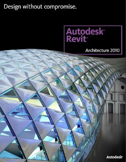
Don’t waste your money on a laptop that’s not capable of handling the software. I unexpectedly had to replace my first laptop (cost around $1600 in 2006) after only 2 years of use with a more powerful, $3600 one (having better processors, RAM, hard drive, graphics card, etc.). Though compatible, the first laptop just couldn’t, and wouldn’t handle the software. So my advice would be to just go all out the first time, and the machine will pay for itself. Having said that, this is still a battle you cannot win due to lag of retail compared to the rapid rate of technological evolution. The instant you buy a new electronic device, a newer model is already taking its place. The same goes for CAD software. The key is that the skills you learned in one program often make it easier for you to move to the next version. I began using AutoCAD 2002, and I have probably used every version since then, up to the current AutoCAD 2011. I recommend learning as many different types of programs as you can. Start with becoming familiar with some basics like MS Office Suite, Google SketchUp, AutoCAD, Revit (seen in the photo), Photoshop, and/or Corel Draw. But don’t stop there. I was scared to death of the complexity 3DsMax and totally avoided it all through my undergrad studies. Now, I can’t get enough of it. 3DsMax and Revit are truly two of the most powerful and rewarding software that I’ve used. AutoDesk provides free current versions of most of their software to students (click here). During my studies at SIU alone, I have used SketchUp, Google Earth, MS Office, DynaScape, MicroStation, FormZ, Kerkythea, Onyx Garden Suite, Photoshop (extensively), Corel Draw/Paint, Viz, VRay, CAD, Revit, 3DsMax, StruCalc, Ecotect, and Maya, (and I’m probably forgetting a few). I would also recommend introducing yourself to Rhino, Flamingo, Grasshopper, and whatever else you can get your hands on. These programs, however, won’t do your design for you (…unless of course you program and script them to do so); so remember that what you do with these programs is still up to you and not the technology. Never let the software limit your design!
Link to Image:
http://www.strucsoftsolutions.com/Autodesk.asp
Friday, September 17, 2010
Make Ribbons Work for You
By Dustin Stoll
For those of us who have been using Autodesk products for awhile, we have noticed a major change in user interface within the past two or three years. It seems as if Autodesk has taken a page from Microsoft’s book, by utilizing a ribbon at the top of the screen instead of the standard icons we have grown so fond of. Like it or not, ribbons are here to stay and below are a few tips on dealing with them.
With Auto CAD, it is easy to switch back to a more familiar “classic” view, if one is totally opposed to conforming to the new interface. In the lower right hand corner of the screen, below the command window, there is a “gear” shaped icon that allows for transition between types of work spaces.
Switching to the classic view can also be achieved by simply typing “workspace” into the command line, and selecting “settings” from the available options. Within the settings window, it is easy to select classic view from the “my workspace” drop-down menu.
Revit doesn’t give us a choice when it comes to using the new ribbon interface. There is no option to switch to a “classic” view in Revit. However, there is a way to put all of your most frequently used icons in a place where they can be accessed without using the ribbon. This useful option is hiding right under your nose and can be a major time saver. If you look at the very top of the screen, you will see the “open” and “save” icons. These icons are docked on something called the “Quick Access Toolbar” (QAT). Many people know that this toolbar exists, but don’t know that any of Revit’s many icons can be added to it.
The first thing that I like to do when I set up a QAT, is to move it below the ribbon. This can be achieved by clicking the “down arrow” at the far right of the QAT. This allows much more room for adding icons. To add an icon to the QAT, right-click on the desired icon and click “Add to QAT.”
Once you have added your icons to the QAT, you can easily manage them by clicked the QAT drop-down menu and selecting the “customize” option. Here, you can move and delete icons as desired.
The QAT is available on all ribbon based interfaces and can be a very useful tool. I hope that you can use this toolbar to become more productive and efficient in your work.
Thursday, September 16, 2010
Conceptional Design Practice
By Yuko Aoki
ARC 551: Design Studio is a requirement in the second semester of the Master’s of Architecture program. I am taking this class right now under the instruction of Peter Smith and Steven Turnipseed in fall 2010. They are giving two projects, a three week project and a thirteen week project, in this semester. I want to tell you about the interesting first project that graduate students are doing.
There is a website which is a competition base website called ICARCH. There are a lot of competition lists on this site, but every topic has a name “House for …”. The object after “for” could be anything, which is great practice for creating a concept and developing a design based on the concept idea. The competition topic that my professors chose is “House for Lady Gaga”. Yes, you read correctly; they asked graduate students to create a conceptual house for the pop singer Lady Gaga. I was amazed by her soon after I started to research about who Lady Gaga actually is and what kind of message she wants to send out to the world using her music. Everything she does looks so weird, but has meaning, which can be difficult to understand because it has so much depth. However, because of her complicated life style, this conceptual design is interesting.
Moreover, you as an architect need to decide a site for the house which, of course, has to follow your concept and connection to Lady Gaga. Architects or architectural students are usually given a site so this decision becomes tricky because you have to pick one location from all over the world!!
The class project is proving quite interesting to me. It has more focus on design itself. This practice will help me thinking not only about technical design, but also about conceptual design. I hope the thirteen week project, designing a memorial and crematorium, will also be interesting as well.
ICARCH: http://www.icarch.net/
Picture: http://www.ladygaga.com/photos/detail.aspx?fid=15765&phid=15766
Wednesday, September 15, 2010
Look How Far I Have Come
By Shane Healey
When I was growing up as a child, every now and then, my father would show me all his artwork, whether it was with paint, pencil, or pastels. I was amazed at what he could create, and his ability to take an image from his mind and convey it on a piece of paper. I was so intrigued with this, that, when I was nine years old, I had my parents enroll me into art classes on Saturday mornings. I was in art classes for four years, in which we used mediums from oil paints and watercolors, to pens and pencils. We did numerous types of still life drawings, from animals and people, to cars and landscapes, but my favorite thing to draw were houses. To this day I have all the house sketches that I did as a child. In addition, I have my first floor plan, which was dated; I did when I was only twelve years old. This 5,000 square foot design had no hallways, a putt-putt golf course, and only one door; however, it was my dream house.
My love of drawing houses and buildings inspired me to take two Auto CAD and one model building class while in high school. After taking Auto CAD, I liked how you could take a design I have sketched, and turn it into a working drawing that anybody could use to actually build. I liked it so much that I gained my Associates Degree in Auto CAD/ Drafting in 2007, but I knew I wanted to continue and enter an architecture program, eventually becoming an architect and earning money while doing something I loved.
In the summer of 2007, I came to SIUC School of Architecture to continue in my path as an architect. While here, I have learned how to use a number of programs: Microstation, 3Ds Max, Photoshop, Corel Draw, Revit, and Google Sketchup. In addition, I have learned many different architectural topics, such as structures, mechanical, and lighting design, site analysis, concrete, steel, and wood design, and environmental issues. I have also designed in a wide variety of building types, such as churches, apartment buildings, bridges, libraries, breweries, and recreation centers. In the end, I have come a long way from designing a 5,000 square foot dream house with no hallways and only one door.
Photo: http://www.library.dal.ca/duasc/dcmackay/images/129_BrookeHouse.jpg
Tuesday, September 14, 2010
SIUC Interiors to Master’s of Architecture
By Jessica Grafton
For my first post I’m going to tell you about my transition from the SIUC undergrad Interior Design program, into the Master’s of Architecture program. Initially I had no intention of majoring in Architecture, but as an undergrad in Interior Design at SIUC, we are exposed to the first 2 years with architecture students. I think this is great, because it gives you a firm background in CAD, conceptual thought processes, architectural history, and a small portion of building technology. This preparation was very beneficial in the junior and senior years of the Interior Design program.
After Graduation, I was working under an Interior Designer in an internship, and had every intention of going on to work in a firm, sending out resumes wherever I could. Then of course a few months turned into a few more, and with all of my prospects falling by the wayside due to the economy, I decided to apply to the SIUC Master’s of Architecture program. SIU makes this transition very simple for their interior design graduates since we’ve already completed the freshman and sophomore years of Architecture.
With this background I’ll be able to complete the Master’s of Architecture degree in 27 months, using the first two semesters to get caught up on the structures and building tech courses, picking up where I left off my junior year of undergrad. Then I’ll be able to join in with the other 15 month track graduate students, who have their undergrad degrees in Architecture.
Monday, September 13, 2010
Death to Facebook
By Vince Burdi
Have you ever found yourself pulling all-nighters the during finals week? If so, you are not alone. Time management is not something that comes easy to most college students. In fact, there are too many distractions that get college students off track ranging from social networks to reality television. In order to avoid these all-nighters, we have to make responsible decisions early on during a project. Seems simple enough, but it was even something I struggled with this past summer.
Dr. Walter Wendler wanted his students to consider the lack of time during the summer semester. Dr. Wendler explained, "Make a decision in order to have something to work on early. There are no bad decisions at the beginning of a project only at the end." Dr. Wendler wanted his students to stand by their choices throughout the course. By defending our work we became more responsible for our choices, which in my opinion made our projects stronger. What I have learned this summer is that design is never going to be perfect. As many times as you think you can change your work to become “perfect", it just will not. Progression is truly the only objective we should concern ourselves with. Below, I have outlined 6 easy steps to avoid the dreadful all-nighters.
Step 1, use the syllabus, it is a great tool that most students tend to forget. The instructor has obviously taken the time to write what he/she expects from you. So, take the time to read it and yes, try to actually stick to it.
Step 2, mark your calendars. Some of us are new to the campus life, but those of you who have been here before know the temptations around us. By setting up your schedule ahead of time, you can plan around parties, bars, vacations, etc.
Step 3, instead of waiting to the last minute, set times up during the day to work and study. Find a good study area and make it a ritual by going every day. Before you know it, you will begin to miss the place. Hint: the printing does take time, so do not wait to the final day to print. Get in the habit of printing before your deadlines.
Step 4, turn off the technologies. I know it seems impossible, but try to spend less time on Facebook, Twitter, YouTube, Xbox, television, phone, you name it. The only reality about reality TV is that those people are making money while you watch them for hours. So, do yourself a favor and study, you might have something to contribute in class.
Step 5, make decisions early about your design during a project. Figure 1-a represents two types of time management. The red line represents someone who waits towards the end of the project to make decisions about their design. This will ultimately leave someone with little or no time to work out the details of the project. Forcing a person to spend late nights cramming their work the last week before it is due. The blue line represents someone who begins to make decisions early on. The persons level of work does not drastically change, and there is a consistency to the time and energy spent on their work. Making decisions early not only allows a person to correct their own mistakes but does make for stronger design.
Step 6, follow through on your work. Many people can come up with the ideas, but when it comes down to getting on paper, they fall short. Remember not to wait to last minute, but just in case you should have some sort of computer malfunction. Trust me when I say this, it does happen. A log of your notes is a last resort. Keeping clean notes always helps your professor/boss track your work and he/she may be a bit more understanding when you fall behind. There you have it steps to avoid the dreadful all-nighter.
There are plenty of ways to fall behind, but if you stick to these steps you should find yourself on a smooth track that does not include late nights, coffee, and red bulls. Hope this helps and good luck on the rest of the semester!
Figure 1-a - Design Energy
*Note: the same amount of energy is spent between sections A and B. Instead of waiting to the final week (red), you can start making decisions early on (blue) during the course of a project.
Sunday, September 12, 2010
Architecture and Civil (Structural) Engineering
By Micah Jacobson
Hello, my name is Micah Jacobson. I am the TA for Arch 361-Structures 1 this semester. I am a new student to SIUC. I am from Columbia, Missouri. I just finished my undergraduate degree in Civil Engineering from the University of Missouri. I will be here at SIUC for two years working on a Master’s of Architecture. My wife is a special education teacher working with children with developmental disabilities ages 2-4. We have been married for two and a half years.
My focus in my undergraduate was Structural Engineering. I made a change in my major two years ago from Mechanical Engineering to Civil Engineering and 1 year before that from Electrical Engineering to Mechanical Engineering. I found a love for Architecture in a class from Dr. Benyamin Schwarz at the University of Missouri. This is also when I changed my major to Civil Engineering.
In Civil Engineering there are four main disciplines; Environmental, Geotechnical, Structural and Transportation. Environmental Engineering is concerned with regulation concerning pollution in air, water, and soil. This is a very chemistry heavy discipline. Geotechnical Engineering is the study of soil mechanics, structural characteristics and design of foundations, damns, levees, earth slopes, retaining walls and other soil based structural builds. Structural Engineering is the analysis and design of structures for buildings, roads, bridges, damns, water towers, antenna, boats, planes, spaceships and many more. Transportation Engineers analyze traffic, design roadways, intersections, slope and crowning of roads, and traffic signal timing and placement.
I have always loved to build things and figure out how things work, so Engineering and Architecture are both obvious choices for me. My career goal is to become licensed to practice both Architecture and Civil (Structural) Engineering. I hope my experience can be a help to everyone in this program. I look forward to my endeavor in this program and as the TA for Structures 1 and Structures 2 in the spring.
How I Got To SIUC
By Scott Fisher
I started my college career at Vincennes University, in Vincennes Indiana, by taking an Architecture CAD class; which was my first experience in an architecture class. My first day in a CAD class was definitely an experience for me. CAD seemed to do everything I didn’t want it to do. At this time I was also in other general classes and an architecture hand drafting class. I found out in the first week of college that I was very good at hand drafting but CAD was going to take some time for me. Later on in the semester I got use to CAD and was getting better and ending up being one of the best in my class. Continuing on to my freshmen spring semester, I continued to take general required classes and now was taking a CAD class that was to basically put everything I had done in the hand-drafting class onto the computer, in CAD. After a year of taking a lot of notes and getting the college experience, I registered for the upcoming fall semester taking the more advanced CAD courses and design courses.
The fall semester started and I was in my first design course with a new professor that I never had before. As I went through the design course I was handed projects to do that were not architecture related; they were mainly about combining shapes, lines, dots and other symbols in a way to create a unique object/design. After a few of these projects I was wondering what this had to do with architecture, but my CAD class was all about architecture drawings. So continuing through the rest of the semester working through individual, group, and community projects, I gained interest more in design class and became more knowledgeable of what was next after my two years at VU; the architecture program was only a two year program. After pages of notes, essays, hours of CAD, several models and tons of math problems, I started my last semester at VU. I was down to taking physics, advanced CAD, advanced design, site planning and a 3d digital modeling class. As I started my final semester I found out this was going to be a hard semester but I had to do good to finish my college career at VU, but I would also figure out where I wanted to transfer to get a bachelors degree. As far as the other classes I learned how to use Autodesk Viz and learned how to do site observations. I drew a hole set of CAD drawings, and finally I did design architectural projects, physics, and other general required classes.
Working closer to the middle of the semester I was told by my professors that I could not transfer to anywhere in the state of Indiana to continue my architecture to earn my bachelors…so what to do? After thinking about it and talking to my advisor, he said he was in connections with Southern Illinois University Carbondale. He said he was sure that my credits would transfer and that would be my best choice. Weeks went by and semester got busier and I found out that I knew some people down at SIUC and that some of my architecture friends at VU then were also going to SIUC. So I graduated at VU and the summer started and I decided to take a campus tour of SIUC. I got down to SIUC and took the tour and was able to meet with Dr. Wendler of the Architecture Department and was able to talk to him about the architecture program. Traveling back home that night I had a lot of information going through my head and did not know what to do. Going to SIUC would be a big change: living away from home, bigger university, being around more people I did not know, and what classes would I take? Days went by and I made up my mind that I wanted to earn my bachelors and my best choice was going to be SIUC so I applied and weeks later I heard back from campus that I got in.
Image: http://www.mdc.edu/main/collegeforum/archive/vol13-3/academics/architecture.asp
Friday, September 10, 2010
Then and Now. My Journey into Architecture and Design.
By Tara D. Loughman
Looking back, I always knew what I wanted to be when I grew up. For me this was always a simple choice. I grew up in a family in the construction business and was constantly around all sorts of construction sites. Of course when I was younger I hated it and wanted nothing to do with it, but as time progressed I knew it was something I wanted to do.
One thing that was always constant in our house was me rearranging my room and any other room in the house I could get a hold of. I was always building things with my little cousins Lego sets. Of course I played with Barbie’s but only to build and decorate their houses; then I was done. After awhile, I needed more of a challenge and started to do things around the house with my dad and grandpa. The more I got older, the more I wanted to design and construct new things; now I just needed more of a challenge.
After taking a few interior design classes in high school, I started to look at colleges that offered an interior design degree. My advisor suggested to me, a small, private design school downtown St. Louis. After looking at Patricia Stevens College, I knew it was a perfect fit. I graduated in March of 2006 with my associate’s degree and then went on to Maryville University to finish my bachelor’s degree. A year later, Patricia Stevens College, called me, telling me they now offer a bachelor’s degree and asked for me to come back. I did and was the first to graduate, with a Bachelor’s Degree of Science in Interior Design, at Patricia Steven’s College, in March 2009.
Immediately following graduation, I was already on my way to starting my master’s degree. I started classes at Southern Illinois University Carbondale in the fall of 2009. For the first year I took several classes to level out from interior design to architecture. This summer was the official start of graduate classes and my current position as the graduate assistant in the AID Library.
Looking back to my years growing up around my dad and my grandpa, I can really see the inspiration they gave me in my career today. It’s really nice to look back and see all that I have accomplished thus far in my life and career. I can’t wait to one day be licensed as an Interior Designer and Architect and work within the fields that my family had once proudly worked for.
Thursday, September 9, 2010
Sustainable Living in Cades Cove
By Ben Temperley
This past summer break I took a trip to the Smoky Mountains, staying in a cabin in Gatlinburg, TN. On the final day of my trip, my wife and I toured the pioneer settlement outside of Gatlinburg known as Cades Cove. A cove is a relatively flat area between mountain ridges. Cades Cove began as a small pioneer community in 1821 that reached 685 (132 families) in 1850 (Brewer, 1999, p. 23). Cades Cove is now part of a national park with over 70 historic buildings. I would like to highlight the sustainable features I encountered on my tour of the cove.
The first building I encountered was the John Oliver Place. This is the oldest log cabin in the cove, built in the 1820s. Local trees were felled with simple tools (without the use of fossil fuels) to provide material for the cabin. Open spaces between the logs were filled with mud (no VOCs) to seal out the elements. The stone chimney is filled with a mud mortar. The construction process involved little embodied energy. In addition the cabin has lasted nearly 200 years!
Elijah Oliver, son of John Oliver, bought a property in Cades Cove after the Civil War (Brewer, 1999, p. 11). Without a refrigerator or a freezer, Oliver used a spring house to keep milk and butter cool. The spring house was built over a stream on his property. The cool spring water kept perishables from spoiling. In order to store and preserve meat for an entire year, Oliver built a smokehouse. Corn was stored in a corn crib for grinding into meal to last until the next harvest. Without motorized farm equipment or vehicles, animals and farm tools needed to be kept in a barn. Hay was stored in barns. Cows provided milk. Elijah even piped water from the nearby stream to his kitchen sink (Brewer, 1999, p. 11).
The grist mill was my favorite building in the cove. It harnesses energy from a creek that flows through the cove. Water is funneled through a wooden flume that pours onto the large wheel, causing it to turn and providing energy to grind grain. Again, fossil fuels are not involved. Instead, gravity is used to power the mill. The grinding speed is adjustable based on how much water is allowed to pass through a gate on the water flume.
Cades Cove had a blacksmith shop. The blacksmith shaped iron into axes, adzes, knives, bolts, saws, etc. A sustainable quality of the blacksmith shop was that iron was not wasted. If a saw broke, it could be made into a butcher knife. Iron was readily recycled, as it is today.
A final sustainable feature may be represented by the village's communal spirit. They attended church together in the churches they built. Neighbors helped each other husk corn, make molasses, peel apples and quilt. They gathered chestnuts together on weekends.
The Cades Cove families lived a sustainable lifestyle before we realized the importance of sustainability. They used local resources. Those resources were renewable. They did not rely on burning fossil fuels. The materials they used did not off-gas harmful VOCs. They lived within their means. They did not waste their resources, and their lifestyle fostered a sense of community togetherness.
Works Cited
Brewer, C. (1999). Cades Cove Tour. Gatlinburg, TN: Great Smoky Mountains Association.
Wednesday, September 8, 2010
Little Person in a Big World
By Rhonda C. Daugherty
I embarked on a trip this Labor Day weekend to Chicago. As I arrived and looked over the edge of my window, the tracks appealed to be woven together like rope, in no particular order. I stretched my arms up and yawned; then, I began to pack my things in my carry on bag, as we grew closer to Union Station. The whistling trains in the distance, screeching breaks, dim lighting, and dusty tunnels were crowded with people as they hustled to their destinations. I started to wonder… “Wow, I’m pretty short.” Everyone had a target and they were moving hastily to get to them. Back and forth from the entrances and exits, pushing and shoving.
How did the architect investigate circulation for both Union and Ogilvie Station? How does the architect attempt to understand the complex patterns of both travel and behavior? Is everything random or a logical guess? The three different scales I partake in were Carbondale to Chicago, Union Station to Ogilvie Station and Ogilvie to Bellwood. There are four types of rail ways in Chicago: Metra, Amtrak, CTA, and the freight trains. The function and priority must have influenced the design.
The experience became to be surreal, I boarded the train at 3:15 A.M. Sunday night, and I got off the train at 9:05 A.M. Sunday morning. Groggy and tried, I got off the train carrying my luggage and walking aimlessly to the waiting area to meet my ride as people walked swiftly around me. I had arrived at the station only to depart five minutes later…