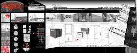
Taking the time to setup your boards is important and should not be taken lightly. We have all waited to the last minute to throw pictures, renderings, drawings, text, etc. on a board just a couple of days before the project is due. It is not a good habit to start, consider this a warning. I find it better to actually give the layout a bit more thought then it just making it look clean. There are infinite amount of ways to layout a board, but if I could offer a few suggestions.
1. Think outside the box. Challenge yourself to maybe come up with a new format. Finding new ways to display your work is not only challenging but rewarding.
2. Give some thought about your design and how visually you can communicate to someone outside of architecture. Imagine this person has no idea what concept means. Make that link graphically.
3. Consider the space you are going to display your work. A hallway is much different from a room, you may have only a second to get your potential audience to stop and view your board.
4. Choose a font that is easy to read and works for your board. Do not get fancy cursive it does not, I repeat, it does not look good. Size does matter. Think how far someone is going to be when they read your board. If the text is too small people will not be able to read it.
5. Test colors schemes before print day to see if the colors work. Have you ever seen those boards where it was either too bright, colors clash, or my personal favorite "Easter Eggish" Pastel.
6. SELL IT! You spend hours putting together your work. Show it, take pride in your work, it pays off.
From day one you should already begin thinking how you are going to convey your design. Spending a few minutes every week brainstorming incorporating design layout goes a long way. There are many places you can go for ideas like projects in the hall, graphic design work, upperclassmen, or books. Utilize every source in the building. Graphic designers are next door in computer lab. I know they use Mac computers, but they are still people. So, go over there ask for input. They won't bite.
Are job as architects is to see the overall image of a project and in school you are here to develop those skills. For some this may come natural, we are all designers in Quigley, but we have friends, family, potential clients that do not see concepts like us. A personal technique of my own is to grab a complete stranger outside of the architecture world and ask them to critique my board. I love this one the most. Complete strangers offer probably the best critiques which can help you find what you are missing. Most common phrase I hear is, "I don't get it". We need to deliver that message, concept. If we can make a complete stranger understand a board, well you are on your way to becoming a better designer.
I have learned by looking at graphic designers work that every point, line, color, scale, drawing, etc. is taken into consideration. Architecture students have plenty of work to do as is, but why spend the time? It sells! Designing your layout sells your product. Okay, we are not making any money just yet. But, sooner or later you are going to be searching for a job. Setting up your resume, portfolio, business card, letterhead, etc. are just a few to get you started or employed, but begin thinking about your presentation board layout techniques. It will pay off in the end. Below is an image of a board I found off Google that caught my eye. The building silhouette is interesting and a nice way to layout a board.

Google search images: Architecture design presentation boards
http://evandavis.com/?page_id=5
http://evandavis.com/wp-content/uploads/2007/06/final-presentation-board1.jpg
No comments:
Post a Comment