By Dustin Stoll
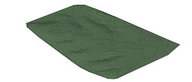
If you have ever attempted the contour tool in Revit, you already know that it can be a headache. In this blog, I will hopefully shed some light on the subject for you. First, I realize that there are several ways to create a topo in Revit, but the way that I am showing you, I feel like is the fastest, most accurate way to create a complex site.
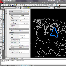
First, we will start in AutoCAD. You will need to create the contour lines for your site as poly-lines. The reason why you HAVE to have poly-lines is because poly-lines can be assigned an elevation within AutoCAD, thus making this a crucial step in creating a 3d site. In order to create a poly-line, you can type “pline” in the command line, or if you have a CAD file with existing contour lines that you would like to convert to poly-lines, you can use the “pedit” command, type “m” so you can select multiple lines, convert to poly-lines, select “join” option, and hit enter 3Xs.
Once you have created the poly lines that make up your contour map, you need to assign the appropriate elevations to each poly-line. In order to do this, select the poly-line you wish to edit, go to the line properties, and set the elevation to the desired height.
Once you have created your .dwg file in AutoCAD, it is time to import it into Revit. Now, within the Insert tab at the top of the screen, click “Import CAD” to import your .dwg file into the Revit project.
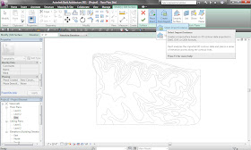
Now, to turn the .dwg into a toposurface. First, click the “Toposurface” button, in the site tab at the top of the screen. Next click “Create from Import” ”Select Import Instance” and then click on the .dwg that you imported.
The previous step might take a minute or two, depending on the complexity of the site. Now click the check mark at the top of the screen and you toposurface is complete.
Sunday, October 31, 2010
Saturday, October 30, 2010
Art is in the Stroke
By Rhonda C Daugherty
Architecture and art are integral components that work simultaneously with one another. The design process is quite multifaceted; the hand is interpreting the complex reality of space that the mind creates.
Is the illusion of points defining space too literal, or is it the space is determined by the volume of light interacting with the mind; thus, processing visual details? For this reason, the design has to go beyond the day by day intellect to generate conceptual ideas in architecture today. How must one keep up?
The first painting is about a digging deep within one’s self to find the strength to emerge. While the viewer may see hints of pain and discouragement, one has to also notice that there is life after confusion. The white represents the possibility of brighter days to come.
The second painting is about struggle and confliction. Simply trying to be someone else, other than what he is destined to be. Sadly, he is happier blurred out and ultimately freed without limitation to construct what is needed to be construct. Yet, life doesn’t work out that way. He has to settle and get by, instead of living up to his full potential.
In architecture there is also pain and confliction in the process of design; it is how the designer channels ones uncertainty and despair so that we may be honored to see intellectual potential.
Modern Marvel
By Micah Jacobson
On a trip to Omaha, Nebraska, I was able to visit a pedestrian bridge. This bridge linked Nebraska and Iowa, crossing the Missouri River. The modern marvel that made this bridge possible is high strength steel.
Typically, structural steel is specified at 36 or 50 KSI, although you can get up to 70 KSI or higher. One KSI is equal to one thousand pounds per square inch; that is a lot of stress! The steel wires you see in the bridge have an ultimate tensile strength of around 290 KSI, that’s two hundred and ninety thousand pounds per square inch of stress that the wires can withstand in tension. Ultimate strength means that the wires can withstand the stress in tensile, not compression.
Steel this strong is not like typical structural steel, in that there is no yield plateau or strain hardening. This material makes long spanning bridges possible. It is also used in pre-stressed concrete. Until recently, the materials available did not have the properties necessary to make pre-stressed concrete. The materials did not have enough strength and had to much strain to be effective in the use of pre-stressing elements.
This super high strength steel is made of cables gathered into strands. In pre-stressed concrete, a seven-wire strand is usually used. In bridges, especially highway bridges the strands can be several inches thick. This new material is a great achievement and has opened up many new possibilities for architects and engineers. Just think what the possibilities for the future are.
Thursday, October 28, 2010
Colors and Townscapes
By Bahkti Shah
This article talks about the colors in townscapes as expressions of values and their impressions on one’s mind. The colors in townscapes are not merely a built form and visual relief, but something which goes beyond that. It goes deep into the differences in ones perception for personal feelings within their visions and souls.
Colors have a symbolic connotations as well as psychological significance. Color surrounds us; it feeds & nourishes our senses. We see it, feel it & absorb it. Our mind, body & spirit are profoundly affected by it.
Townscape is physical & social characteristics of built & unbuilt urban environment & the way in which we perceive these characteristics. It is the mixture of characteristics & perception that make up & contribute to the townscape character which gives a sense of place or an identity where color is the predominant element.
The true identity of Indian social fabric lies deeper than surface decoration. There is a notion of depth and meaning which mirrors the Indian mythology. The buildings and towns are meant for all people, such as for the literate & illiterate, children and even senior citizens, thus they establish the dialogue between built form and human beings.
As time passes, townscapes are evolved in all dimensions of space, aesthetics, materials and colors, but the basic expression of identity remains the same. The colors of townscapes are influenced and are evolving for several reasons, for example, geographical locations, foreign influences, availability of resources, individual likings and by the order of the king in their kingdom during different empires. Similarly, it is perceived in different forms like in landscaping, streets, architectural elements, handicrafts and clothes, etc. Within the town, each community has their traditional references that are symbolically depicted by them in their paintings, on the walls and with decorations. This also adds the colors to the townscape and still retains its identity.
Day Tripper
By Ben Temperley
If you are looking for a nice day trip, I would recommend heading south on highway 51for about half an hour to Anna, IL. The Stinson Memorial Library in Anna is an architectural gem. Walter Burley Griffin was appointed to design the library in 1912. Griffin graduated from the University of Illinois in 1899 with a degree in architecture.
After graduation he moved to Chicago to work in the office of Frank Lloyd Wright. The library is made from limestone that was quarried on the farm of Dr. Rich near Jonesboro, IL. The exterior parts that are not limestone are made of concrete. The concrete portion sits on top of the limestone portion, creating a contrast between natural and engineered materials. The clerestory art glass windows remind me of Frank Lloyd Wright’s work. The lot is nicely landscaped. I visited in June when the bushes were flowering.
Inside there is lots of natural light from the clerestory windows. On a sunny day you would not have trouble reading a book without artificial light. The furniture, lamps and décor have a Prairie Style feel. I particularly like the table lamp (looks like a Tiffany, but I am not sure). The lower level contains a meeting room with a stage and recessed lighting.
Next, I recommend heading west and stopping at Mayberry Music. They have some nice "guitarchitecture". After that, head west to IL-146/IL-3 and follow that south until you reach IL-146W which takes you to Gape Girardeau. Cape Girardeau has an awesome cable-stayed bridge that opened December 13, 2003. The Bill Emerson Memorial Bridge is 3,955 feet long. It crosses the Mississippi River. There is a nice park just after crossing the bridge. The park has great views of the river, the bridge and has a really huge old tree! The riverfront has some neat old buildings. Cape Girardeau has a beautiful flood wall with murals of famous Missourians. Check out Cape’s own Rush Limbaugh (aka. The Dr. of Democracy). Finally, the nearest Olive Garden to Carbondale is in Cape Girardeau. That alone may make the trip worthwhile.
Monday, October 25, 2010
Milwaukee Art Museum
By Cray Shellenbarger
The Milwaukee Art Museum is a great building. Before visiting it I was a little skeptical due to the popularity of the building. I was worried that it wouldn’t live up to all of the hype. However, it was fantastic. The approach was great. Everything about the building reflected a free nautical feeling. The views from the café were impressive as was the food. I was expecting some overpriced cafeteria-style cuisine but was surprised with a well-prepared lunch. Although there was an event later in the evening and the main entry was cluttered with equipment, it was a fantastic space.
As you enter via the skywalk, you begin to understand why the building captivates so many. The elegance of the support cables going up to the support tower seem light and airy while being inches in diameter. The louvers that spread out and retract depending on weather make the building seem like it could fly away at any moment.
Although the exterior was beautiful, my favorite parts of the whole design were the galleries. The steady repetition of the structure was organic, evoking the image of an exoskeleton rib cage. The subtle inlet of light kept the space light and comfortable. One nice detail was the handling of the HVAC system. The vents were placed in a recessed groove along the perimeter of the rooms. This made for a nice connection between vertical and horizontal planes while doing a great job of hiding the system.
I have to say that I didn’t go for the artwork contained in the building. Among the art connoisseurs and the hipsters I felt a little out of place. While they were discussing the artwork I was taking pictures of the structural connections and architectural details.
Calatrava’s building lives up to its reputation. It sits perched on the water ready to take off in flight at any moment. There are not enough examples like this. Anyone interested in architecture or great spaces in general should visit the Quadracci Pavilion.
Traditional Taiwanese Funeral
By Kang-Hsin Fan
In keeping with the Taiwanese customs, people who are passing away will not actually die at the hospital. When the families decide it is time for them to leave, they are taken off life support, put on oxygen to be transport home by ambulance, and placed on their bed. As the initial part of the ritual, their bodies lay in state on the bed for approximately 10 hours while their families chant to assist there soul in passing to the happy place. Once the 10-hour period passes, their bodies are put in a coffin-like freezer in the house. According to the traditional Taiwanese funeral, the 7-day mourning period is more time given for further assistance to the soul in passing to the happy place. As part of the funeral custom, the homes are prepared including having a tent set up in the patio area for the visitors. Under Chinese customs, friends and relatives literally pay their respects. They bring money in small white envelopes as a donation to the family. Once the funeral is over, the funeral home takes their body, along with the funeral participants, to the local crematorium. After their ashes are secure in the urn, the funeral home transports the family to their interment site. These buildings are almost always located on a hill and have a nice view of the harbor. As part of Buddhist tradition, after the funeral, the families will perform ritual chanting for one or two hours, once a week, for seven weeks, at a designated temple. The process is led by the head nun, in front of a temporary shrine with their favorite fruits, cookies, and desserts set out on a table. The purpose of these rituals is to guide them to the happy land, encourage them to follow the right path, and avoid distractions by evil spirits.
Sources:
http://shelz-lyn.blogspot.com/2009/07/chinese-funeral-costume-and-ceremony.html
Sunday, October 24, 2010
How to Setup Multiple Computers to Render?
By Scott Fisher
Often times in design studio, the students are told to design a building. In the assignment it usually includes floor plans, elevations, sections, site plan(s), details, and renderings. Out of all these usually the rendering takes the longest. In these simple steps you can render in 3Ds Max in shorter amount of time than any other rendering method.
Step 1 Start up as many computers as you have available (must all be 64 bit)
Step 2 Connect all computers to a network (up to 10 computers will work)
Step 3 Go to Start, all programs,
Step 4 Chaos group, V-Ray Adv for 3dsmax 20.. for x64, distributed rendering
Step 5 Click on distributed rendering then right click on Launch V-Ray Spawner
Step 6 Click Run as administrator
Step 7 Repeat steps 2-4 on all computers
Step 8 Open file on original computer
Step 9 Go to render setup
Step 10 Load any V-Ray presets
Step 11 Go to Settings tab, V-Ray:: System
Step 12 Under Distributed Rendering click settings
Step 13 Click add server (here you enter IP address for all other computers)
Step 14 Go to another computer and click start, and in the search box type “CMD” enter, now type “IPCONFIG” enter
Step 15 Look through all the network codes and find “IPv4 Address”
Step 16 Copy and paste the IPv4 Address to the “Add Render Server” on the original computer then click “OK”
Step 17 Repeat Steps 14-16 on all computers that are helping you render
Step 18 Click Resolve Servers once all computer IP address have been entered
Step 19 Click “OK”
Step 20 RENDER (Once rendering has started the V-Ray messages will tell you when each computer has started rendering)
Saturday, October 23, 2010
Garden of the Gods
By Yuko Aoki
Southern Illinois University is located in rich natural settings. The campus itself is very green. If you like to do a little bit of hiking and love to view magnificent scenery, Garden of the Gods is the one place you must visit. It is one of the parks in the Shawnee National Forest. Rocks are lying down there from about 320 million years ago. They form cliffs and unique shapes. Camel rock, which is literally in the shape of a camel (bottom image), is well known. Wind, rain, and freezing and thawing actions curved rocks and made the shape. It must take a long time to shape and will never stop.
In the fall, leaves are changing their color. When I went to there on October 17th, the panoramic views from the observation points were crowded by people who also wanted to feel the seasonal change. The contrast of colors, the positioning of individual rocks, and the side walk around those rocks and trees are inspiring to me.
I love to be in the park because I can see and know the power of nature. Also they make me feel refreshed. I recommend you to go Garden of the Gods if you are in Southern Illinois. For directions, please go to the link below.
Sources: http://www.fs.usda.gov/wps/portal/fsinternet/!ut/p/c4/04_SB8K8xLLM9MSSzPy8xBz9CP0os3gDfxMDT8MwRydLA1cj72BTJw8jAwjQL8h2VAQAzHJMsQ!!/?ss=110908&navtype=BROWSEBYSUBJECT&cid=FSE_003714&navid=110160000000000&pnavid=110000000000000&recid=10685&actid=50&ttype=recarea&pname=Shawnee%2520National%2520Forest%2520-%2520Garden%2520of%2520the%2520Gods%2520Recreation%2520Area
Friday, October 22, 2010
A Need for Separation
By Shane Healey
Due to our programs high technical expertise in steel, concrete, and wood, combined with excellent graphic communication and diverse knowledge in computer programs, Southern Illinois University, in August of 2010, had become the fifth Illinois School of Architecture to gain an accredited masters program; therefore, the last thing we are missing is an identity of our own. SIUC’s architectural program, currently, shares a building with two other programs: interior design and fashion design and merchandising; however, the engineering department has five large wings combined in one building. As it stands, in Illinois, SIUC is the only architecture masters accredited program without its own building. However, some might argue that we have the Blue Barracks, but they are outdated “army buildings,” that are barely able to sustain a class environment. These “buildings” have poor acoustics and air conditioning. In addition, to our growing program, the appearance of these blue structures might raise the question, “why are architecture students in a building that looks like a 5 year old could have designed.” For our program to catch up to U of I (Chicago and Urbana), Judson University, and Illinois Institute of Technology’s programs, we are one major element, a building to call “ours” to give us a sense of identity. When I came to SIUC for the first time four years ago, I asked people where to find the architectural program. To that question, I usually got one of two responses: I don’t know, or...we have one?
Thursday, October 21, 2010
Quad 2010
By Tara D. Loughman
Over the weekend many architecture students at SIUC, in coordination with our AIAS chapter, headed to the annual fall Quad Conference. This year it was held at a famous national landmark; the former house and studio of the late Frank Lloyd Wright. Taliesin (East) is located in Spring Green, Wisconsin, which is less than an hour’s drive west of Madison, Wisconsin. The house is setback into the hillside of Wright’s family farm once owned by the Lloyd-Joneses.
The conference was made up into three days of various workshops, lectures, and tours that were specific to architectural design, nature, and the tales and history that Taliesin holds. Many speakers that once knew or worked with Wright made an appearance to give their personal insight to who he was as a person and designer, contrary to what is generally noted about him. Another lecture taught us the purpose of using whole tree’s in our designs. This was introduced to us to highlight the facts in comparing engineered wood vs. whole tree wood and the benefits it has on the structures, environment, and economy. Most interesting to me was the tour of the entire Taliesin property given to us by the current students at there.
Wright had many structures built on the property. Many of them were built for his aunts and uncles on the farm when he was a young architect just starting out. The realization of his ideas and concepts used behind Taliesin is clearly seen throughout the site in many forms of materials and their uses. The most important thing you identify with is his passion and desire for nature. No matter where you look, you will see these indescribable scenic views into nature.
Overall, the conference at Taliesin taught me more of an appreciation for certain things in architecture, especially the multiple uses of nature and its importance. The feeling can be overwhelming at times but in the most positive way. Quad, too, was a great place to get a chance to meet and talk to other architecture students from various universities. This spring, Quad will be held here at SIUC, and not only will it be another memorable event, but it will give us students another chance to learn from one another.
Wednesday, October 20, 2010
My Teaching Assistant Position as a Graduate Student at SIU
By Russ Baker
Being a Teaching Assistant as a graduate student at SIU definitely has its advantages, but it is not exactly a walk in the park either. Although considered an SIU quarter-time employee, serious time management skills are a must in order to fulfill the responsibilities due to the rigorous nature of the graduate program. Graduate assistants must schedule their duties around a full load of classes including a studio, thesis work, future planning, student organizations, and extracurricular activities…and eating and sleeping if time permits. I’m certainly not complaining though. In addition to being well paid for my assistance, approximately three quarters of my tuition (all but the first summer session of the fifteen month program) is taken care of by the university. It really is an excellent opportunity providing mutual benefits between the university and the student. My case is somewhat unique from others’ because the professor I work for, Professor Jon Davey, also just so happens to be the Committee Chairperson for my thesis (about which I will undoubtedly post in a future blog). This enables me to keep in touch and work efficiently with Professor Davey on a daily basis.
There are three types of Graduate Assistants (GA’s) available, including Teaching Assistants (TA’s), Administrative Assistants (AA’s), and Research Assistants (RA’s).
• Teaching Assistantships – assists with teaching by offering tutoring or assisting in a course. The School of Architecture does not assign GAs to lead any of its courses. GAs will work with a professor.
• Administrative Assistantships – assists the School by staffing our computer lab, library, and CNC machine/laser cutter lab. In addition to overseeing a lab, you may be assigned other duties by the School of Architecture that are to be completed during your assigned work hours.
• Research Assistantships – assists a professor with a research agenda defined by the professor.
http://graduate.architecture.siuc.edu/files/2010/07/Graduate-Student-Handbook-2010-2011-SoA-MARCH.pdf
Becoming a TA required extensive training by the university this past summer, and other types of ongoing training such as ethics training by the State of Illinois. In addition, I was required to train on university technological, projection, and computer equipment such as the Auditoria, which is the sophisticated podium in the front of many classrooms and auditoriums (including the auditorium at Quigley).
As Professor Davey’s TA, I am basically just that…his personal assistant. Not that I get him coffee or anything, but the range of tasks I complete for him is vast and diverse. I often run errands for him such as retrieving/returning library materials, and delivering/retrieving tests, photocopies, and other academic materials across campus. He has also asked to work on posters, hang fliers across campus, move models and change displays, hang/remove banners, and some other physical labor tasks. In addition, I have helped bring him up to date by transferring to DVD all of his old VHS educational tapes which were aging and progressively becoming more problematic. Basically, I do whatever he asks and whatever I can to help him out. Recently, I accompanied Professor Davey to meet with the owner of a local business to discuss possibly redesigning the façade of the client’s building. Perhaps most importantly though, I do actually cover his classes when he is unable to be here due to travels or other circumstances. Since the school of architecture does not ask TA’s to lead or teach any classes, as is the case in some other departments at SIU, Professor Davey always has a Plan A and Plan B for me to implement in his absence, such as showing an educational video, possibly distributing assignments, or proctoring tests. Although I never really know what he’s going to ask me to do next, the system we have worked out symbiotically benefits us both, and I am very appreciative to have been given the opportunity to serve as a Southern Illinois University Teaching Assistant.
Tuesday, October 19, 2010
Places to Relax at SIU
By Ben Temperley
We all need a place to relax once in awhile. Thankfully, SIU has some great places to sit back and rejuvenate in the great outdoors. The Kumakura Garden is a lovely Japanese garden named after Nobuo Kumakura, the mayor of Nakajo, Japan. It is located behind the north end of Faner near the Coal Research Center and Old Baptist Foundation. The entrance features a wood, Japanese style gate. The walking path is paved with stones. There is a serene koi pond fed by a gently cascading waterfall, over which is a Japanese bridge. The bridge reminds me of Monet’s “Water Lilies and Japanese Bridge”. There are benches that tastefully echo the curvature of the bridge. The landscaping showcases ornamental grasses, Firepower Nandina, Japanese maples, pine trees, natural stones, and miniature pagodas.
A great place to relax is in the Troutt Tea House located within the Kumakura Garden. It features an octagonal opening and octagonal columns to match. The roof structure is exposed like a lot of traditional Japanese architecture. Planted next to the Tea House is bamboo to enhance the Japanese feel.
If you are curious, you can follow the path through the Kumakura Garden and check out Dorothy Morris Gardens located beyond the pond next to Faner. Dorothy Morris was the wife of SIU President, Delyte Morris. Be sure to read the plaque to learn more about her and check out her statue. Keep journeying behind Faner, and you will enter the Museum Sculpture Garden. You may want to visit the museum in Faner sometime for a break from your studies. The Sculpture Garden is a pleasant, grassy area featuring sculptures by SIU students. “The Worm” by Colby Parson-O’Keefe is quite interesting. You’ll also find a nice view of the Pulliam Hall clock tower.
So, take a break. Relax outside before it gets too cold. Have some tea. Maybe do a little sketching, and enjoy some of the scenic areas of the SIU campus.
Importing Rhino Files Into Revit
By Dustin Stoll
In the past couple of years, Revit has made great progress with its 3d modeling tools. However, even though Revit is awesome, some forms might be much easier to create and manipulate in Rhino during the design development stage of your project and then later imported into Revit for design finalization. The following is my process for exporting forms from Rhino and importing them into a Revit project.
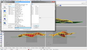
First, in Rhino, type “export” into the command line. Next, select the objects that you want to export and press the “Enter” button on your keyboard. This will bring up the Rhino “Export” menu. There are several file types that work with Revit, but my personal preference is to export as an ACIS(*.sat) file.
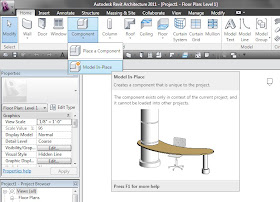
Now it’s time to import the .sat file into Revit. First, select “Model In-Place” from the Component drop down icon.
Next, you will be asked to select the Family Category and Parameters; you MUST select Mass. Now you are in the Mass Editor. You now need to select “Import CAD” from the Insert tab on the ribbon. You can now navigate to the .sat file that you created earlier and click “Open”. NOTE: You might have to select Feet, in the import units drop down, before clicking “Open”, if your file does not import at the correct scale. Now click “Finish Mass” on the right side of the ribbon. NOTE: You will have to make masses visible, by selecting “Show Mass” in the Massing and Site tab on the ribbon.
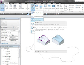
The mass I imported in the example is intended to be a roof, so in order to make the mass a roof, I will select the “Roof by Face” option, under the Roof icon.
Then, simply click on the mass and then click “Create Roof”. DONE.
Monday, October 18, 2010
Real Happiness
By Bhakti Shah
Hello everyone! Today I want to talk about a different topic. You might think why I chose such a high level topic. But though it looks different, it is associated with our daily life.
What is a real happiness? I am always confused with this apparently simple question. We usually believe that happiness is a function of material wealth and it may be true to a limited extent. We often think that money can buy us all the happiness in the world but it ultimately does not turn out to be true.
Happiness, in fact, is a very complex concept. The great Indian scriptures and sages say that happiness comes in attaining ‘Moksha’, which means becoming free from this material world by escaping the cycle of life and death or doing ‘Karma’ which means doing good deeds throughout the life.
There is other form of happiness also that lies in many little everyday things. It can be something such as meeting your family after a long time, getting to drive a car for the first time or hearing your baby talk for the first time. It can be very trivial thing such as getting a glass full of ice-cold water after walking in scorching heat of sun for few hours. It is at such times when you forget everything else and concentrate on these little things that momentarily make you very happy.
To summarize, I believe, everyday happiness lies in enjoying all the little everyday experiences and the ultimate happiness lies in being a good human being throughout your life!
Image: http://logolitic.com/40-happiness-photographyinspiration/&usg=__JbmpPOBpP5CL14
Gothic Architecture
By Cray Shellenbarger
In doing research for my thesis I have been forced to look into the history of spiritual architecture. Gothic architecture is one of the most captivating styles in history. Gothic architecture is one of the glories of our civilization’s architecture. The cathedrals of in and around the twelfth century were built to help man reach toward the heavens. It is also argued that these vastly ornate structures were built simply as town gathering places. Either way, they are still marveled at to this day. It is interesting in the fact that these buildings beauty could be accredited equally to the architect and the stone masons of the time. For without their expertise and craftsmanship none of the buildings would have the delicate beauty that causes them to stand out in history. In general, the style can be identified by the flying buttress and stained glass. Also, the pointed arches and tall, slender spires are a dead giveaway that the building is gothic.
Two of the most prominent features in this style are the tracery and the flying buttress. The traceries were a beautiful addition to these buildings but the true innovation lay in the flying buttress. This new structural element allowed the walls to be of lighter construction. This allowed for much finistration allowing light in and the implementation of the traceries mentioned above. This structural element carries the load of the building allowing the wall to be penetrated or decorated as the designer's fit. This is what allowed these buildings to reach the heights and obtain such beauty.
There are several types of Gothic Architecture. Some of which include French, English and that of Italy and Germany. First is French Gothic. As the birth place of the Gothic style, the French pushed the style farther than most. According to Architecture: A Spotter’s Guide, this style introduced the rose window. The rose window is a delicate oculus allowing light into the building in a new way. In the 13th century, English Gothic was birthed. The less ornate but equally as beautiful style carried on the majority of the Gothic Ideals. The architects of the time were slower to adopt the flowering details. Stained glass windows became an even stronger aspect of this style. In Italy and Germany, during the 12th century, another gothic style began to develop. The influence of the French and English Gothic are obvious in these buildings but there is also a strong Roman influence. With the integration of Romanesque columns and the introduction of heavier horizontal lines, it began to break away from the more traditional Gothic ideology. This new development was a little more restrained than its English and French cousins.
The beauty of Gothic Architecture lies in the detail and the scale of the projects. One can’t help but be in awe of the vast ornate naives that were built in the 12th and following centuries. Even by today’s standards, the completion of these projects is impressive.
Thursday, October 14, 2010
Architecture Around the Country
By Shane Healey
Here at Southern Illinois University’s, School of Architecture, all of the studio teachers that I have had, has given the students a wide variety of projects in a wide variety of locations throughout the United Stated. In my four years here, I have designed a wide array of projects: a Baptist church in Louisville, a penthouse in Chicago, a winery, a dream house, and a town square in Carbondale, a presidential museum and library in Springfield, IL, a community center in New Orleans, a crematorium in St. Louis, and other locations around Illinois. In addition, some teachers have locations where they prefer to design. For example, Dr. Michael Brazley prefers projects that are located in New Orleans, LA and Louisville, KY; however, Professor Swenson prefers to do projects located in Cairo, IL. Although, most locations are in the Mississippi River Valley, some teachers have used extreme locations including: Montreal and areas in California.
To accompany the variety of locations within the United States, Professor Davy, in the past, has taken groups of students all throughout the world. Last Spring, he took a group of students to different locations in Egypt. In addition, last summer, for a month, he took a group of students to various countries throughout Europe. By doing this, SIU is giving the students the opportunity to have projects on both ends of the spectrum and in locations all over North America; therefore, a greater possibility of a well rounded designer. In doing this, the students are given the ability to design a building that fits the needs of a certain environmental conditions. That ability, along with our program’s strength in teaching the students’ the technical side of wood, concrete and steel design, creates an individual that can not only produce well designed projects and graphics, but make their designs actually buildable.
The Way To Be An Architect
By Yuko Aoki
According to the National Council of Architectural Registration Boards (NCARB), architects must be licensed before they can practice architecture or call themselves an architect. Now then I have questions on how to be licensed and what is the process to get there.
On the NCARB web site, four steps are introduced.
1. Earn a professional degree from an accredited architectural school by National Architectural Accrediting Board (NAAB)
2. Internship
3. Complete the Architect Registration Exam
4. Licensure
Master of Architecture in Southern Illinois University is accredited by NAAB so I will cross off the first step after I graduate in August. The second step takes about three years to finish. The Intern Development Program (IDP) is a program which lays out all the requirements to be trained and experienced before obtaining a license. There are 5,600 hours of experience which are divided under 16 training areas. When students are in undergraduate study, they are able to start taking IDP. If you are thinking of becoming an architect and do not want to waste time doing an internship after graduating, I would highly recommend doing a summer internship or finding a firm. Step three is the exam. ARE is composed of seven divisions: programming, planning and practice, site planning and design, building design and construction systems, schematic design, structural systems, building systems, construction documents and services. Even though I can take the divisions in any sequence, it will take a while to pass all of them. In the state of Illinois, people who earn professional degrees can take ARE right after their graduation. Of course, they need to complete IDP training hours to obtain their license.
The road to becoming an architect is long and winding.
Resources:
http://www.ncarb.org/en/Becoming-an-Architect/Architecture-Basics.aspx
http://www.ncarb.org/~/media/Files/PDF/Guidelines/2010_IDP_Guidelines_OCT.pdf
http://www.ncarb.org/~/media/Files/PDF/Guidelines/2010_ARE_Guidelines_JULY.pdf
Wednesday, October 13, 2010
Innovation in Corporate Furniture
By Jessica Grafton
One of the best things about my internship this past year was getting the opportunity to work with and become more knowledgeable about new innovations in office furniture. There are amazing new technologies out there that are making the way we work more efficient and more multi-functional. Whether its ergonomics, media, or mobility, furniture is adapting in the design world to be a more versatile aspect of the day to day work routine.
I don’t know about all of you, but I like to be comfortable when I work, and that usually involves sitting in bed with my laptop so that I can prop my feet up. This chair from Kimball / Interstuhl called the Mitos covers that and more. I kept telling my boss that everyone in studio needs one of these. Haha, I know I would certainly use it every day.
I’m sure most of us know that multi-use spaces are a high commodity in today’s work world. We need our conference rooms to double as gathering spaces and ballrooms, theater rooms and galleries, and on the occasion your typical corporate yoga room. This demands a mobile solution, and the table below called Aspire is one of many options out there that offers an alternative to a heavy static conference table. Not only can this table be easily moved, but it also folds in way that allows it to be stored easily as well.
These two products I’ve shown you have had more to do with the functional aspects of office furniture, but in my next blog I want to jump into a little more of the tech and media options that are out there. These are a must in order to keep our work places up to speed with all the new I.T., and play an integral part in the design process.
All photos from www.kimballoffice.com
Late Night Giggles
By Rhonda C Daugherty
Nine o’clock at night and I am in studio doing work, “Uhmm…“, I started thinking to myself that I need to finish this work so I can work out in the morning after I go to class. Selecting elements while arranging them in the right places while paying close attention to detail then I glance at the clock. “Aw...man, it is eleven now... “, I run my hands through my hair with strength as I re-focus my eyes…. “Back to work” I tell myself. I work for another hour then my classmate tells me that everyone is heading out and I will be alone in studio if I stay. So I packed all my stuff and head home. The transition from one place to another sets me one hour back.
I unlock my door and walk in to my apartment that is dimly lit hearing giggles in the background. Walking toward the light and giggle I see my roommate talking to her boyfriend. I stop and yell “HI ROOMMATE” in a condescending tone and they pause and stare at me for two seconds looking startled. “Hello?”… They yell back and then continued enjoying each other’s company. I unpack my stuff and continue to work for another two hours until three o’clock in the morning.
Is this what graduate school is suppose to be like or am I doing something extremely wrong? I’m tired, lonely, stressed, and happy. The funny thing is the busier I am, the more overworked I feel, but it makes me feel alive and proud of myself. At the end of the day I enjoyed exploring the limits I can push myself, and I know now it will bring out the best in me. A wise man once said, “What doesn’t make you weak makes you stronger!”
Tuesday, October 12, 2010
How to Make a Contour Model Correctly
By Scott Fisher
As an architecture student, you realize how busy life can be at times; working, going to class, doing homework, eating, and hopefully getting sleep. In architecture design studios at SIUC, you are told to design a structure and construct a site model. The first few weeks in the project you conduct precedent studies that lead to the designing phase. In this phase you get to create a structure in which you believe most represents your objective. Once you finish designing you still have to put together the site model. Building a site model can be really useful to help represent your structure in 3D and how it fits within the site. Site models often include the building(s), landscaping, sidewalks, roads, people, and contours. All of these elements show how the surrounding context connects. One element that is often confusing is the concept of contour lines. Contours are used to show a grade change on the model. So how can you avoid a contour catastrophe while making your site model?
Follow these few simple steps:
Step 1- Take the site into CAD and plot it to scale with the contour lines.
Step 2- Once plotted, you place the plot with the ink side down and take a charcoal pencil and shade every line on the back of the sheet.
Step 3- Flip over the plot and trace the lowest elevation contour line(s). Step-4 Take another piece of your material and put the plot on top of it and trace the next highest contour line(s).
Step 5- Repeat Step 4 until you are done tracing the contour lines and label each contour with the elevation height.
Step 6- Take all sheets and cut on the line(s) but keep all pieces together that are on one sheet.
Step 7- Now take the first sheet (lowest contour) that you cut/traced and remove the smallest piece and trash it (only if your building is on a hill). Often times there are hills and valleys on a project, so you will start to make a model with several pieces on the base and eventually work your way up the hills; not all of the hills will be as high as the others.
Step 8- Now take the proceeding sheets 2, 3, 4… and keep the biggest piece, placing it on the largest previous piece. Example: biggest piece from sheet 2 goes on the biggest piece from sheet 1.
Step 9- Once to the top of the site, go back and glue between each layer of material; be careful to not mess up the layers.
Step 10- Place all buildings, cut out sidewalks, trees, people, and other stuff on your contours.
Step 11- Turn in your model.
Image: http://www.okstate.edu/osu_orgs/asla/Peru98/Model.html