Monday, January 31, 2011

ARC 362 Concrete Project

By: Russell Baker & Adam Dubree


For ARC 362, the second undergraduate structures course of three at SIU, we were required to create and test a single-pour, cast-in-place, concrete "bridge" in lieu of a final exam in the spring 2008 semester. This was a fun project that allowed us to get out of the classroom and acquire hands on experience with pouring concrete. Teams of two were to discus and agree upon a concept, create a scale model, perform calculations, and construct and test a concrete slab. The project required the beam/slab to support 8 #6 modular units (bricks) at the end of a 16" cantilever, while simultaneously supporting 16 #6 modular units at the center of the main 30" span. The overall length was to be a minimum of 48", and the slab must evenly rest on a 6" riser step opposite the cantilever. Each modular unit measured 2.5"x4"x8" and must be stacked precisely as seen in the attached pictures.


Material requirements designated the use of no more than one 40lb bag of Quickcrete and 150lb tensile nylon string to simulate rebar reinforcement. The entire structure was to weigh 45lbs or under. Form construction materials included 1/4" foam core, duct tape, plastic wrap, paper clips, and hex nuts. If the slab successfully supported the bricks weight for 30 seconds, and A was earned. If it a completed slab collapsed, the grade was dropped to a B. Five additional points were awarded for each two inches of span or cantilever over the minimum requirement, for the most interesting project structurally, and for the most fun project.


Prior to construction, study models were made from clay, all the bending moment ("strength") calculations were performed in accordance with LRFD design, and moment and shear diagrams were drawn up. Tension and compression components were then analyzed before constructing a digital model of our design. Product specification sheets were also a requirement in the final report submittal. An initial test pour was performed early on to make sure the formwork would support the weight, which in our case, it did not. So modifications were made to the form supports. As predicted by our calculations, our design used every last bit of the concrete perfectly and passed the testing phase with flying colors.

Walk-Through Animation in 3D's MAX

By Scott Fisher

1. Open your file in 3Ds Max.
2. Activate the Top viewport and maximize it.
3. Click Zoom Extents All button.
4. Pick the Create Tab in the Command Panel. Then Pick the Shapes button and select Splines from the drop down menu. Pick the line button in the Object Type rollout.
5. In the Creation Method rollout, pick smooth radio button in the initial type area.
6. Now pick a series of points in the Top viewport to create a line. Use the cones as a guide, starting at the bottom cone, to create the path.
7. To end the command –right click.
8. Name the spline in the Name and Color rollout.
9. To modify: the spline click the line and click the modify tab in the command panel.
10. Under the selection rollout select the vertex button.
11. To Refine Path: Pick the refine button in the Geometry rollout.
12. Add a new vertex where the path enters the building by picking on the line at that point if you have a building already created.
13. Pick the select and move button.
14. Select the new vertex and move it to the center of the doorway.
15. Now switch to the left viewport and maximize it.
16. Move the first vertex so that the first vertex it is at the same level as the bottom of the house/object.
17. Now select the vertex button again to turn off the vertex sub-object mode.
18. Move the motion path 50 units on the world Y axis.
19. Select the Time Configuration button to set the length of the animation.
20. Enter for example 2000 in the length: spinner in the Animation area of the dialog box.
21. Click “ok” (don’t forget to save frequently)
22. Click walkthrough assistant from the animation pull-down menu.
23. Under the Camera Creation area of the Main controls rollout, click the free radio button and click the Create New Camera.
24. Under the Path Controls area, check next to the Move path to eye level.
25. Pick the Pick Path button to pick the line created as the path.
26. Now under the View Controls rollout of the Walkthrough Assistant pick the click to render preview.
27. Drag the time slider left to right and backwards to view your animation in the camera viewport.
28. To adjust the camera angle: drag the time slider to “0.”
29. Open Walkthrough assistant enter “-45” in the Head Tilt Angle spinner in the View Controls.
30. Click the Toggle Animation Mode to toggle the animation “on.”
31. Now drag the Camera till it’s halfway through the doorway (if none the skip this step).
32. Enter “-10” in the Head Tilt Angle spinner.
33. Now click the Toggle Animation Mode again to turn it off.
34. Play animation in the camera viewport. Save
35. Assigning Path Constraint Controller: Select the camera.
36. Click the motion tab in the command panel. Put a “+” next to the Transform: Position/Rotation/Scale to expand. Select the Position: Position XYZ in the hierarchy.
37. Pick the Assign controller button, select path constraint, and click “ok.”
38. Select add path in the path parameters rollout. Right click in any viewport to select the walkthrough path.
39. Check the follow check box in the path parameters rollout.
40. Adjusting the camera: Activate the left viewport, select the camera
41. Select the rotate button and right click on it.
42. In the Absolute world area; enter 80 in the x-spinner, 0 in y-spinner, and 0-spinner
43. Now activate the animation mode again and move the time slider to the spot where it’s halfway through the door. In the absolute world area in the Rotate Transform Type-In dialog box, enter 80 in the X and 0 in the Y and Z.
44. Save again.
45. Drag the time slider to frame 50 again and select the track view dope sheet form the graph editors pull down menu.
46. Pick the add keys button at the top of the track view.
47. Pick open degrees track at from 50 (for the door).
48. Close that dialog box, drag the time slider to 100 and now select the door and click modify.
49. Enter 90 in the Open: dig spinner.
50. Select Saved Track Views form the graph Editors and then click the track view dope sheet in the cascading menu.
51. Pick add keys, click open track at 225 for the door.
52. Right click on a new key but make sure 90 is the value in the value spinner then drag the time slider to 275.
53. Click animation mode “on” and enter “0” in the Open: deg. Spinner in the parameters rollout.
54. Activate the camera viewport and click play after finished playing then press stop and then save again.
55. To Render an Animation: Select the objects button and then select the walkthrough path.
56. Right click the viewport to display the quad menu. Click Hide selection form the upper right hand quadrant.
57. Select make preview from the animation pull down menu then click create to accept the default settings.
58. Render A Final Animation: Make the camera viewport active.
59. Select render from the rendering pull-down menu to pick the render scene dialog toggle button on the main toolbar.
60. In the time output area set the active time segment radio button to make it active.
61. In Output size area of the dialog box pick 320x240 button (higher the number the higher the resolution).
62. In the render output pick files button and save the animation as a “.avi” file
63. Click “ok” and then Click Render.
64. Save.

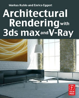
Image:
http://www.heroturko.org/ebooks/450062-architectural-rendering-with-3ds-max-and-v-ray-photorealistic-visualization.html

Electricity Consumption in the World

By Yuko Aoki


This satellite view of world at night is a beautiful image. In the winter, a lot of people decorate their houses, streets, and parks for holidays. Winter is my favorite season because of the light decorations. I feel like I’m in a magical space. However, using a lot of electricity doesn’t seem good for our future.

Under the green movement, people have started using sunlight, water, geothermal, or wind for generating electricity. Yet, the major source of electricity continues to be fossil fuels. Oil, coal, and natural gas are the top three. Only 13 percent of the sources are natural resources or nuclear, which means usage of electricity is increasing carbon dioxide in the atmosphere. Through our behavior we are creating and encouraging global warming.

Then, why is it so difficult to change? Many architects and students are trying to infuse Photovoltaic geothermal heat pumps
and wind mills into their designs. However, the initial cost to residents or customers are very high in real life. It is not easy to put these options into use in a practical, affordable manner.

I just hope that people realize the importance of electricity and how it is generated so that they will use electricity more efficiently. Also, I am hoping that those greener applications will become easier for people to implement and become more realistic options for the average person interested in reducing our impact on the environment.

Image: http://geology.com/articles/satellite-photo-earth-at-night.shtml

Source: http://en.wikipedia.org/wiki/World_energy_resources_and_consumption

Sunday, January 30, 2011

Edmund Husserl

By Rhonda Daugherty


Husserl approach to phenomenology refers the human condition of consciousness. When building our knowledge on the phenomena of the human spatial configurations, the person must start with his or her own conscious awareness (Kockelmans, 1994). In essences, one must be alert to the experiences of objects in space. Husserl says "Natural objects, for example, must be experienced before any theorizing about them can occur" (Merleau-Ponty, 1964). For example, when thinking and speaking about a wall, One must have already experience and touch the wall In order to know what a wall is. The senses play a huge role in how one accumulates a database of knowledge containing objects (Merleau-Ponty, 1964). The design thesis is going to examine the human perception and how one builds knowledge of space and then challenge what one perceives.

Perception falls in line with the idea of how one perceives objects in space. Husserl refers to intentionality, the example is, “if you perceive” he believes you have to “perceive something or someone” (Anton, 2009). The notions that objects only exist through consciousness and phenomena is the essences of Husserl’s term phenomenology (Anton, 2009). He then goes on to talk about objects in space to say and how they described and interpreted, “It is impossible to describe the essential aspects of a perception or a memory without [referencing] to what is perceived or remember, without describing the concrete [object] of these determinate activities” (Kockelmans, 1994)120).

The essences of an object that exhibit existing in a space that is perceived to be the embodiment of phenomena that cannot be describes or interpreted wrong simply because it exist through physically through memory and actuality. Husserl notes once again “that all experiences are experiences of something” ( (Kockelmans, 1994)120). The design thesis will question the rationality of the unseen and uninterrupted through challenging how one perceives what is familiar and known (Kockelmans, 1994). One might have previously interacted with the object visually but thats about the touch or smell, now one must become familiar with all aspects of the exhibition spaces.

Crematorium Project

By Dustin Stoll

In graduate studio this semester we each designed a new Crematorium/Chapel/Office complex for Bellefontaine Cemetery in St. Louis, MO. The program called for a 40,000sqft. building(s) that would include two chapels for funeral services, all the functional components for a crematorium, and administration offices for staff.

About 4 weeks were set aside, just for the conceptual development phase of this project. During that time I looked at a lot of artwork, literature, and precedence. After collaborating all of the information I gathered, I came up with the concept of Mystic Journey to Serenity. The building will represent our pilgrimage through life, which might lead us down many paths, but will ultimately end in the same way. There are few certainties in life, and for the most part our future remains a mystery. As we travel through life, we have our loved ones by our side, but after we pass away, the ones who are closest to us must let go. When leaving one behind, it is a comforting thought that they have passed on to a better place; that they are now free from their earthly restraints and have reached life’s final destination. Below is a digitally generated graphic that I created to explain my concept.


Once I had my concept, I was able to start developing the design of my building. The concept was the driver behind how my building looks and feels. Since pictures can probably explain my building better than words, below are a few of the renderings I generated for the final presentation.


Saturday, January 29, 2011

Chicago 2010

By Ben Temperley

While I was in Chicago for Greenbuild 2010, I had a chance to explore downtown Chicago. My hotel was in downtown Chicago right off of Michigan Avenue. After snapping some shots of the skyline, I checked out the Spertus Institute of Jewish Studies. The building, designed by Chicago’s Krueck + Sexton Architects, opened in 2007. The façade is an aluminum and glass curtain wall arranged in a sharp angular fashion. If you stand outside in front of the entrance and look up you get a good look at the structure that allows for the uneven façade.

Next, I checked out Adler and Sullivan’s Auditorium Building which was completed in 1889. It is now home to Roosevelt University. The massive outer walls are made of load-bearing stone. When it was completed it was the tallest building in the city and the largest building in the United States. I liked how the stones at the base of the exterior walls were rough and uneven. This makes the building appear as if it is emerging organically from the ground.

I took some photos of my favorite museum, the Art Institute of Chicago, as I walked along Michigan Avenue. This is a beautiful Beaux Arts building housing a collection of fine art including a large Impressionist collection. In 2009, a new modern wing designed by Renzo Piano was opened. It houses 20th and 21st century art.

I really enjoyed walking through Millennium Park. Crown Fountain features two transparent glass brick towers. The towers light up with different colors and project peoples’ faces on one side. When the weather is warm there is a reflecting pool between the towers.

Next, I walked by the McCormick Tribune Plaza and Ice Rink and Park Grill to the Jay Pritzker Pavilion designed by Frank Gehry. This is a bandshell that has 4,000 fixed seats, plus lawn seating for 7,000. The bandshell is very freeform and covered in sheet metal-very characteristic of Gehry. Behind the bandshell you can get a look at the complex structure required to support the freeform façade. The colored lights shining on the metal gave a very beautiful appearance. Steel tubes criss-cross above the grass lawn in order to hold speakers above the lawn. I would imagine that the sound would be evenly distributed to concert goers.

As I walked behind the Pritzker Pavilion I saw Aqua, an 86-story skyscraper designed by a team led by Jeanne Gang. The façade has an undulating appearance similar to ripples of water.

Next, I walked across BP Pedestrian Bridge over Columbus Drive. It is the first bridge designed by Frank Gehry to be built. It is a winding bridge that reminds me of a snake. The deck is made of wood planks, but the sides are covered in Gehry’s typical sheet metal.

Later, I visited “Cloud Gate”, also known as “The Bean”. It is composed of 168 stainless steel plates welded seamlessly together and highly polished. It is 33 feet by 66 feet by 42 feet. It is very cool! You can see reflections of the Chicago skyline in the polished surface.

I wish I had more time to explore, but I only had one night. There is so much to see in Chicago!

References:
http://en.wikipedia.org/wiki/Auditorium_Building
http://en.wikipedia.org/wiki/Art_Institute_of_Chicago
http://en.wikipedia.org/wiki/Millennium_Park
http://en.wikipedia.org/wiki/Aqua_(skyscraper)

Digging a Hole

By Vincenzo Burdi


Chicago has been the city of architecture since its birth. It has a long list of architects that have influenced generations of designers. Louis Sullivan's vision of the skyscraper represented a new form of architecture. Daniel Burnham’s design of the "White City" for the 1893 World's Columbian Exposition led to a revival of architecture throughout Chicago. While Burnham did develop the 1909 "Plan for Chicago", perhaps the first comprehensive city plan in the U.S, many of Chicago's skyscrapers occurred after the Exposition. In the early half of the 20th century, Frank Lloyd Wright's Prairie School influenced building design all over the Chicago land area. Ludwig Mies van der Rohe's Illinois Institute of Technology campus in Chicago influenced the later Modern or International style. Structural engineer, Fazlur Khan introduced a new structural system of framed tubes, which led to taller and stronger structures. All of these architects contributed to the architecture not only in Chicago, but led as shining examples for the world.

To continue in tradition of architecture, Santiago Calatrava was commissioned to build the Chicago Spire, a white building that would trump even the Trump Tower in beauty and scale. The image depicts a hole in the heart of the city's lakefront. It goes to show you that today every city is victimized by the current economic conditions. I begin to wonder what's next for Chicago's architecture?

Reference: http://featuresblogs.chicagotribune.com/.a/6a00d834518cc969e20148c69b479f970c-popup

Tuesday, January 25, 2011

Christmas

By Micah Jacobson

This is one of my favorite times of the year. It’s time for family and friends, reflecting on the past year and pondering the message the season brings. Something I always admired about this time of the year is the increase in selflessness and giving, even though budgets are more strained than any other time of the year.


Something fun that we did in history class with Professor Davey was design and build a set of blocks. We were to create a known structure with no more than $10.00 worth of wood. There were many creative pieces of architecture made by our class, some were; Hagia Sofia, the Parthenon, Great Pyramid, Notre Dame, Stone Hinge and many more. I built the Willis (formerly Sears) Tower. It was a fun project to work on. We were able to present the blocks to the Salvation Army and Marines Corps to distribute to children for Christmas presents. What a great feeling to know that something I created would be used to bring joy to a child on Christmas!

Another great thing about Christmas is being out of school! What a nice break after a busy semester. My wife and I will return home to Columbia Missouri to visit our family. I hope everybody has a great holiday break. Check out the fun card below found at: http://www.designboom.com/weblog/cat/9/view/1844/the-architects-christmas-tree.html

More on Spiritual Architecture

By Cray Shellenbarger

In order to design universally engaging spiritual architecture, a secular approach is required. Also, this understanding must go beyond what is typically viewed as religious. There is a universal feeling of spirituality that should be strived for. Human beings have a natural inclination to the building environment. The work analyses the natural inclination and the reasoning being the purpose and results of this longing. The purpose is not to argue the existence of any entity or the validity of religion or spirituality on society as a whole. The focus will range from the architectural elements that influence the spirituality of space to the manifestation of cultural influences in these spaces. Along with the built environment it is important to understand the spiritual contributions of outside spaces. These naturally forming spaces such as a forest or a cave can have significant effect on the human psyche. These spaces bring us closer to the “universal oneness” that is called by many names but is experienced by all people.

There are various physical elements that influence how we experience a particular piece of architecture. Aside from the obvious symbolic elements of spiritual architecture, there are other aspects of the design that have a tremendous impact on us. Light and proportion are two of these. According to Mark Torgerson, depending on how light and proportion are arranged, we may get a feeling of transcendence or a feeling of immanence in the space. This matters because depending on a person’s beliefs, a different relationship with God, for example, may be required.

The commonalities amongst various religions, spirituality and natural settings should be carefully studied. Along the same lines it is crucial to understand the effect of secular architecture on the occupant. Through research one can begin to understand the differences and similarities amongst these spaces. The particular religion or belief system doesn’t matter. This discussion should discuss how light, layout or whatever else influences these spiritual spaces generally. It is understood that different individuals view places of worship or natural spiritual spaces in very different ways. With this said, one must discuss how each views the environment. It is understood that some could not care less about where they are worshiping. This study is of the physical spaces that are important to those whom occupy them.

The connection between the built and natural environment provides interesting clues as to what has made forms evolve over time. Inhabitants of natural environments can have transcendent experience in a natural environment just as well as the built. It is integral that we understand why this is so we can apply the elements to what we build. This may show that the answer to our built environments is a reference to nature. This is not meant in the “green” sense but in connection back to nature.

Another question to be explored is why humans are inclined to build for reasons aside from necessity. Every culture has looked toward that which they do not understand to help them through life’s problems. The understanding of why humans look to this requires much research. In my opinion there is something in the human psyche that we try to fulfill by reaching to the divine.
How do “spiritual” spaces affect humans as a culture? How do they interact with the individual? These spaces and buildings have a tremendous affect on us. There is something in our psyche, mentioned before, that motivates us to build and praise. Regardless of what we are praising, whether it be religion, ideals, materialistic views or whatever, most of us try to fulfill this “emptiness” with something.

It is essential that society understands why a particular space is spiritual. A place becomes holy through symbolism and reference. There reason an occupant feels a certain way in a space is because of decisions made by the designer. It is not an entity that makes a place spiritual but the designer’s understanding of specific elements and cultural ideals that influence the to be inhabitants. Although not the intent, this statement raises the question of the results affect on society. What if it is proven that there is no “spirit” in a building? The spirit of a building is the experience. This, in no way, argues the existence of a god or its influence or presence in the space. If the feelings people have in a space are controlled completely by other humans does it make these feelings arbitrary?

Cultural predispositions have a remarkable affect on the interpretation of a particular space. Over time, this may fall out of the architect’s hands. The architect must do his best to understand what will happen in the future. Even with the maximum amount of research, a historical event can easily change the perception of a design. This is a problem for the study. The massive number of variables make the exact interpretation of a space almost impossible to control. However, it discusses the serious importance of understanding the cultural views of a population. Although we cannot control the future cultural position we must understand the current ideals and how future views may change.

The manifestation of these cultural influences is a valid area of interest in regards to the topic at hand. These influences have a dramatic affect on layout, form, symbolism and ultimately experience. How do current cultural influences affect a design. What is it about a culture that causes certain design criteria to be adopted into a project? Nothing is random. We must research the past, present and future plans of an area in order to understand what needs to be designed and to develop an adaptable one for the future.

The concept of “universal oneness” is also something to be incorporated into this discussion. Many people have had what can be explained as a spiritual experience in a natural place. It can be said that bringing oneself closer to nature will make an individual closer to happiness. It is argued that this is because humans are all connected spiritually.

Friday, January 21, 2011

Case Studies

By Tara D. Loughman

A Case study refers to the collection and presentation of detailed information about a particular participant or small group, frequently including the accounts of subjects themselves. A form of qualitative descriptive research, the case study looks intensely at an individual or small participant pool, drawing conclusions only about that participant or group and only in that specific context. Researchers do not focus on the discovery of a universal, generalizable truth, nor do they typically look for cause-effect relationships; instead, emphasis is placed on exploration and description (1).

o Case studies should be defined as a research strategy, an observation that investigates a fact or occurrence within its real-life context.

o Case studies examine a specific situation and provide a complete understanding to the problem.

o They provide a generous amount of reliable sources and provide new questions for further research.

How to Develop a Case Study:

o Determine and define research questions. Find an applicable case study.

o All data about case is gathered.

o Data is evaluated and organized in a manner to highlight the main focus of study. Apply case study material and its relevance to your thesis.

o Prepare a narrative for overall report analysis. Summarize key points. Have program participants review narratives.

o Cross compare case studies to find themes and patterns. Find motifs, patterns, common concepts and solutions.

Reference:
(1) Bronwyn Becker, Patrick Dawson, Karen Devine, Carla Hannum, Steve Hill, Jon Leydens, Debbie Matuskevich, Carol Traver, and Mike Palmquist. (2005). Case Studies. Writing@CSU. Colorado State University Department of English. Retrieved [Date] from http://writing.colostate.edu/guides/research/casestudy/.

Urban [IM] Plants

By Kang-Hsin Fan

In this case study, it discusses the tactics for recombining landscape and collective space in Bonheiden, Belgium. Bonheiden, a town in the province of Antwerp in Belgium, lies in a region known for its exceptional national beauty, and was approximately estimated at 14,000 inhabitants in the Flemish periphery in 2005. It is one example of many Flemish towns undergoing the aftereffects of the countryside’s massive postwar suburbanization. It has become a prime case study of urban dispersal, and has rooted in the political history and economic of the region in recent years. Bonheiden is an insignificant suburban island, and is floated in a peripheral void in between lager urban cores that connected by highways and train. According to Verbakel (2008), the purpose of this case study is to turn this situation around by creating public spaces that use the town’s “original landscape as the material”. Bonheiden was selected for the proposal to provide strategies, and to increase the built density of the suburban town which could reintroduce and strengthen its connection to landscape and nature. In other words, the author explains that “the proposal brings the landscape to the public spaces, pulls the public into the landscape and creates hybrid living typologies between urbanity and nature, thereby creating a collective landscape”(Verbakel, 2008, p75). As a result, they present a “design toolbox” as an alternative conventional master plan instead of a matrix of pinpointed interventions of various scales and budgets. The advantage is the design toolbox can be flexibly implemented and modified on demand, and can control its own progress. There are two project examples to illustrate the function of recombining landscape and collective space.

The first project employs a technique of urban plants which recombines some segments of public space and landscape in punctual interventions of changing scales. This purpose is to reintroduce the wild healthy landscape back into the city by specific design interventions. These images display the landscape become the main component of the renewed public space. To allow the inhabitants direct interaction with the primary natural condition of the place, the project is to replace and erase the identity of recognizable public spaces. With the transforming the existing public spaces, the reintroduction of combining a wild health landscape into a new type of urban space will successfully to stimulate new urban life, and attract a mixture of inhabitants.


Urban plants = Landscape as collective

The hybrid intervention is the second project that describes the relationship between built fabric and nature produces new hybrid urban conditions. In this project, urbanity and nature are merged into an irreversible hybrid of structure and vegetation. The hybrid implants are organized by three spatial characteristic of the urban configuration of Bonheiden: fields, lines, and points. Fields of the urban configuration stand for the surfaces such as squares, parks, and natural domains; Lines stand for the continuous spaces along streets and paths; Points stand for the structures and art installations. Each of elements can be a stimulator to implement the surrounding urban space. In this example, a floating pergola can be added on undeveloped sites to shape a new vertical landscape. A café-terrace can be added on existing serving buildings to provide outdoor seating areas, to promote the living quality, and to create a green collective street façade.


Urban plants = Hybrid interventions

In conclusion, the recombining landscape and collective space in Bonheiden is to create public spaces by using the town’s original landscape as the base material, and to employ the design concept of toolbox strategies to reach the goal which achieve flexible and innovative design according to location, type of intervention. These strategies can be connections between urbanity and nature as a collective landscape to improve the living quality, and to allow the inhabitants interaction with the natural environment.

References:
Segal, R. & Verbakel, E. (2008). Architecture Design: Cities of Dispersal. NY: Wiley.

Zody

By Jessica Grafton


Most of us have probably seen this particular chair I’m about to introduce on various television shows. It’s called the Zody by Haworth, and it’s not only significant for its charm and good looks. This chair is both ergonomically and environmentally friendly.


“Zody is the first task chair certified Cradle to Cradle™ Gold by MBDC, and the first to be endorsed by the American Physical Therapy Association for science-based comfort and ergonomics. User control makes it popular around the office, and its global design makes Zody seating right for any work environment.” Zody is also GREENGUARD® certified as a low emitting product and is free of PBDEs, PVC, CFC, and chrome, and has zero waste to landfills.


The unique back and lumbar support for this chair is called the “PAL™” system, which consists of a flex frame, mesh construction, lumbar pad and spring suspension, assymetrical adjustment and pelvic support. Along with these features the Zody also allows for seat height, width and depth adjustments, forward tilt and 3-d arm adjustments.

As far as task chairs go, this one seems to have all the bells and whistles. It’s extremely functional for most users, has great LEED attributes and is ergonomically sound in so many ways. The Zody has many firsts under its belt and has paved the way in the commercial furniture industry, making it a great option for any office setting.

All Photos and info from www.Haworth.com.

Monday, January 10, 2011

Designing Unusual Buildings in Fall Studio – A Different Experience!

By Bhakti Shah

In Graduate Studio of Fall 2010, we worked on two projects. The first project was to design a house for Lady GAGA and the second one was to design a Crematorium and a Chapel for Bellefontaine Cemetery in St. Louis, Mo. Both of the projects were quite interesting for me with some challenges.

I am an international student from India. My social, cultural and educational background is different from the local students. I know it is somehow different for international students from other countries also. So I would like to share my experiences during designing both these projects.

A House for Lady GAGA – This project is different as its name suggests. The name ‘Lady GAGA’ is famous and in discussion with lot of controversies. She is well known in some other countries also. But, in certain way I was not familiar with her name, her type of music and her personality because I hardly listen to any American music. When first I came to know about this project, I was a bit confused, unhappy and I felt a bit disinterested. But, I then realized that in our profession we have to deal with different people, clients, building typologies, concepts etc. So, ultimately, we have to study the given project with its background, its components, users etc. Thus, I started taking an interest in the project. As it was a conceptual project, flexibility and freedom of imagination was given to us without any limits. Using the resources and information, I stretched my design ability and was able to propose an option for the Gaga House!

The second project was designing a Crematorium and Chapel for Bellefontaine Cemetery in St. Louis, Mo. This time I was even more nervous with the building typology. I had never imagined that I would have to work on such a design project. When I was in India, I was not at all familiar with these kinds of buildings. Rather, these buildings are not considered as places to visit often, unlike here in United States. When I first came to USA and saw many Cemeteries in and around the town and also came to know that people here often visit cemeteries, I was surprised. In India, these buildings are considered untouchable zones due to some religious background and customs. According to old customs & beliefs, females usually do not to go to these buildings during funerals. Activities related to cremation, burials, funeral and the related rituals and ceremonies are predominantly done by the male society. Also, in India, open-air cremation is usually preferred. For that, open grounds especially sites nearby the river in town/city are reserved. In earlier times these grounds were located outside the city/ town. But, these days, due to limitation of space, the crematoriums and burial sites are within the city limits.

I became more interested in the design after seeing different precedent studies, studying some philosophical background behind the facts of death, after life, body-soul relation, emotions associated, mourner’s physical and psychological needs, flow of activities and sequence of funerals/processions etc. Use of existing site, ambience creation, relation between buildings, use and effectiveness of light- shade - shadows, flow of emotions through the building and a few more important factors focused during the design process.

Ultimately, I was able to successfully complete my design after 7-8 weeks of efforts, inputs, guidance, and inspiration, a bit of frustration, touch of irritation, fun, enjoyment and satisfaction. I guess I should not use the word ‘complete’ – as someone said, ‘Designing never ends ‘, it gets revised and altered and imagined newly every time with some new ideas!

Now I can say that I am done with one design option and eagerly waiting for the long break to freshen up for upcoming challenges of Thesis in the coming semesters!