Monday, April 28, 2014

This is Going to be Reviting!

By Timothy Shotts

This is going to be a two-part tutorial to create STL (stereo lithography) files for the CNC and 3D printers.  I primarily use Rhino, Sketchup, and Revit for modeling so that’s what I’ll go over here.  I’ve broken it down into two sections – Sketchup to STL, and Revit to STL.  For reference, I will be using Rhino5, Sketchup Pro 2013, and Revit 2013, so YMMV.

Part 1:  Sketchup to .STL
Rhino5 will not open a Sketchup file more recent than V8, so down-save a copy of your model.


1.  Open your Sketchup V8 file in Rhino
Accept the default SKP Import Options


2.  When I import files into Rhino, they come in as millimeters, so I’m going to change the units to inches for the CNC.
In Rhino’s Command line, type “units”


Now my site model is 11,520” x 11,520”.  Great!  Almost done.
3.  Scale to the correct size.
I want my model’s scale to be at 1”=64’, so in Rhino’s command line I’ll type in “Scale”, select all my geometry, set the origin to (0,0,0), and the scale factor will be 1/768  1/768
Now my site model is 15” x 15”, a very manageable size.
4.  Export model as a STL file.
Select all your geometry to export, and type “export” into the command line.


Make sure your Export Options window looks like this.
CONGRATULATIONS! You are now ready to CNC your Sketchup model.

Part 2:  Revit to .STL
1.  Go to the Default 3D View


2.  Export a DXF file


DXF Export window will open and click Next…


Make certain that the file type is a 2010 DXF.  Rhino5 will not open a 2013 file.
3:  Open file in Rhino5
Since my Revit model was in feet and inches, I am going to import my file into Revit using inch units.


Double-check that your model is at the correct scale.
4.  Scale your model for fabrication.
I’m going to 3D print this model at 1:100 scale, or 1/1200
Great!  Now I have a 3D model that is about 4” x 5” and will fit on the Replicator’s platform.
5.  Change units.
The Replicator needs the units to be in millimeters.  You can do this in the Makerbot software, but I prefer to do it beforehand.
In Rhino, type “Units” into the command line, change the Model Units to Millimeters, and choose “Yes” to scale the model.


6.  Export model as a STL file.
Select all your geometry to export, and type “export” into the command line.


Make sure your Export Options window looks like this.
CONGRATULATIONS! You are now ready to 3D print your Revit model.

Life of a Saluki Architecture Grad Student

By John Svast

As I may have mentioned before, I’m not doing a typical “project” thesis for my graduate work here at Southern Illinois University.  I’m doing a written thesis… all words… no pretty pictures…. no models… just my idea, meticulously spread over the page like the peanut butter and jelly I so desperately crave/can afford.  So as the end of the semester begins to loom overhead, I would like to pass on my knowledge to the next chap that is bold and brave enough to venture away from the image driven world of architecture.  To you, I give 10 things I have learned since I decided to take a swim into the written word-o sphere.

1- NOT EVERYONE WILL BE EXCITED ABOUT WHAT YOU ARE DOING
Many moons ago I read a quote from someone that is much more clever and famous then me about talking about what you enjoy.  I don’t remember who the quote is from or the exact wording but I’m going to attempt to give you the gist.  AHEM… here goes…
                “Talking about what you are truly passionate about is kind of like pissing your pants, It is hot to you but not to anyone else”-someone famous
How does this quote apply?  You are no longer creating renders and models that inspire your peers to interact with you anymore.  You are creating pictures with your words, and architectures students are about as famous for taking the time to read something as great white sharks are for eating all their vegetables.  No worries… stay the course.
2- YOU HAD BETTER ENJOY READING
Sweet Corbu’s ghost you better love to read! 
Your new purpose in life is to take in everything thing there is to know about your topic and extrapolate it to good use. 
How is this done? 
Well… unless your great grand Pappy/Mammy was a Pritzker Prize winner that enjoyed bouncing you on their knee when you were a young puppy while they regaled you with bedtime stories of their youth, you will be force to learn this knowledge from a book.
So start reading!
3- TAKE AMAZING NOTES
Since you will be reading roughly one-bajillion books over the course of your thesis, you had better take good notes, unless you like reading books multiple times… because you know… you will have so much time on your hands to do that.
4- BUILD YOUR OUTLINE NOW
The outline is your new building grid… don’t throw it in at the last second in hopes that your thesis argument will stand up on its own.  Start your outline early and let it develop as you learn more about your thesis.
5- DON’T BE DISCOURAGED BY BRICKWALLS
I can’t stress this enough.
I’m not talking about writing brick walls, you are a grad student now, and you have run into an umptiy-dozen amount of writing brick walls by now and hopefully have ways to bust through them.
I’m talking about research brick walls.  On multiple occasions I have been on a research sprint through what I had assumed was a new world that I was creating as my mind unfolded it and then BLAM!  I find out that my thesis has already been done before by some other Grad student at another school.  I’m not going to lie… this always depressed me.  On those nights that I felt as though my original ideas were torn from me I usually drank until I felt better…I don’t recommend this.  Your research is like a good movie script, you will run into ideas that have been done before, this is your opportunity to take those older ideas and “flip” them until they become your own… then keep running with it.
6- PICK A PARTICULAR TIME OF DAY TO WRITE… AND THEN WRITE
I am a morning person.  I can immediately wake up and start joyously whistling along with the birds and dancing as though it was a 1950’s Disney cartoon… this has angered and disgusted every single girlfriend that I have ever had… what have I learned from this?  I have learned that I will die cold and alone because of this… BUT!! I also learned that the best time for me to write is the morning.  Pick the best time for yourself to write… and then write!
7- USE THE WRITING CENTER AT MORRIS LIBRARY
When I was in boot camp, my drill sergeant told my entire flight and myself that we were all unpolished turds and it was his job to polish us.  He then yelled “When I say down you say flush it!  When I say up, you say swoosh!” and then we all did pushups to this odd toilet driven cadence until he got tired.  The writing center at Morris Library is just like this… except without the yelling and pushups.  They take that turd that you call your thesis and polish the hell out of it. 
8- DON’T GET STUCK IN YOUR WORLD BY YOURSELF… TALK TO OTHER PEOPLE.
Reading, writing and research is not a team sport… it is something you drag yourself through kicking and screaming but it does help to have a few onlookers check out your form. 
Don’t lock yourself in a room until it is all over… TALK TO PEOPLE!  Don’t just talk to your chair…  Talk to your friends about this!  Talk to your professors!  Talk to your peers!
9- GIVE YOURSELF AWHILE TO EXPLAIN YOURSELF
When you do talk to others… give yourself some time.  It takes me an hour to go over my entire thesis argument.  When you have read a mountain of books you tend to have a lot to talk about.
10- ENJOY WHAT YOU ARE WRITING ABOUT
You will be in this for the long haul… you better like what you are studying.  If you don’t care about it, who else will?


GOOD LUCK!!

Deadlines Are Past...For Now

Hello Readers,
Just wanted to apologize for the temporary unintentional hiatus I took from the blog for the last five days.  Last week was pretty much the worst one of the semester, and the end of it marks a small break for us as far as deadlines go.  So, I spent a much-needed weekend with the other girls in studio, mostly drinking wine and shopping.  As far as the blog goes, I will continue posting the last round of blogs I received.  Then we have one more submission this Wednesday and those will be the last ones.  There will be new blog posts until May 10th which is our graduation day! After that, I will leave this blog to the next Library Graduate Assistant starting next fall.  Thanks!

Lauren Hale
Blog Contributor

Wednesday, April 23, 2014

Alternative Building Method: Cob Construction

By Michelle Harris

Gasoline is a limited energy resource. Further consideration of alternative building means is necessary in a industry, specifically construction, fueled by gasoline. Relying on gasoline as an energy source is also part of a vicious cycle that pollutes water. If you are interested in learning more about the issue of fracking for gasoline, Gasland by Josh Fox is an informative documentary. There are many alternative building options to consider. Cob is one of them.

Cob is an ancient building method. It is a natural construction material made from sand, clay, water, and straw. There are often other materials available to add to the cob mixture such as animal dung or fur. The placidity of the material allows sculptural possibilities. Another great thing about cob construction is that is fireproof and inexpensive. An example of a home made of cob is one by Michael Buck.

Michael Buck's current home is traditional construction. He built another home by his garden in his spare time that is used for a woofer, a working tenant. The cob structure is framed from lumber hewn from the trees on Buck's property. The house is 300 square feet and cost 300 dollars to build. Most everything was salvaged and only one power tool was used in the construction. Cob makes financial sense but has some comfort drawbacks.
The comfort issues are tied to the material composition. In technical documents cob is considered an "organic aggregate," where the cob is an insulating. Cob insulates in the winter and cools the residence in the summer. However, cob as a perpetual wet mixture is always drying out. This leaves the structure damp. Without proper lighting there is also an issue of a gloomy interior. In some ways even with the practicality of the environmental economics, a cob house is not much different than a cave interior.
Even though cob construction may not be practical for the Midwest climate or rainy areas there is potential in warmer arid climates. Driving through the southeastern portion of the United States, Nevada, New Mexico, Arizona I saw quite a few examples of cob construction. It makes sense that Paul Serilio, the founder of Earthships, which often utilizes cob, is in Taos , New Mexico. For now in the Midwest it’s about making the best of what you have with where you are.


References:

Design-Build Lessons

By Isaac Grayson

I have had the opportunity to take part in a design build project for ARC 242. In years past the class has constructed full size wall sections in the courtyard of Quigley Hall. But this year Chad Schwartz and his students are trying something different. This year the project is to overhaul the amphitheater out at Touch of Nature.
                My role in this project is just to help during the construction process, and attempt to foresee problems and help the students solve them. We have several problems pop-up but thankfully they have all been solvable with some field sketching and on site problem solving. I will be the first admit that I do not know everything  that is going on, nor do I know how to solve every problem that arises, but as a group we have been able to accomplish a lot. And I have learned a lot from this experience.
                Getting the opportunity to build, at full scale, is a rare opportunity during school. Often we draw, play on the computer, and build some scaled models. These things help solidify our ideas but they don’t teach like full construction can. For example there are several structures being built along with the amphitheater. The one I have had the most involvement with is the pathway bench. When we were constructing this bench we were referring to drawings produced in class. We quickly learned that the dimensions on the drawing were not sufficient to properly build the bench. Or rather the dimensions were there but to get the numbers needed we had to do a fair amount of fractional inch math, which always has a tendency to lead to errors.
                Probably the most comical dimension string was one that called out bottom of footing to top of beam. It may look fine on the paper but it’s a comical process to see people’s faces realize that you cannot measure from the bottom of footing. Especially now that they are all full of concrete and surrounded by dirt. It’s these kind of lessons that can be rigorously repeated in a classroom setting but they don’t really click until an individual is faced with the situation in real life. Now this group of students will be able to properly dimension to inform the builders of their future projects.

                We are coming up to our third scheduled build day. The goal was to be putting the finishing touches on the structure now. We are nowhere near that. Granted as usual it took a large amount of time to place the footings correctly. But now we are getting framing in place so we should begin to see the designs manifest themselves before our eyes. 

Sunday, April 20, 2014

Building Daze

By Randy Thoms

The ridge is 8000 feet into the sky and in relative terms it is a razor's edge, yet the Incas still wanted to build a palace here for some reason.   So during the 15th century a king-warrior named Pachacuti started to layout plans for a royal estate.   As Ken Wright states, one of the many problems to overcome and the biggest, would have been landslides and so stabilizing the slopes was priority one (2009).   As studied the site work and foundations seem to take up 50% to 60% of all work completed at the site over the 90 year build time.   Due to heavy rains and steep slopes this was a necessary evil to spend such an exorbitant amount of time and money.
            Through more investigations the site work and drainage composed of three material choices;  topsoil, sandy gravel and white granite.   This vast system of underground work for drainage was needed to keep Machu Picchu on the hillside otherwise it would not be there today.    This is because the average rainfall in this area is 76 inches and during the wet season mostly which last seven months.   By compassion, that is almost three times as much rain as Chicago sees in a year.   One interesting find to go along with the drainage system was the white granite, which seemed to be the waste ruble of the buildings which sit on top.  So Wright (2009) surmises that the original Inca buildings would have been white and not the Grey weathered stone color we see today.  
            The next would have been the terraces and lots of them.   Over 700 follow gracefully along the topographic elevation lines with curves and straights.   The water is allowed to drain deep below into the ground and safely away from the hillside as not to wash the entire structure down with it into the river below.   They not only serve as foundations for the various building and plazas of the site, but also soil stabilization  for the plant growing fields  for their agricultural needs (Wright 2009) and walking paths along the hillside.  These are the fundamental building blocks for the longevity of Machu Picchu.

            Unfortunately, this sounds all to familiar to one Architecture class on SIU campus and that would be ArC 242 Building Tech I: Wood.  We are building a new stage, amphitheater seating and entrance benches out at the Touch of Nature campus near Giant City State Park.  Nonetheless, weather has not been our best friend out there with all the rain and cold.  The students are in the process of trenching, cutting, digging, draining and back filling 9 terraces, much like the Incas (in a somewhat smaller scale, but do not mention that to the ones digging) with gravel, sand, soil and railroad ties.  We are also using string lines, water levels and "eyeballs" to get everything plumb, level and straight, much like the Incas.

Bredar, J. (Interviewer) & Wright, K. (Interviewee). (2009). A Marvel of Inca Engineering [Interview transcript]. Retrived from NOVAbeta Ancients Worlds website:http://www.pbs.org/wgbh/nova/ancient/wright-inca-engineering.html

Designing a Mosque

By Sufiyanu Momoh

The mosque serves as a great part of Muslim architecture. Mosques serve as landmarks in many Muslim societies as you see the minarets standing high in the skyline, and also the call for prayers five times a day can also serve as a point of direction and location. The architecture of mosques all around the world vary immensely even though they all have some similar element like the mihrab facing Mecca, courtyards and minarets but these are just minor differences in the various styles of mosques. In the early days mosques borrowed architecture elements from its surrounding before they established their architecture
     Every major mosques had certain elements before the modern movements in the twentieth century, elements such as the hypostyle hall which usually has a flat roof above it and possibly a small dome, large openings in the center of the building covered by a massive dome or pyramidal pitched roofs vaulted halls on both sides of a bi axially divided rectangular court yard. Triple domed mosque with large court yards or pavilions enclosed by landscape spaces.
   In the earlier days monotheistic religions were opposed to the use of buildings as a house for their faith as they would have preferred staying out in the open or the natural caves. they were strong on these believes until their leaders thought that any faith without followers would die out quick and a means of keeping these followers is by having a symbol such as a building. Even though there are no surviving buildings from the first two years of the Islamic religion. There are various literature that described what these types of buildings might have looked like. At the beginning during the Umayyad period the architecture of the mosque was based on the prophets Muhammad’s house in medina. Because we do not have any surviving structures from the earlier time of Islam no particular type of structure can standard to represent the mosque. Even little components that have strong meaning such as the cross in the case of Christianity and seems to exist in almost every church is absent in the mosque. Components such as the minarets and mihrabs serve functional purposes in the mosques and are not necessarily a symbol for them. As a matter of fact, the religion Islam does not really have a main symbol except for the ka’aba in Mecca
   There are various components that serve as part of a mosque that can be seen in various parts of the world and these may vary in looks in different places. Most mosques have a demarcated space for prayers which could be completely closed or partly open or completely open. In every mosque there most be a wall facing Mecca. At the center of the wall  is the mihrab which is the most decorated part of the mosque. It is like a recessed or niche but not a sacred place like in the case of Christianity. The mihrab is usually semicircular in plan just like the roman niche. The wall facing Mecca is also known as the qibla. Because everyone has to face Mecca during prayers, they all line up perpendicular to the mihrab while they pray

    Another part of the mosque is the minbar or the pulpit; it is always placed at the right of the mihrab, consisting of a staircase that leads to a small platform which is open crowned by a cupola shaped roof. It is usually used to deliver messages to the followers in the mosques. The mosque also contains other elements such as the dikka which is positioned in line with the mihrab. It serves as a reference of what the imam would be like at the front of the mosque. Another major component of the mosque used in the earlier centuries was the maqsura used to protect the imams of the mosque. Most mosques if not all have what is called the pool. This is basically a place for Muslims to perform their ablution for prayers. The minaret of course is a major part of the most mosques as these may be built in different designs. These towers like structures usually stands as a landmark for the mosque but the main purpose of the minaret is to ensure the voice of the person calling the prayer travels its furthest distance.

Friday, April 18, 2014

Raising the Dome

By Kayla Fuller

               As I was wandering the internet for the inspiration for today’s blog piece, I decided to check for things that effected SIU. Why not incorporate some history… So who or what I something that has effected not only SIU but the world? Buckminster Fuller and his Bucky Dome! Maybe the “Raising of the Dome” event this weekend had some inspiration for my topic.
                During my first few years at SIU, people would ask me if we were related. As exciting as it would be to have such an influential relative, unfortunately we are not related…. But how cool would that be?!?
A little history of the renowned inventor and visionary R. Buckminster Fuller, born in Milton, Massachusetts on July 12, 1895. His family was known for producing individuals with strong potential and determination of providing public service. Shortly after entering Harvard University in 1913, Fuller was expelled for missing midterm exams and excessive socializing. This was not unusual for many successful individuals, interesting huh? After his expulsion, he went to Canada to begin working in a mill, where his interest grew in machinery and manufacturing equipment.
                Fuller began inventing a winch for rescue boats to save downed airplanes during his time in the U.S. Navy from 1917 until 1919. His invention resulted in his nomination to receive officer training at the Naval Academy. With the help of his father-in-law, Fuller helped to patent the invention of a new method of producing reinforced concrete buildings. This was the first of his soon to be 25 patents that Fuller would earn.
                Improving human housing through technology and revolutionized construction was a lifelong interest of Fuller. After completing his invention of an air-delivered, apartment building, he designed his Dymaxion House. Based on the words “ion,” “dynamic,” and “maximum, the use of “Dymaxion” would become part of his subsequent works. His design philosophy of “doing more with less,” reflected his growing recognition of the accelerating global trend to improve development through efficient technology.
                The geodesic home was the dominating invention of Fuller during his life and career. The easy to assemble, cost-effective, lightweight geodesic dome can be seen in many locations around the world. Fortunately for those of us at Southern Illinois University we take a short ride to visit the former home of Buckminster Fuller.
                There are many instances that I have been traveling and have seen the influence Fuller has had on the world. As unusual as the shape of a dome home may be, it provides structural integrity through the triangles in the frame as well as protection from harsh weather. Areas with high winds and severe weather could benefit the most from a geodesic dome home.
                There are many more inventions of the famous R. Buckminster Fuller that could have been included. With the “Raising of the Dome” and personal influence Fuller had from working at the university, influenced the focus on the geodesic dome home. Although this may not reach you before the event this Saturday, hopefully you will have the opportunity to visit the dome.

                There are only a few more weeks of the semester… I would like to wish you all good luck and to those who are graduating this year, congratulations! 

Angkor Wat

By Kristopher Teubel

                        Throughout the semester, my classmates and myself have been working on a research paper involving an example of non-western architecture of our choosing.  The architectural work that I selected is Angkor Wat.  I would like to share some interesting information that I've found.  Though the name and general information about this temple in Cambodia is well known, the magnitude and beauty of Angkor Wat may be lost on even the most astute architectural scholars.
                        The Buddhist temple known as Angkor Wat began its long history in northern Cambodia in the early 12th century.  It is a product of the ancient Khmer Empire.  As interesting as the temple is itself, it serves to tell the stories of the people involved in its distant past.  It has survived the ever-changing political and natural landscape it has found itself in with great poise.  Though it is partly succumbing to the landscape around it, it is still serves as a testament to the resourcefulness of the people who built it. (Fujioka, Tsunenari & Mori, 1972)
                        Suryavarman, the Khmer king who commissioned the construction, broke with the tradition of his ancestors and dedicated the temple to the god Vishnu instead of the more common Shiva.  Purportedly for this reason, the temple faces the west.  The west was considered to be the domain of the god Vishnu.  The people of Khmer toiled away at the construction of the moat and temple for approximately thirty to thirty-five years before they finally finished.  From the excavation of the moat to the skilled carving of the bas-reliefs, it took nearly the whole reserve of man-power to complete Angkor Wat in time for Suryavarman's death.  (Mannikka, 1996)
            The word “angkor” translates to English as “town”, “thom” translates to “town”, and “wat” literally translates to a pagoda.  Therefore, Angkor Wat can be characterized as the royal temple of its host city, Angkor Thom. (Fujioka, Tsunenari & Mori, 1972) The influence of the pagoda upon ancient Khmer architecture can be traced from farther east in China.  The tiered form of the pagoda is representative of an religious ascension.  As a visitor climbs the levels of the building, they also embark upon an upward journey of the soul.  The pagoda itself is, just as many other elements of the Khmer civilization, was an interpretation of the Indian stupa.  A stupa is a domed structure representative of the Great Buddha himself. (Stratton, 2000)
            Few descriptions of Angkor Wat are as poetic as that of the architect from the eleventh century, Ramacandra Kaulacara.  About it, he stated:

He, the creator (Visvakarman), lays out the plan of the universe according to measure and number. This small universe (the temple) has to be situated with respect to the vaster universe, of which it forms a part. It has to fall into line with the position of the earth in relation to the course of the sun, and also the movement of the planets. The layout of a temple is based on fundamental cosmic and metaphysical conceptions that govern the whole structure. The situation of the temple must, in its space directions, be established in relation to the motion of the heavenly bodies. But inasmuch as it incorporates in a single synthesis, the unequal courses of the sun, the moon, and the planets, it also symbolizes all recurrent time sequences: the day, the month, the year.
            (Mannikka, 1996)

            Angkor Wat  has served the local people in so many different ways throughout the years.  It is an awe inspiring religious monument for Hindus and Buddhists alike.  It has relatively recently become a tourist draw.  Without fail, since antiquity, it has given the people of Cambodia more than they gave to create it.  In any creative practice, whether architecture or any other artistic expression is examined, that is a true testament to the success of one's efforts.  Does it give back? Angkor Wat has for centuries and continues to today.
References
Fujioka, M., Tsunenari, K., & Mori, C. (1972). Angkor wat. Tokyo: Kodansha International.

Mannikka, E. (1996). Angkor wat: Time, space, and kingship. Honolulu: University of Hawaii Press.


            Stratton, E. (2000). The evolution of indian stupa architecture in east asia. New Delhi: Vedams ebooks     Pvt Ltd.

Wednesday, April 16, 2014

Architectural Charrette

By Lani Walker

Recently in our Architectural History class, we did a charrette – just some quick hand sketches on trace paper – for a Chinese Buddhist temple.  We were given a location high up in the Nyenchen Tanglha Mountains, about 100m north from the city of Lhasa in Tibet.  This became a very interesting, fast-paced project to design for because this area of Tibet is not very developed.  Up in the mountains, there is only a railroad, but not other roads.  There is also no running water or access to reliable electricity.  Therefore, my first decisions were to design the temple without any water usage, electricity usage, and only building with local materials.  However, most temples I had researched in Tibet only used local stone and timber anyway so that was the norm in this area of the world.  As for the electricity – many temples only used candles or oil lamps so that seemed like a viable solution for this temple as well.  Not having any plumbing was fine since this particular temple didn’t need any, but the temple complex [Wat] that this temple was a part of would definitely need a well or utilize the stream nearby.  So, the next few decisions revolved around what type of temple this would be. 
I decided to mimic a large Buddhist temple complex called the Lingyin Temple complex which is near the city of Hangzhou in China.  The Lingyin Temple complex has several different parts to it.  The Hall of the Heavenly Kings is the entrance to the temple complex.  The principal statue in this hall is the Laughing Buddha, located in the center of the hallThen, the Grand Hall of the Great Sage is separated from the Hall of the Heavenly Kings by a large courtyard.  The Grand Hall houses the historical Buddah and carved images of some 150 Buddhist personalities.  After the Grand Hall, one would enter the Hall of the Medicine Buddah, which holds the statue of the Medicine Buddah.  Uphill is the Sutra Library, which is not open for worship.  Following the Sutra Library is the Huayan Hall, which houses statues of the three sages of the Avatamsaka Sutraand.  The sixth and final building on the main axis is the Hall of Five Hundred Arhats.  This building has a floor plan shaped like a Buddhist swastika and has five hundred arhats as slightly larger-than-life bronze statues.

Since this charrette is a quick project, I decided to design only one of the buildings listed above, although it would be located within a larger temple complex for our given location in the Nyenchen Tanglha Mountains.  I began designing my “Hall of the Heavenly Kings” based on research I had done and the lessons I have learned in class.  Staying within the local customs, I sketched out the building to have double-eaves with a timber frame.  Then, the exterior needed ornate geometric painting and the front of the building traditionally carries a plaque with the temple’s name.  I will admit that I do not read or speak Chinese, so the symbols on the plaque of my temple are just created, not actual symbols.  Then, the interior of the hall has a very specific statue layout based on research that I did.  The center has a statue of the Laughing Buddah, on a raised altar.  Arranged along the left and right sides are the statues of the Four Heavenly Kings.  In the Buddhist faith, the Four Heavenly Kings are four gods, each of whom watches over one cardinal direction.  At the northernmost part of the hall is the Wei Tuo, who is like a guardian Buddha who guards the Buddhist teachings.  After I had the floor plan, section, and elevation of my design sketched out, it was time to put on the finishing touches.  I used colored pencils to quickly express the color scheme, utilizing the traditional red and blue color schemes I had seen on other Buddhist temples in China.  So, here is a picture of my design below.  From this project I learned quite a bit about Buddhist temples and the Buddhist faith.  Given the time restrictions on the project and the fact that our teacher asked us to hand sketch our designs on trace paper, we didn’t go very much in depth on this project.  But, nevertheless, it was fun and well worth the time put into it.         
 ‘Hall of the Heavenly Kings’ Design Charrette.  Image by Lani Walker.

Tuesday, April 15, 2014

Earth Bag House

By Michelle Harris

This semester has been one of exploring alternative building types.  I have had the privilege of observing the construction of an earth bag house and assisting with a cobb house. I am currently drafting a finished pole framed house. In each incidence, the natural resources and means of construction were easily accessible. However, the technique and construction management is lacking. While this may seem a harsh judgment, the amount of preparation to effectively build is why you have a contractor, architect and engineer. The accessibility to design and construction professionals who are adept in alternative construction is rarer than not. After studying the alternatives, I am not sure if they are what I want to do professionally. I love the concept: a building made from local supplies that ideally will be inexpensive to construct, own and operate.
Even though I am not a hundred percent sold on these methods as feasible for mainstream construction, I’d like to recommend what I have learned to you!
This week, I’d like to talk about my observation of earth bag construction. The example I studied is of a house on a local farm. In this example seed bags were filled with earth dug from a hillside. The bags are stapled shut. Then these filled bags were laid end to end in a circle to be tamped. Tamping is done with a heavy solid object, ideally a tamping rod. This particular building is one that has structural issues due to the imbalance of the bags. If the bags are not solidly tamped they can shift due to the weight distribution. In this case, the forces push the bags inwards. The exterior has buttressing to relieve some of this stress. However, all in all, it is not enough to sustain the amount of force distributed vertically from the building materials.

The reason for the issues with weight distribution is that this earth bag house is a dome. Domes and arches require special attention to vector forces. If the forces are not properly directed into the buttressing the dome will begin to collapse as you see here.
This is mendable. More buttressing and support can be provided. However, the structure is intrinsically flawed and will continue to need maintenance for the rest of its life.  This isn’t to say that earthbag construction is not a good technique. If properly managed there are phenomenal opportunities for this method.
I was not an active participant in this construction however I thoroughly appreciate the work contributed to the creation of this earth bag house. Each layer has hand filled bags. These bags are then ‘velcroed’ to the next layer with barbed wire. Incorporating the two by four framing needed for windows and doors does not appear easy. The exterior of an earth bag house is covered in adobe. This hides much of the work that goes into the construction. Adobe is an excellent material for cooling in the summer and heating in the winter. However due to Southern Illinois’ climate, the amount of rain, adobe is not an ideal building material for this region.
Earth bag construction has flourished in dryer Southern Climates as have other alternative construction practices that rely on adobe as an exterior finish.
If you are interested in learning more an excellent resource of which I am willing to loan is ‘Earth Bag Building’. You can browse the book here through Google Books: https://play.google.com/store/books/details?id=jEYWaBdyoHcC&source=productsearch&utm_source=HA_Desktop_US&utm_medium=SEM&utm_campaign=PLA&pcampaignid=MKTAD0930BO1)

The Mile High Illinois

By Kristopher Teubel

            With the upcoming construction of the Kingdom Tower just north of Jeddah, Saudi Arabia, the world has another opportunity to witness another marvel of construction engineering.  The tower was designed by Adrian Smith + Gordon Gill Architecture based out of Chicago, IL.  It is projected to trump the Burj Khalifa as it stands over 1,000 meters (3,280 feet).  Construction is expected to be completed in 2017. (Rosenfield, 2014)
            As I review the information about Kingdom Tower, and look at various renderings I can't help but be inspired to look back at a remarkably similar looking project designed by Frank Lloyd Wright to be built in Smith + Gill's hometown of Chicago.  The beauty and majesty of such a large project of this nature can easily be found in both designs. (Rosenfield, 2014)
            Wright's work on the Mile High Illinois skyscraper was originally published in his 1956 book,  A Testament.  It was projected to have 528 floors including extensive automotive parking as well as helicopter parking.  Wright produced various drawings of the building including floor plans for the “base”, 320th, and 528th levels.
            What sets both the Burj Khalifa, and soon to be the Kingdom Tower, apart from Mile High Illinois is that the technologies of today much more readily afford us the ability to construct such large buildings.  Wright designed the Illinois with steel construction in mind.  Though this may have been possible at the time, there are serious drawbacks of steel construction at the proposed height of one mile.  If not coupled with the use of concrete, serious swaying from wind loads could greatly undermine the useability of the building.  Tuned mass dampening would have been implemented for approximately fifteen more years. ("The illinois," 2014)
            Also, in the aforementioned floor plans, Wright designed the building with a severe lack of vertical circulation compared to the standards of today.  On the 320th floor plan, there is shown only one staircase that is open to the rest of the building.  Today, multiple fire-rated stairs would be required by code.  Just as interesting, the 528th floor has one elevator serving it with no stair access.  Wright stated the lack of proper vertical circulation was attributed to the idea that the building was designed to be fire-proof. ("The illinois," 2014)

            Despite its shortcomings, the Mile high Illinois is a work of beauty in an already very illustrious and influential career.  The silhouette of the buildings exemplifies a slender beauty that can be rarely found outside of a project of this nature.  The elevator banks of the lower levels extend beyond the sloping exterior facade.  This imbues the building with the appearance of a triangular pyramid with several parapets rising from the facade. ("The illinois," 2014)

            Sadly, the building was designed before its time.  Just as many other visionaries have done before, Wright had to leave his creation to posterity to decide its value.  It has influenced Skidmore, Owings & Merill's design for the Burj Khalifa and Smith + Gill's design for Kingdom Tower.  Perhaps if the Mile High Illinois is never built closely to its original design, it may still live on in the influences it casts upon the people who have been caught in its awe.

References 
Rosenfield, Karissa. "Construction Slated to Begin on 1km Kingdom Tower" 27 Mar 2014. ArchDaily.             Accessed 02 Apr 2014. <http://www.archdaily.com/?p=490768>
The illinois. (2014, April 02). Retrieved from http://en.wikipedia.org/wiki/Mile_High_Illinois
Photo Reference 
Solt, I. (Photographer). (2014). The Illinois and Burj Dubai comparison [Web Photo]. Retrieved from 

Monday, April 14, 2014

North American Steel Construction Conference

By Ryan Kinports

I was able to attend the NASCC hosted by the American Institute of Steel Construction in Toronto last week.  It was a 14 hour drive each way but the chance to see how modern technology is being applied to steel manufacturing was a positive learning experience, and Toronto is a modern city that seems to be expanding rapidly. In November of 2013 they had 181+ active construction cranes. In addition to the conference we explored the city using their subway system that could get us basically anywhere we wanted to go in a few minutes.
There were over 100 vendors ranging from steel manufacturers to ballistic rated tire protection for construction vehicles. The most impressive areas were the fabrication “booths” that Peddinghaus Corporation, Ocean Machinery, and Kinetic Cutting Systems had. They were automated steel work machines that could manipulate beams up to 44” deep, cut through steel 10” thick, and produce fine detail work in minutes. I watch a w-series beam be cut like butter in a few seconds. On the software side we learned about a program for calculating steel connections called Tekla that does all of the work for you and produces a file that can be manipulated with Revit. I was also able to try welding on a virtual machine that is used to train welders. The conference, while meant for engineers, was well worth the trip. There were 200+ registered students with only three from architecture. We attended a lecture on how to communicate with architects that was somewhat humorous. It seems we aren’t thought to be smart enough to understand their math wizardry.

The real highlight though was seeing Toronto. The University of Toronto was outstanding. It is a sprawling city campus with examples of architecture ranging from gothic to modern glass curtain walls. They rest of the city is blanketed by construction of new buildings, renovations and additions to the subway system, and new attractions like the Ripley’s Aquarium of Canada. You can always tell when you’re in a good area by how many Starbucks there are – I don’t think you could walk more than 10 minutes in any direction without seeing at least one. I felt like Canada is the 51st state as the only visual difference was that speed limits were in KPH. The dollar was accepted anywhere although we used Canadian currency whenever we had it due to the favorable exchange rate.


Thinking of Bad Design as an Invasive Species

By Tim Shotts

During my recent trip to the Dominican Republic I helped remove invasive species from the Escuela Ambiental Recinto #2.  Elvis, a staff member in charge of removing invasives, taught us why and how to remove two invasives on the property.  The invasive species were introduced for food for cattle and wood to burn as fuel, but they have become out of control.  They take up water and nutrients that the indigenous plants that they are trying to cultivate.  There are a couple ways to combat invasives.  The first is to spray pesticides on the area, but that method is not usually organic and it will also kill indigenous plants.  The second is to painstakingly pull and dig plants out and get as much of the roots as possible.  The plants are then laid in the sun to kill the roots. 

Similarly, we have bad design both in architecture and in the products we use.  We have developed fast and efficient solutions to a problem and they have spread rapidly.  One of those is the pole-barn.  They’re pre-engineered, low-cost, and have a really low price per square foot.  However, they’re being converted into offices, and used as homes.  This really isn’t a problem, but these structures are making architects irrelevant but are using the same materials and resources but not producing a building as good as it could be. 

So how do we fix this?  We make good design more accessible!   I’ve recently watched Objectified (you should all watch it too), and Paola Antonelli, Design Curator for MOMA said that she grew up with good design not because her family was wealthy, but because that’s what you could find on the corner.

“We are surrounded by arbitrariness and thoughtlessness in our designed world and it’s unnecessary. “
“We have too many unnecessary things”
“Good design should be innovative.”
“Good design should make a product useful”
“Good design is aesthetic design”
“Good design will make a product understandable”
“Good design is honest”
“Good design is unobtrusive”
“Good design is long-lived”
“Good design is consistent in every detail”
“Good design is environmentally friendly”
“Good design is as little design as possible”

                -Dieter Rams, former design director for Braun, Kronberg, Germany

Friday, April 11, 2014

What a useful / efficient tool!

By Brittany Ricker

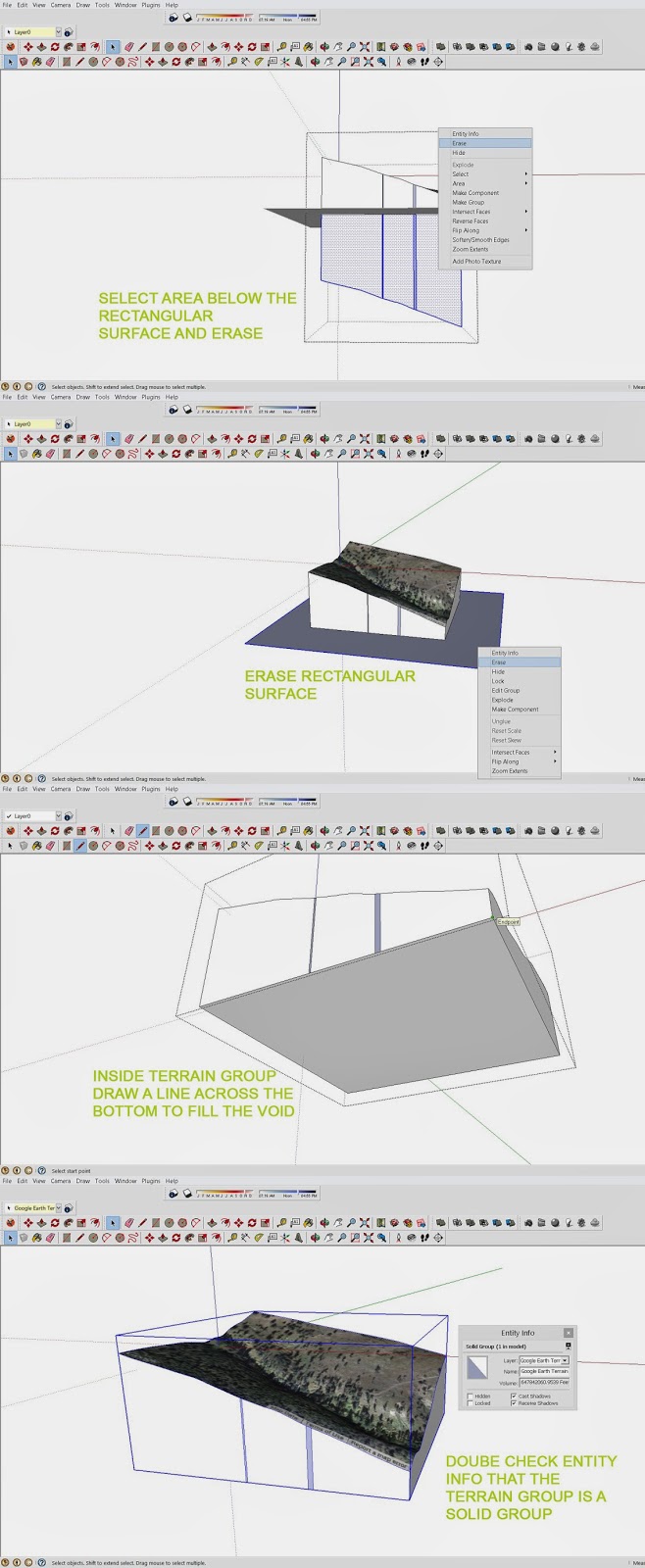
While being in architecture school and working in firms (architectural and engineering), I have come to realize the value of certain tools. Some are taught and others are just ones you may happen to come across after hours and hours of trial and error on certain projects. One in particular is the Slicer Tool (provided on Sketchucation.com). I’ve traced line drawings that I found on the internet; I’ve imported CAD drawings and converted it into a topo. If you’re like me then you’d understand that tracing drawings and interpolating contours isn’t all that fun but sometimes it has to be done. But what if I told you that you could easily grab a location off of Sketchup and turn it into a file ready to be laser cut for your topo OR what if I told you, you could take that same location and turn it into a CNC topo model in less than a couple minutes. You’d be excited right?! Well you can. ALSO… you can take field survey Cad drawings and import them and create CNC ready models as well. (So if you have access to accurate drawings or GIS that would help …but since we are in architecture school this will do just fine…)
I’ve put together a little tutorial to help you get started learning a couple of my favorite plugins for sketchup. Some might believe that these plugins are for taking the easy way out…. But in fact it saves hours of work and realistically … time is money … when you get into an actual firm. If you could provide an extremely quick 3d model of a site for preliminary stages in an architectural firm… they’d be quite impressed. (given that a survey hasn’t been made yet)


Just a thought and hopefully this helps all of you out. I know it helped me out.


 Photos by Author 


Fail

By Isaac Grayson

Failure and Misery. Both bring about growth and misery. All the best stories come from misery. All my best and most told stories contain something miserable. Mostly it involving being in the rain and being cold. The topic of failure came up during a recent history design Charrette. We were given the coordinates for two locations and told to design a women’s clinic at one and a temple at the other. This was for a non-western history class and so we needed to take into account the local climate and social structure of each. We had a week to tackle this project. So there was some collaboration on the research but it can be hard to learn all there is to know about a different culture just from internet sources.
After a week of working on this Charrette and realizing how little I really knew about the functions of these facilities in their perspective locations, I was just feeling hopeful that what I had drawn was close to being correct. When it was time to pin-up or designs for review we were told that this was going to be a pass fail review. Reviews are rough but a surprise pass fail review sets everyone on edge very quickly. And on top of this we are not allowed to speak during the review, the poster must speak for itself.
Our professor made the comment, when we was explain the process we were going to be using to review the projects, that you learn the most from failure. Saying this reminded me of a quote I have pasted on my desktop by Samuel Beckett. It goes “Ever tried. Ever Failed. No matter, Try Again. Fail again. Fail better.”
I found this to be a very helpful quote because as architecture students we are encouraged to stretch ourselves. Trial and error lend itself to more error than success. There are lots of quotes about the invention of the light bulb and I won’t go into them here but this is a classic example of how failure, and large amounts of it can lead to something good.  Sometimes it is hard to remember that failure is not all bad or unproductive.  So continue to fail and know that failure will happen again. But strive to fail better.
“Ever tried. Ever Failed. No matter, Try Again. Fail again. Fail better.”

-Samuel Beckett
Charette by Author

Thursday, April 10, 2014

Where Has the Time Gone?

By Kayla Fuller

Is it really April already? My has time flied! This semester has been challenging, exciting, nerve-racking and overall a test of my emotions. Individually architecture school is intense, when you add the graduate part it really puts you to the test. Although graduate school has been slightly frightening at times, I really enjoy the challenge. This is the time you can explore and improve your skills, the most important decision you will make is not who your chair is, but how you manage your time. You’ve probably heard it a thousand time, make a schedule and keep to it, honestly do it. You will be glad you did.
                Many times people ask why I am doing graduate school. The main reason is so I can become licensed, isn’t that everyone’s goal? Especially now with the current changes within the field of architecture. No one aspires to be bossed around throughout their entire lifetime. Therefore continuing your education after an undergraduate degree can provide you with multiple opportunities that would not have been available previously, such as being head principal of a firm. Another reason why I chose to further my education was to learn more about historic preservation and planning. During school there are not many opportunities for us to specialize our educational experience, it’s designed so we can gain experience in a variety of areas.
                My interest in architecture began in 6th grade. We had to complete a scavenger hunt of this various styles of architecture in the historic part of Quincy.  For those of you who are not familiar with the location and history of Quincy, it is a river town along the Mississippi in central Illinois with a history that dates back to 1812. Along Main Street, there is a variety of homes with many of them dating back to the origination of the city. These home are beautiful and the care and attention that was put into them cannot be replicated in today’s world. The most inspirational part of historic work is the time and meaning behind all the details. Our sense of time today is completely different from the 19th century and so our architecture reflects that. Sorry about the rant back to my main thought….
                If it wasn’t for the various projects that we were required to do, I would never have given planning the time of day. From day one I wanted to work on mainly residential or mixed use work with some additional works. For me it is important to create a space that not only inspires those who occupy it but as new program requirements change, it can adapt. Realistically this isn’t feasible for every project, but can easily be incorporated through different designs. The most important thing for me is to keep an open mind. Although on design or concept may not work, keep it, you never know when the perfect opportunity may arise. This is true for most of life. There may be some times in life when things don’t work out the way you want or expect, just remember, things happen for a reason, what you are looking for may be right around the corner.

Hope you are enjoying the last few weeks of the semester work hard and don’t let things get you discouraged, use that as fuel to work harder next time.

A Lesson in Ethics

By Tyler Dunahee

What does one do when possible success and an easier track to said success comes at the expense of others? Does it solely depend on circumstances or is it a universal set of ideas?  I presented my thesis this morning, a Masterplan for my hometown of Centralia, Illinois.  Two of the huge issues facing Centralia is that it doesn't have much to draw people from other towns and unemployment is high, largely in part due to a lack of jobs because of small manufacturing plants shutting down.  Anyway, during the presentation one of my committee members makes the proposal of a downtown casino (half kidding) ignoring the legalities of the proposal, it seemed like a viable solution, it would draw people from hours away, as the closest casinos are in St. Louis over an hour away, as well as provide hundreds of jobs.   The issue with such a proposal (again ignoring legality issues) is is this the right kind of establishment for Centralia?  A focus of my project is trying to bring in more small businesses to the downtown area, people who own the shops live in or near Centralia, which in turn will keep the money in Centralia. Large corporations such as Walmart, McDonalds, et cetera keep money from staying in the area, profits are sent to those high in the corporate food chain, who are not in Centralia.  The products in Walmart are largely made overseas, which again sends money out of the area, while products could be made in Centralia, using local materials keeping all resources and money in the area, maintaining a stronger local economy.
            You also have to analyze the impact such a building type would have on an economy, this is another reason that I wouldn’t believe a casino is right for Centralia.  When people discuss Centralia there seem to be a number of issues that come up, one of the biggest of which is drugs. Drugs are a real problem in Centralia, as alcohol can be, and to me, pairing those two vices with a casino would raise serious doubt and anger among the community, as casino’s generally don’t always bring around the greatest characters, nothing against those who do partake in gambling, I have friends that go consistently and a family member that works at one.  Again, however, I don’t see it as a good fit in the Centralia community, and it would take a lot of money out of the community, because let’s face it, casino’s would not be around if everyone was winning.  Where would those casino profits go? It’s unlikely such a venture could be afforded by a local business man, so it would likely be a larger corporation that would open it, with profits leaving the Centralia area, and those profits would come at the expense of local citizens. 

            All things being said, it was a very good idea, addressed too big needs for Centralia, a real draw to bring people in and it would have brought in a number of jobs, but you have to look deeper, and having grown up there my entire life, I know it would not be the right solution for the problem.  I think this was my first true test of ethics in a project, perhaps I only think that because of my passion for my hometown, but it definitely hit home this morning, it was an interesting feeling.