By Cray Shellenbarger
For our Architecture 532: Non-Western History class we have been asked to write a paper on a piece of architecture. I chose the Tower of Babel. The Tower of Babel as mentioned in Genesis is a well known story. The people of Babylon came together to construct a tower “with its top in the heavens.” God then realized that such a people unified by their language could achieve anything they attempted. So, God decided to confound their speech and spread them across the face of the Earth. Some say that this story was developed to explain the vast diversity of the human race. What if there is some historical significance to the story? Perhaps there is some sort of architectural evidence to compliment the stories. Analyzing the story alone is very interesting but this will look at it from an architectural point of view.
There is actually a large amount of information available on this project. The bible is only the beginning of references to similar buildings and stories. In the Book of Jubilees describes the Tower of Babel as being over 5,400 cubits in height, which would be over 8,000 feet tall. This would dwarf any of our modern buildings by several times. As mentioned earlier, many scholars believe that the story could be a reference to an actual building. One possibility would the ziggurat, Etemenaki. Etemenaki, a temple of the god Marduk, was located roughly fifty miles south of Baghdad. The base of the structure is said to remain there. The base that is supposed to be that of Etemenaki can be seen from satellite photos. Other references claim that the tower was located in Shinar which was a region in Mesopotamia with unknown boundaries. There have been many interpretations of the appearance of the Tower of Babel. Some of them include the images in this article.
It is also said that Etemenaki may have had an influence on the biblical account due to the Babylonian imprisonment of the Hebrews. Regardless, the story of the Tower of Babel is an etiology, an explanation of a phenomenon. This will continue to serve generations to come.
Images courtesy of Wikipedia.org and Joseph Barrigan
Thursday, March 31, 2011
Cairo Public Library & the Cairo Custom House Museum
By Russell Baker
Today, per Professor Davey's recommendation and request, I traveled to Cairo, the southernmost city in Illinois, which also happens to be the location where the confluence of the rivers occurs (the Mississippi and the Ohio Rivers). I went there to investigate a potential example of Guastavino Cohesive Tile Method Construction for my thesis. As it turned out, I was somewhat disappointed to find out that it was not constructed using this method, but the method did appear to be somewhat similar in nature, and the trip was a good educational experience making the trip, still, a worthwhile endeavor. The brick construction method used in the ceiling was only a single layer of bricks with 2" of concrete on top (See Attached Image by this Author). If it were at least two layers, it would have proved to be 100% useful as a local example of Guastavino tiling for my thesis presentation, but I still enjoyed seeing all that I did.
Before visiting the Cairo Custom House Museum (a partially restored "courthouse"), I first visited the Cairo Public Library, which in itself, is a piece of architecture exemplifying beautiful and intricate details. The purpose of stopping by the library was to search and peruse the original architectural drawings in the Rare Books Archives for the Cairo Custom House designed by architect A.B. Mullet. Mrs. Smith retrieved these drawings for me and I was amazed at the level of detail and ornamentation that was used in the drawings a century-and-a-half ago...by hand at that! It really reminded of the simple yet often taken for granted expression, "They don't make 'em like they used to."
Mrs. Monica Smith told and Mrs. Ogg Louise assisted me in my quest at each of these locations. Mrs. Louise mentioned that Professor Swenson and Professor Davey had assisted in some restoration work involving roof and soffit restoration, etc. They were both very helpful and interesting to talk with. She told me that the steel beams in the ceilings were installed before the Bessemer process was introduced to the area!!! (The Bessemer process was patented in 1855, and plans for construction began in 1867 and construction was completed in 1872). That was cool to learn. The building also used cast iron columns and banisters and other supports and had such a sound foundation that it was considered to be a bomb shelter during World War I. Though some spaces are unfinished due to funding issues, the museum is otherwise filled with really interesting historical exhibits and the amount of history displayed there is baffling. So all in all, although the ceilings weren't exactly what I was hoping for, they were still very interesting to see, and I'm glad I made the short trip to visit these two places.
[Two Scanned Brochure Images Courtesy of The Cairo Custom House Museum, 1400 Washington Avenue, Cairo, Illinois 62914]
Wednesday, March 30, 2011
Net Zero Energy Buildings
By Micah Jacobson
A Net Zero energy building is building with zero net energy used and zero carbon emissions used annually. There are renewable energy systems installed in building with an agreement with the power company. The meter will reflect the flow of energy; positive when power is being consumed by the building and negative if the building is providing more power than needed and therefore giving electricity to the power company; this will add credits to the customer’s bill. The customer is only charged the net power used during a certain interval of time.
Having net zero energy is one of the criteria for the living building challenge. The living building challenge is a philosophy, and advocacy platform and a certification program. It is a standard of performance and a path to restore the future. To qualify you need to have a responsible site plan, limited growth (only build on previous sites), habitat exchange (1 acre per acre exchange for 100 year non-development.), Net Zero energy, no red list materials, construction carbon footprint (builder must purchase carbon offsets for the type and size of the building), responsible industry (wood needs to be FSC certified, salvaged or harvested on site), appropriate materials (materials must be from an appropriate distance), leadership in construction waste (a certain percent of construction waste needs to be diverted from landfills), Net Zero water waste, sustainable water discharge (all storm water handled on site), window in every populated area of building, healthy air-Source control (manages chemicals, paints, adhesives and others), healthy air-Vitalization (building must meet California title 24 requirements), beauty and Inspiration, beauty and spirit (meets aesthetic needs of the visitors), inspiration and education (must be open to the public at least one day a week and educational materials must be available).
The net Zero energy and living building challenge are good programs that help to achieve a truly sustainable built environment.
A True Record Setter
By Shane Healey
Burj Khalifa, Located in Dubai, United Arab Emirates, became the world’s tallest building on January 4, 2010. Designed by SOM architect Adrian Smith, the 2, 717 foot structure was designed from patterns found in Islamic architecture and from the Hymenocallis desert flower. This structure has made many landmarks in the structural world. The 1.5 billion dollar building took 22 million man hours to build. The two main materials used in the building was 330,000 meters of concrete and 50,000 tons of steel creating a structure that weighs 500, 000 tones. In addition, the amount of steel used if laid end to end would extend over ¼ around the world. With a structure of major importance, symbolism interwoven throughout the design which includes: Dubai’s new wealth, optimism, reaching toward god, and international cooperation. However, with all positives there are negatives. Some believe that the Burj Khalifa symbolizes a decade of excess, fantasy, and recklessness in Dubai. In addition, some see the building as a metaphor for pursuing goals in life that ultimately prove empty. Since its opening, the Burj Khalifa has set many world records ranging from tallest man-made structure and world fastest elevator speed at 40 to highest New Years Eve fireworks displays and worlds highest swimming pool, on 76th floor. The y-shaped building contains 163 habitable floors, seven double story mechanical levels, located every 30 floors, and 2 parking levels in the basement, containing parking 3,000 spaces. In the end, with the completion of this massive structure, Dubai is becoming recognized as a true world city, like New York and London.
Sunday, March 27, 2011
Details of Taliesin
By Jessica Grafton
Frank Lloyd Wright’s Taliesin School of Architecture in Spring Green, WI is a vastly sprawled property that encompasses some of the most breathtaking views of prairie style living I’ve ever seen. The grounds are so peaceful and serene that you almost feel like you’re viewing the past; a simpler time where the rush of day to day doesn’t exist and you feel so calm in your surroundings. The natural landscape alone makes the place magical, but it’s the way Wright implements his design into the countryside that is undeniably genius.
The school itself is very small, not at all like a campus, and is laid out very intimately. It is also very secluded and houses the small student body as if it were a community of homes, rather than traditional student housing.
Among all the buildings scattered across the property, are the amazing little details that comprise the experience of Taliesin. Every corner and pathway is a photo waiting to happen. The statuary and gardens surrounding the buildings give character to the already beautiful scenery. It’s great to see such attention paid to every area you encounter there.
Wright’s vision is epically apparent at Taliesin and ties seamlessly with the natural world around it.
Thursday, March 24, 2011
SIU Facebook
By Vincenzo Burdi
It is that time of year to start thinking about your career after graduation. Where are you planning on ending up after SIU? Are you going back home? Will you move out of state? Would you be willing to work in a different city? These are all questions we face towards graduation, but some of us are still not prepared to deal with the future. Sometimes we just need a bit of exposure in order to get that dream job. Where can you showcase your work? Assuming you have your portfolio and resume finished, hop on Facebook and find "SIU Carbondale Architecture".
That's right SIUC Architecture is on Facebook. We wanted to link our architecture students with our alumni working in the field. It is a great place to post your own work, pictures, and start conversations within the Architecture Community at SIUC. Our alumni is frequently coming in asking about potential students looking for work. You can contact old friends, faculty, and SIU Architecture Alumni all through our brand new profile. Find us on Facebook at "SIU Carbondale Architecture" today!
Wednesday, March 23, 2011
Kanchenjunga Apartment: Mumbai, India
By Bhakti Shah
During my precedent study for the thesis, I came to know about a high rise residential tower - 'Kanchenjunga Apartment' in Mumbai, India. It was designed by the renowned architect Charles Correa.
"As the location's most endemic factor, climate provides the designer with a legitimate starting point for architectural expression in the endeavor to design in relation to place, because climate is one of the dominant determinants of the local inhabitants, lifestyle and the landscape's ecology."
--Dr. Ken Yeang, 1996--
Mumbai has a tropical climate and it asks for East west orientation for the buildings to catch the prevailing wind from the Arabian Sea and city's best view. It has sea view as well as harbor view. But these sides are directions of hot sun and heavy monsoon rays.
Old bungalows, in this type of climate, have often solved climate problems effectively with its traditional planning. These bungalows were wrapped by verandas, which act as a protective layer for main active areas against natural elements.
In the design of Kanchenjunga apartment, Architect Correa had effectively used traditional strategies of bungalow planning in high rise residential tower. It has 32 luxury units of 3 to 6 bedroom flats. All the units were are arranged as an interlocking composition with the play of intermediate split levels. 3- 4 bedroom units are one and half story and 5-6 bedroom units are 2 and half storied. These displacements of levels were critical in planning. These floors were differentiated with the terraces on outer ring with elevated internal volumes. This layout successfully responds to the climate of Mumbai. These deep garden veranda's provide occupant a defensive line from the harsh weather. The tower has a proportion of 1:4 - 21 meter square and 84 m in height. Facade has a dramatic effect due to outer double height terraces and themes of color palette add the drama in the aesthetics. Interlocking form and colors reveals the complex spatial organization of the livable spaces of the tower.
This tower is a successful attempt to implement traditional bungalow planning strategies into a multistory residential apartment.
Source: http://www.charlescorrea.net/ http://thearchiblog.wordpress.com/2011/01/09/charles-correa-kanchenjunga-apartments
Image: http://www.charlescorrea.net/
How to Add a Background and Materials in 3Ds Max
By Scott Fisher
I thought I would try to simplify things for those who have had trouble working in 3Ds Max this past weekend for ARC 232. Here are the simple steps to add a background and how to add materials:
How to Add a Background:
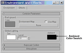
1. Select Environment from the Rendering pull down menu
2. Pick the Environmental Map button which currently has the label of None
3. Select the Mtl Library radio button in the Browse From: area. Then, pick the Open button in the File area
4. Select (your background image file name) and pick the Open button
5. Select (your background image file name) and pick the OK button
6. Make sure the Use Map check box is checked. Then, exit the Environmental dialog box
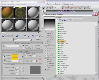
7. Open the Material Editor. Select an available slot
8. Pick the Get Material button to display the Material/Map Browser. Pick the Scene radio button in the Browse From: area
9. Double-click on (your background image file) in the list to load it into the Material Editor. Close the Material/Map Browser
10. In the Material Editor, make sure Screen is displayed in the Mapping: drop down list in the Coordinates roll-out. Also, make sure 0.0 is entered in the Blur Offset: spinner
11. Finished
To add materials to you object in 3Ds MAX:
1. Select your object you want to add material to (that has a name for example “dome”)
2. Pick the Material Editor button on the Main Toolbar
3. Select the first sample slot, and then pick the Get Material button
4. In the Material/Map Browser, select the Mtl Library radio button in the Browse From: area located in the File area, pick Open
5. Select the a category and then pick Open (for example select metal file)
6. The different materials preset in that category are displayed
7. Double-click on the material (Metal_Chrome) you want in the Material/Map Browser to load that particular into the Material Editor. Then pick the Assign Material to Selection button in the Material Editor.
This process can be repeated for each object you have in the project. The only thing that is different is that you would select the next slot in Step 2.
Big Muddy Film Festival: Concrete, Steel & Paint
By Tara Loughman
Recently, I have spent a good time in the graduate studio working on some of my thesis homework, along with other graduate students. A few weeks ago, while I was leaving Quigley Hall to go home, I picked up a Nightlife magazine off the stand in the hallway. Curious to see what was inside, I started to quickly read the paper looking for something interesting to do around campus. Soon enough I noticed an ad for the Big Muddy Film Festival. I have heard of the film festival before, but, personally, I have never been to it or have never had much interest in going. After being in school so much, I felt that I needed a change of scenery and continued to read the list of featured films and stopped at the first one that caught my eye; Concrete, Steel, & Paint. Soon enough I decided that I wanted to check it out and go see it along with some other friends from studio the next day.
As the film starts, I notice right away that this is not the same idea I had for its title. The film took place in one of our country’s most historical cities, Philadelphia, PA. Over the past few decades, Philadelphia has experienced crime on its streets much like the rest of America. The story starts out in a local prison; home to many-convicted inmates who may spend the rest of their lives behind bars. The prison provides many different types of classes for the inmate to take. One of the more recent popular classes held is an art class. This class can be taken as part of their requirement for a recreational activity. A local artist in the community was asked to come into the prison and teach the inmates about mural making.
In recent years, Philadelphia has been known for their artistic walls around the city. At first, this was due to vandalism and crime, but with the help of many people in the community, this is changing and for the good of many people. Last fall, I was in Philadelphia for school and while on a bus tour, we learned of this great community service that the film was mentioning. This made it much more interesting to me because I had seen some of these murals in person and had learned the facts behind them and their true meaning.
Before the class was over, many inmates where inquiring about how they could make a mural. Many of the inmate’s felt that painting was therapeutic and a release for how they felt. They wanted to make a mural for their victims and their families, to express their forgiveness and hopefully heal many scarred wounds. Jane Golden, the artist and founder of Philadelphia’s Mural Art Program, the went home with many of the inmate’s ideas in her head and soon meet with her group of mural artist to discuss the possibility. After much debate and talks with the prison, it was decided that a mural would be made with the prisoners and victim’s families together. At first things looked good for the inmates, this was an opportunity for them to express forgiveness and remorse, but when the victim’s families were shown the mural concept, they felt as if it was still about the prisoner’s life, not the innocent victim. After much debate, two murals were made, one from the inmates view and the other from victims and their families.
At the end of it all, the film showed a side of people in many different ways, both positive and negative. The film proved healing for many different people and on multiple levels. The movie may not of been about concrete, steel, and paint in the way I may have thought it would, but it taught me something else and reminded me the true meaning behind some of those colorful murals I had seen in Philadelphia.
Link for more information on Philadelphia’s Mural Arts Program: http://muralarts.org/
Picture Resources:
http://bigmuddyfilm.com/33/films.html
http://www.communityarts.net/readingroom/archivefiles/2007/12/community_arts_2.php
Big’s Loop City
By Kang-Hsin Fan
“History plays a different role in landscape architecture than in building or even urban design. As Smith notes, it is a long term enterprise: when a piece of architecture is completed, it begins its decline, when a piece of landscape architecture is done, it is just beginning, It takes time to grow a landscape” (Hubbard, 1995)
Systems shape urban forms. In basic landscape Architecture: Urban
Design, the author states that “cities are composed of interdependent systems
from the city-wide scale such as transport and utilities, to the microelectronic.
They support urban forms and promote opportunities for growth. These urban
systems can create form in the city landscape” (Wall & Waterman, 2010). An
obvious example is the shape of a city founded upon public transport differs
radically from one built to satisfy the needs of the car. In New York City, the
subway system follows the street network with only several feet of structure
separating the road above from the tracks below. Furthermore, “the high-tech
communications now result in clusters of businesses around certain hubs in the
city; free wireless internet in public spaces blurs the separation between office,
library, and public park, while in the future, localized energy production will invent new urban forms for our cities” (Wall & Waterman, 2010). As a result, with these systems and components of a city, they can help to create a specific context for urban design projects that offer great potential for innovations.
Big’s Loop City
In the Big’s loop city case study, it provides methods to build a development of a comprehensive public transport systems and components, and to improve the terrible traffic congestion problem. The result will help to yield a more effective life-place, and deal with pollution and quality of life issues.
According to Big’s Loop City, this project illustrates a new metro loop in the industrial, cross-border region of Copenhagen’s suburbs. It is under the question “how do we tie two countries together in one metropolitan loop?” These industrial areas in the Copenhagen suburbs were early developed and designed as finger plan by Steen Eiler Rasmassen and a group of urbanites in 1947. These industrial areas are next in line for urban development. From finger plan to loop city, it looks at the famous urban planning strategy and aims to maximize connectivity in the metropolitan region by stringing together a number of highly differentiated urban nodes. The new project is planning to build a new light rail to interconnect 20 development zones with a total area of 11 km2. They combine the light rail with strategies for energy exchange, water treatment, waste management, and electric car stations. The infrastructure with the rail could become the base for a new sustainable ring of development around Copenhagen, and an artery of urbanity pumping life into the heart of the suburbs.
Figure: New Plan Linking The Urban Nodes
Source: Big Company
Monday, March 21, 2011
Phenomenology
By Cray Shellenbarger
For my thesis I am studying spiritual architecture. One difficult aspect of my current work is to develop a way in which to analyze spiritual spaces that is scientific, while including the feelings and interpretations of space. It is very challenging to capture and integrate data regarding a person’s subjective feelings. This invites an almost infinite number of variables. Almost by default, a individual’s feelings are dismissed in most situations. The possibility of cultural and ideological predispositions weighing on one’s responses is certain. The best that can be done is try and understand as many of these variables as possible. I am using the following methods in my research.
PHENOMENOLOGY
The concept of phenomenology begins to analyze all of the things mentioned above. According to Thomas Barrie, “phenomenology rejects the scientific separation of subject and object and re-inserts individual perspectives into scientific and scholarly activity.” This explanation alone says much about the direction of architectural research. Aside from environmental and numerical data, all architectural research should be described in phenomenological terms. An architect practices in order to provide an improvement in the way of life of the occupant. This alone should be reason enough for the architect to take great interest in this area. Barrie goes on to mention more about this idea. He brings up the fact that phenomenology and the concept of rejoining of the subject and object cause another problem: How does one engage and study these types of data? Again, Barrie states, “Hermeneutics, a branch of phenomenology, aims to provide answers to these questions and methodologies to reconcile them.”
HERMENEUTICS
According to Barrie, hermeneutics has been influenced by postmodernism perspectives in three ways: “reality” is not give, but is constructed by human agency; meaning is always dependent on its context; and no one perspective should be privileged because contexts are endless. This is reminiscent of Friedrich Nietzsche’s idea that wrong and right are subjective. They are extremely dependent upon a person environment, just is a person religious beliefs. If someone is brought up as a Christian, the chances of that person growing up to be a Buddhist is very low. Humans are easily indoctrinated in regards to any subject. We hold things in our subconscious indefinitely. These subconscious “memories” can include anything: feelings, beliefs or interpretation of symbolism in the built environment.
The concepts of phenomenology and hermeneutics can be confusing when trying to define them. It has taken a substantial amount of reading to fully grasp what each means and the differences between the two. However, both are very useful when attempting to understand how a person interprets a space
Campus Living
By Micah Jacobson
I thought I would take the opportunity to talk about my spring studio project. There is an upcoming need on campus to build a new housing complex for Greek life due to the current building being out of commission soon. The new building will need to hold around 400 people and would need to be adaptable to suit the needs of not only Greek life, but other student. We are using this program to enter a PCI competition, so naturally the structure will use pre-cast concrete. This material is a very good building material for many reasons.
Pre-cast has the advantage of being pre-fabricated in a plant and shipped to the job site. This allows it to be put up fast, and eliminates the need to build forms and wait for the hydration of the concrete. This means there is less on site labor required for the job, and it gets done faster.
Another advantage is the ability to concrete, with precision, the condition of the hydration of the concrete. You can create an environment that is perfectly situated for the strongest concrete. If the weather is to cold, hot, dry or wet the concrete may not gain as much strength.
A great advantage of pre-cast is that you can pre-stress the members. This will do many things to improve the performance of the concrete. A pre-stressed member will come to the job site with the tension side of the beam in compression. As the load is applied it will be at a much smaller strain level on the tension side, where concrete would normally crack. You can design a pre-stressed beam that can carry a higher load with a smaller cross-sectional area than with cast in place concrete. It is possible to pre-stress a cast in place member (post-tensioning), but not as common.
Concrete is a great material, and when teamed up with steel creates an incredible building product. This project provides a great opportunity to improve my knowledge and gain experience in the design of housing; this is my first experience with it.
Friday, March 11, 2011
My Experience Building a Scale Model Sioux Tipi
By Ben Temperley
Professor Jon Davey teaches Architecture History III: Non-Western Architecture at Southern Illinois University Carbondale (SIUC). This is a required class of the recently accredited Master of Architecture program at SIUC. As part of this class, Professor Davey gave his students the assignment to build a model of a non-western piece of architecture. I chose to build a Native American Sioux tipi. You may ask, “Isn’t that a western structure?” It is not in the sense that western refers to the tradition of building traced from the Greeks, to the Romans, to the Europeans, and to the United States. Native architecture is considered separate from this tradition.
According to Merriam-Webster, a Tipi is “a conical tent usually consisting of skins and used especially by American Indians of the Great Plains”. Tipi is a Dakota word meaning “to dwell”. A tipi is not the same as a wigwam. A wigwam is “a hut of the American Indians of the Great Lakes region and eastward having typically an arched framework of poles overlaid with bark, mats, or hides”.
I was greatly aided in my endeavor by a book entitled, The Indian Tipi: Its History, Construction, and Use by Reginald and Gladys Laubin. I highly recommend this book to anyone interested in a reliable description of the Native American tipi. The authors describe in precise language and detailed diagrams how to build a full scale tipi in the manner of the Sioux, the Cheyenne, the Crow, and other Native American tribes. They also describe the utility and beauty of a tipi, the furnishings in a tipi, and how to transport a tipi.
After reading the Laubins’ book, I drew a model of the cover of a Sioux Tipi in AutoCAD at full scale according to the detailed diagrams in the book. I then scaled the drawing to 1 ¼” = 1’-0” and printed it in the School of Architecture computer lab on trans-bond paper. Next, I purchased materials. I bought twenty 5/8” thick dowel rods from Walmart for the poles. I bought two packages of two-yard long pieces of off white canvas for the cover. I bought yarn and string from Walmart. I didn’t find the fabric paint I wanted at Walmart, so I went to Hobby Lobby. I used the fabric paint to paint designs on the cover.
After purchasing the supplies, I trimmed the dowel rods to the correct size in the Blue Barracks wood shop. I also sanded the ends to points to give the tipi a more realistic look. To transfer the design onto the canvas, I first laid the canvas on a table. I then laid transfer paper over the canvas. Next, I placed the AutoCAD paper printout on top. I traced the design with a pen, which transferred to the canvas via the transfer paper. Next, I cut out the cover. Some of the hems I folded over and ironed together with iron-on adhesive. After that, I painted the design on the cover with the fabric paint.
To assemble the tipi, I followed the instructions provided by the Laubins’. I had to learn what a ‘clove hitch’ knot was to tie the three base poles together to form a tripod. With the tripod erected, I laid the remaining poles in place and tied them together. I attached the canvas cover and inner lining to the poles. Then, I closed the front cover using cut-to-size tooth picks as lacing pins.
I enjoyed my tipi experience. I learned that tipis are ingenious, elegant structures. There is more to their design than you might expect. I challenge you to find out more about them. If I had more space to write I would tell you about the smoke flaps, the inner lining, their insulating properties, their adaptability to winds, how they are not perfectly cone-shaped, how to transport them, etc. If you ever want to build a full-scale tipi, it might be worthwhile to build a scale model like I did first for practice.
Thursday, March 10, 2011
Landscape Design Minor
By Russell Baker
During my undergraduate studies at Southern Illinois University (SIU), in addition to a Bachelor of Science in Architectural Studies, I also earned a Minor in Landscape Design through the Plant and Soil Science department. The coursework involved in this minor, through the Agriculture department, was not only a lot of fun, but also a great supplement to my architectural studies, as landscape design is often overlooked or only briefly touched upon. The coursework required three studio landscape design courses in addition to three related elective courses (of which there are plenty to choose from) totaling seventeen to twenty credit hours.
The first courses I took in the spring of 2007 were PLSS 328A and 328B, which were both Landscape Design studios instructed by Professor Karen Midden. Understanding the rigorous nature of our studies, Karen always made it a priority to work with architecture students' schedules, as she was also my advisor. One of these courses was conducted online through WebCT and Blackboard, on which readings, lectures, and assignments were posted. In this course, we learned about the differences between landscape architects, landscape designers, and landscape contractors, the historical development in landscape design, as well as the scope of the profession and the design processes that are used in it. The other course was an entrance level hands-on design course in which was intended to familiarize students with plants; materials; methods and processes; case studies; general layouts; plant and hard-scape symbols, representations, and labeling; plant selection; and planning and designing, both graphically and written. The final project included the landscape design of a new vacation home and a written paper explaining the use and construction of and landscape hard-scape element, such as an arbor which is a shelter of shrubs and branches or of latticework intertwined with climbing vines or flowers.
In fall of 2008, I then took three landscape courses and a lab in addition to my regular architecture courses. I completed PLSS 240 (Soil Science I and Soil Science I Lab, with Professor Wyciskalla), PLSS 428 (Landscape Design Studio II, again with Karen Midden), and PLSS 431 (Landscape Construction, with Professor Henry). Soil Science I was very similar to an intensified combination of biology, chemistry, ecology, and geology encompassing soils ranging from the microscopic level to the macroscopic level. It involved a lot of memorization, studying, and testing, but also included a field trip to a site to scientifically examine soil samples, which directly relates to the architectural field as far as foundation and site planning goes. In Landscape Design Studio II we undertook two major projects: the entire landscape design for an actual client who owned a very large, brand new lakeside, semi-local residence, and also the restoration and improvement of a local nine-hole golf course. Needless to say, this course was a lot of fun as we were actually working on real projects and were able to make several site visits; not to mention the fact that we were given free golf vouchers for the summer! The Landscape Construction course was also a lot of fun, but it was more of a physical, hands-on, labor-intensive course. We were taught how to, and actually constructed a patio with seating, retaining walls, and landscaping from scratch at the Agriculture building, in addition to an trellised resting area, and some drainage work to solve a minor flooding problem. We also learned the basics of cost estimation in landscape design and construction, which I sincerely believe is one of the few essential elements that are lacking from the architecture curriculum here at SIU.
The final course I took to complete my landscape design minor was PLSS 390, DynaScape Design, in the spring of 2008. This was the first time this landscape design software driven course had been offered, and the instructor was learning the course alongside the students. DynaScape Design is very similar to other computer aided drawing (CAD) except it is specifically tailored to landscaping elements. As an architecture student, it was already familiar territory to dive into new software, but several of the others students who weren't used to using CAD in their design practices found it a little more difficult; so Doc. Henry was appreciative of my assistance with helping both himself, and some of the other students.
Overall, and in hindsight, I'm very glad that I chose to undertake and complete a minor in Landscape Design at SIU. I feel I have gained valuable experiences, knowledge, and skills that will continuously better me as an architect and a designer. I would recommend considering a minor in landscape design to anyone who thinks they may be interested and particularly to architecture students with a love to learn. One can never learn too much and never be over-prepared, right?
The Survey Continues….
By Yuko Aoki
The purpose of my survey is to collect data about human well-being in a single housing environment. Happiness is phenomenal and is different, depending on a person.
In my last blog, I introduced how SIUC students or faculty compose research, surveys, interviews, etc. The Human Subjects Committee just approved my survey, so my next step is to spread the survey to the world. Right now, I have about forty Japanese and twenty Americans who would participate in taking the survey.
The survey has six pages using Survey Monkey, which is an internet based survey service website.
The first page is explaining about me and the survey.
The second page is background questions.
The third page is how people feel or think about their home in regard to living longer and life satisfaction.
The fourth page is about neighborhood relationship.
The fifth page is how people reduce stress and feel comfort inside and outside of their home.
The last page asks about happiness and comfort in the home and how it can be improved.
I hope to collect data from a total of 200 or possibly more people from 18 to over 90 years old.
Since I got my approval with only email solicitation, I cannot paste the link to the survey here. If you are reading this blog and have an interest in taking the survey, please email me at aokiy4@siu.edu. I will send you the link. Your information will be kept confidential.
Image is from http://www.applied-corporate-governance.com/free-online-survey-tools.html
Wednesday, March 9, 2011
The Kraus House
By Dustin Stoll
This past weekend I had the opportunity to visit the Kraus House, designed by Frank Lloyd Wright, and located in Kirkwood, MO (just outside of St. Louis). The visit was part of a field-trip for Professor Davey’s Graduate Architecture History class. The house is one of Wrights later designs, and is in the Usonian style. Wright developed the Usonian style during the height of the depression, in order to create more affordable housing for “common” people. The Usonian style is very similar to Wright’s Prairie Style, but much smaller (approx. 1000-2000sqft) and built on slabs.
I really enjoyed my visit to the Kraus house. I noticed many similarities between the Kraus house and another Usonian house that I visited a few years ago on another field trip to Pennsylvania called Kentuck Knob. Below are a few pictures of each house, check out the similarities!
Kraus House
Kentuck Knob
Kraus House
Kentuck Knob
Tuesday, March 8, 2011
Aqua Tower
By Micah Jacobson
One of my favorite buildings in Chicago is a new addition to the oldest skyline; the Aqua Tower. It was designed by Jeanne Gang and a team of architects. This building stands an impressive 859 ft tall and is the tallest building with a woman as the lead architect. The unique wave effect on the sides is accomplished by using the balconies to create a contour. Some of the balconies terminate, leaving the shiny glass clad exterior of the building exposed to add to the aqua effect.
I found the building to be more impressive the closer you get to it. From the 28th floor of the hotel across the river, I could hardly see the wave effect, but from the ground, I could clearly see the smooth result of its architecture.
The building is a mixed-use residential building and features a terrace with gardens, pools, hot tubs, gazebos, and a track for exercise. It won the 2009 Emporis Skyscraper Award. It also features rain water collection and energy efficient lighting.
I was not able to examine the structure any closer, but I would love to tour it and learn more about the design. It is one of many examples of high tech building that are rising above the historical high rises built by Louis Sullivan and the Chicago School of Architects.
Monday, March 7, 2011
Visiting the Milwaukee Art Museum
By Jessica Grafton
On our trip junior year, we were able to see the Milwaukee Art Museum addition by Santiago Calatrava. Surprisingly enough, I knew nothing about Calatrava’s work prior to this trip, and needless to say, I was thoroughly swept away by the building. Someone had told me on our way about the wings, and of course, I was like, Huh? Wings? To go into it blind and then see something so unique was an outstanding experience.
The thought process behind the design and its nautical theme is so evident and intricate at the same time. You feel that you really understand where the designer was going and what he wanted to accomplish inside and out.
On the exterior, the bright white structure against a blue sky and the water beyond is all you need to imagine setting sail. The long gang plank leads you to your destination and gives the perfect view of the infamous wings that fold in on themselves at certain times of the day. The wings at full span even remind me a bit of a whale’s tail peeking above the water.
Even after entering the building, the feeling of being on a ship remains. The front lobby opens to a view of the lake with an expanse of windows that are reminiscent of a ship’s bow, and carries the theme throughout. Everything flows together as an entity that inspires the thought of being somewhere else. The design stays true to Calatrava’s aesthetic but is also distinctive in its purpose.
Thursday, March 3, 2011
The City of Pune and its Transition from a Cultural Paradise to a Buzzing Metropolis
By Bhakti Shah
My Thesis project of township will be proposed in my hometown Pune in India. It lies in western part of India and in the state of Maharashtra. It is 7th largest city in India and 2nd largest in the Maharashtra state. It is about 100 miles from Mumbai – the biggest city in India. Population of this city is around 5.5 million. It experienced a long-standing urban tradition: first as an historic center of pre-colonial urbanism. It is also known as ‘Oxford of East’ and houses 6 universities and around 600 functional higher education centers catering to an estimated half million student population. Not only students within India but students from abroad are attracted in these institutes. It is referred as ‘Queen of Deccan’ as it is geographically situated on leeward site of Deccan plateau. It was also referred as ‘Pensioners Paradise’ before the rapid urbanization. It was calm, quiet small town away from hustle and bustle of the metro areas. It is also known as ‘Cultural capital’ of Maharashtra state. Various cultural activities (classical music, spirituality, theater, sports and literature) are well established in this city. After independence of India, the city grew in a different direction which changed its original identity and it is now recognized for its IT and automotive hub. It is also called as ‘Cyber City’.
The city has a rich historic character. It was first started as agricultural settlement ‘Punnakka’ – ruled by ‘Rashtrakuta’ dynasty in 8th century. Then it was ruled by different dynasties like ‘Yadva’, ‘Holkar’, ‘Mughal’ (Islamic rulers), ‘Maratha’, ‘Peshwa’ and British rulers from 1817 to 1947. Amongst all these emperors Maratha and Peshwa were the main developers of the city. City was developed in term of the city planning. New term of the city planning – Petha structure was developed during the Maratha & Peshwa era. These structures are still considered as the identity of the city and retained in the core of the city. Outskirts of the city core were developed by the British and established their military set up – a cantonment area, which is now controlled by Indian army. After independence and industrial development in 1950’s and 60’s city developed the suburbs of Pune in all directions.
Pune will soon acquire the status of being a metropolitan city in India. According to a recent report on ‘The 7th emerging metro city in India’ it owes its up gradation to a fast development pace in the area of infrastructural facilities, friendly business environment, education avenues and employment opportunities.
Pune is blooming and blossoming briskly as an important metropolis in the country. As the time passes, Pune’s history, too, will get more and more enriched.
source: http://en.wikipedia.org/wiki/Pune
www.pmc.org
Images from : http://www.google.com/images?q=pue&um=1&ie=UTF-8&source=og&sa=N&hl=en&tab=wi&biw=1111&bih=508
Friends Meetinghouse
By Dustin Soll
The Friends Meetinghouse located in San Antonio, Texas is an award winning project by Lake/Flato Architects. The architects faced many unique challenges with this project, the first of which was to design a new meetinghouse for a Quaker congregation located on a site which was surrounded by noisy streets and apartment complexes. Noise was of great concern, because the Quakers are a calm and humble group of people who would need quiet surrounding in which to study and congregate. In order to mitigate any noise concerns, the main gathering hall of the 4,800ft2 building was located at the very back of the site in a drainage area surrounded by native plants (Kolleeny, 2008).
Another challenge associated with the site was the need to find a way to create an environment that would be able to create a state of mind among the parishioners of study and focus, while being located in such an unpleasant area. This problem was in addressed through thorough site development. First, one enters the site onto a winding pathway that is surrounded by plants and trees to block the urban surroundings. The path was intended to settle one’s mind along the pleasant journey. At the end of the path, one is greeted by a wood gate set in limestone, which gives a sense of arrival (Kolleeny, 2008).
Once one has entered through the gate, the journey continues to and through the building until reaching the worship space (Kolleeny, 2008). The designers clearly used age old ritualistic pilgrimage model of “gate”, “path”, and “place” which Hoffman (2010) mentioned numerous times in his book Seeking the Sacred in Contemporary Religious Architecture.
The design of the building is reminiscent of the first Quaker meeting houses. Lake/Flato incorporated the use of unembellished inexpensive materials, and simple geometry to create a building that promotes humility.
Resources:
Hoffman, D. (2010). Seeking The Sacred In Contemporary Religious Architecture. Kent, Ohio. The Kent State University Press.
Kolleeny, J.F. (2008). Friends Meetinghouse. Architectural Record.
http://archrecord.construction.com/projects/portfolio/archives/0802friends-1.asp
Lake Flato Architects. Friends Meetinghouse. http://www.lakeflato.com/projects/friends-meetinghouse/
Wednesday, March 2, 2011
New Zealand’s Earthquake
By Shane Healey
Bring back visions and events that occurred in Haiti, on Tuesday, February 22, 2011 at 1:02 pm, a magnitude 6.3 earthquake struck Christchurch, New Zealand’s largest city. This earthquake is the second major quake to kit New Zealand in five months. In September of 2010 a magnitude 7.1 struck the area. This deadly act of nature, that originated 5 km below the earth’s crust, demolished 60 percent of the surrounding areas. In addition, the quake has left 75 people dead and another 300 are still missing. By the end of Tuesday, New Zealand had endured a massive earthquake and 10 aftershocks.
http://www.mirror.co.uk/news/top-stories/2011/02/23/
After today, the earthquake that struck an area of 500,000 people collapsed buildings, closed the airports, made roads and bridges impassable, caused fired to break out, and trapped people under the fallen debris. In the end, due to the earthquake occurring during a workday, more people lost their lives, more people were trapped, and the area was declared as a state of emergency
Terracotta Use
By Vincenzo Burdi
Terracotta has been used throughout history for sculpture, pottery, and building material. In ancient times, clay sculptures were dried in the sun after being formed. Today, the material is placed within what is known as a kiln, essentially a furnace for clay. Compared to stonework, terracotta is far lighter, it can be reproduced with reusable mold-making techniques, and can be further glazed to produce objects with color and texture.
Variations in the color and pattern of the glaze make it possible for buildings constructed with the material to look like they were finished with granite or limestone. This flexibility was part of the reason the material was so attractive to architects.
In wide use, there were four major types of terra-cotta used:
1) Brownstone was the earliest type. A dark red or brown block which was not necessarily glazed. It was used as imitation sandstone, brick or real brownstone.
2) Fireproof was developed as a direct result of the growth of the high rise building in America. Cheap, light and fireproof, the rough-finished hollow blocks were ideally suited to span the I-beam members in floor, wall, and ceiling construction.
3) Veneer was developed during the 1930's and is still used today. Ceramic veneer is not hollow cast. It is a veneer of glazed ceramic tile which is ribbed the back like bathroom tile and usually attached to a grid of metal ties which have been anchored to the building.
4) Glazed architectural terra-cotta was the most complex building material developed. The hollow units were hand cast in molds or carved in clay and heavily glazed, then fired. This is the terra-cotta associated with the architecture of Cass Gilbert, Louis Sullivan and Daniel H. Burnham.
Glazed architectural terra-cotta is a ceramic masonry building material popular in the United States from the late 19th century until the 1930s. It is still one of the most common building materials found in U.S. urban environments. It is the glazed version of architectural terra-cotta; the material in both its glazed and unglazed versions is sturdy and relatively inexpensive, and can be molded into richly ornamented detail. Glazed terra-cotta played a significant role in architectural styles such as the Chicago School and Beaux-Arts architecture.
Tuesday, March 1, 2011
Making Survey
Yuko Aoki
Researching happiness for my thesis is very vague and unclear. It is because people experience their emotions differently. Therefore, I decided to conduct a survey to find what the average person’s idea of happiness is.
Making a survey requires taking several steps before the questions go out to the public. If I do not take the steps, the survey would not be reliable and might be not accepted by the University.
First, before you start making questions, visit the Office of Research Development and Administration (ORDA) to see what you need to make and get submission forms.
Second, create questions which the respondents can finish in approximately 5 minutes. I wanted to put more questions on my survey but participants would get bored and not have time to take a long survey, so questions must be simple but something that you want know.
Making a variety of question types would help to hold the interest of participants. For example, if you have continuing multiple questions, mix them with scaling questions and/or short answer questions.
Third, check with your committee members and discuss whether or not the questions are clear.
Fourth, figure out how to distribute the survey and how many people you want to respond. The graduate school at Southern Illinois University does not have a minimum number of human subjects. However, with a larger number you get results with high credibility.
Fifth, submit all the materials and forms to ORDA. A survey which involves human subjects has to get approval from ORDA which would take two weeks to process. Confidentiality is the most important aspect of a survey.
Finally, when ORDA gives back your survey to you, you are ready to send the survey out!!
Image:
Reference: ORDA at Southern Illinois University http://www.orda.siuc.edu/compliances/
What Architects Do
By Russell Baker
First, I would like to note that this article is primarily for non-architectural readers, as I'm certain that most of this article's content is already well-known by any reader with an architectural background.
Recently, I asked one of my non-architecture friends what he thought architects actually do. His reply was, "I personally know you guys do more than this, but I'd guess that the 90% of the general population would think that all you guys do is design houses." This statement is pretty insulting and condescending to architects. In most states, and depending on local legislation, an architecture degree isn't even required for residential design. However, as architects (or architecture students), we realize that it is our job to educate our clients and peers as to exactly what it is that we really do and what our responsibilities are. This, in itself, can potentially prevent many job-related problems, litigations, and in some cases, lawsuit.
Architects are the professional, artistic, and technically skilled creators, inventors, and designers of much more than just residential housing. An architecture student must become a "jack-of-all trades." We must apply a plethora of knowledge to employ in our thought processes in order to not only use in our design, but in our communication of our ideas to our clients.
That said, I would like to clarify some of the responsibilities that come with the job. First and foremost, architects strive to create sustainable modern structures, from housing, to any type of building or shelter you can imagine, whether private or public, residential, commercial, or industrial, to urban city planning. Secondly, we are required to adhere to building codes, the purpose of which is to establish minimum construction standards for the protection of life (safety), health, and welfare of public.
That is a huge statement which architects are never allowed to set on the backburner. Thirdly, our designs must be conform to the requirements of a safe balance of form and function. Not only should the building be aesthetically pleasing, but it also must serve its purpose safely, effectively, and efficiently. The issues of context and complexity must also be dealt with pertaining to site selection. Making sure the new design "fits" is another critical element in the design process, which is rarely a simple task.
Fourthly, being a professional practice, we must adhere to ethics and professional codes of conduct. Generally, we strive to improve professional knowledge and skill while seeking to raise the standard of aesthetic excellence, architecture education, research, training, and practice. We also strive to improve public appreciation and understanding of architecture and the functions and responsibilities of architecture (as I'm attempting here), and to promote the allied arts and contribute to the knowledge and capability of the building industry as a whole. These codes of conduct can be credited with upholding the integrity of the profession, ensuring fairness, and giving us guidelines to follow. Ethically, architects are responsible for upholding the law in conduct of their professional activities, not knowingly violating these laws, not offering or accepting bribes, avoiding fraudulent practices, upholding the safety of the public, respecting and conserving national and cultural heritage, getting involved in civic activities, upholding human right non-discriminatorily, etc. The list of architectural responsibilities goes on and on. The best (U.S.) definition of an architect is a person who is qualified by education, training, experience, and examination, and who is licensed under the laws of the state in which architecture is practiced. Upon licensure, an architect is then able to use his/her seal to stamp legal approval on architectural drawings. An architect may also choose to work in the field as a draftsman, designer, technician, project architect, project manager, firm owner (principal), construction administrator, marketer, networker (which I like to call 'schmoozer'), theater set designer, professor or instructor, building trades technician, or a number of other types of tasks.
It is also important to note that architects provide a professional service, not a physical product. The basic services that architects provide include Programming, Schematic Design, Design Development, Construction Documents (and Drawing Specifications), Bidding and Negotiation, and Construction Observation, as seen in the attached diagram by the author. This diagram also shows the relationship between those involved in the design-build process of taking an idea and making it a reality.
Specifically, the practice of architecture can be described as "the offering of professional services, such as consultation, environment analysis, feasibility studies, programming, planning, aesthetic and structural design, construction documents consisting of drawings and specifications and other documents required in the construction process, administration contracts, project presentation, and construction management, in connection with the construction of any private or public building, building structure, building project, or addition to or alteration or restoration thereof" (Professor Tony Murphy, ICC 2003).
Subscribe to:
Posts (Atom)